• All Galleries
  • BLOG
  • About
  • CONTACT
Menu

Bobbi Baugh Studio

  • All Galleries
  • BLOG
  • About
  • CONTACT
bobbibaughstudio-blog-header-10-25-20.jpg

I LIKE COMPOSITION BEST

October 25, 2020

I like composition best. I decided today while I was composing some small paper collages.

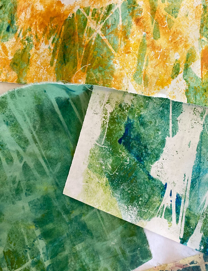
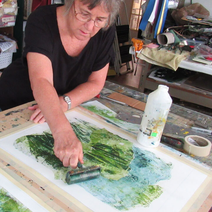
Yesterday I had a great printmaking session to try out some new stencils on a variety of papers.

bobbibaughstudio-cutting-tree-stencikls.jpg

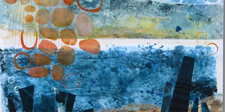
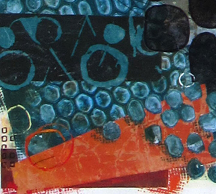
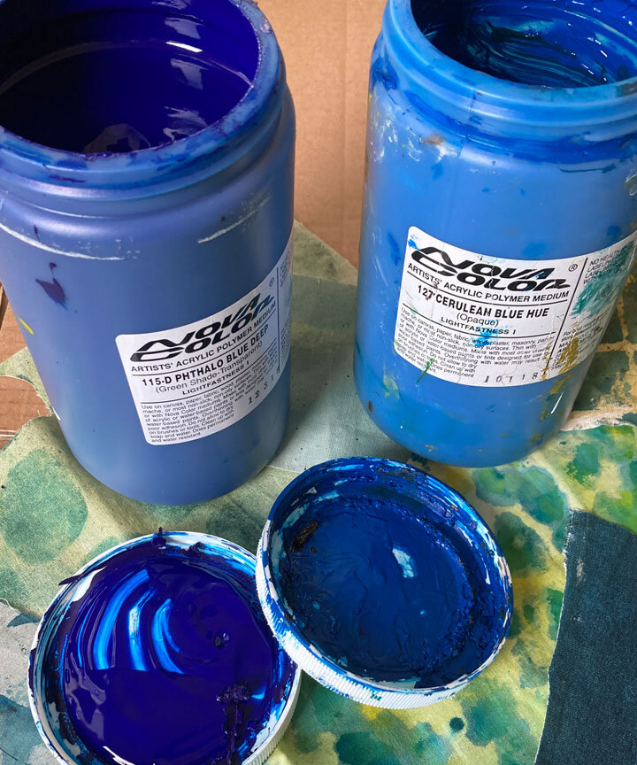
I like designing and cutting stencils. And I like mixing colors. And I really, really, really like hand printmaking. I like the rhythm. I like the discovery. I like the spontaneity. I like seeing a pile of things I’ve printed in a short period of time.

BUT… Putting them together into composed pieces is a whole different experience.

bobbibaughstudio-selecting-prints-for-collage.jpg

Composing involves listening. Well, for me, not at first. I’m not a completely intuitive creator of artwork. I’m a planner. So I have sketches or ideas that I’m trying to accomplish. When I begin, I have a sense of where I want to go.

When I get the pieces I’ve created and begin to arrange them, the experience changes. I often find that what I’d planned won’t work. Or that it will go a different way. Or that I need to move things around a number of times till the pieces speak to me and say, “Yes. Stop.”

All of those things occurred as I worked today.

bobbibaughstudio-work-in-progress-measuring.jpg

Setting out the parameters is pleasing to me. As soon as I’ve decided on the size and drawn my border, I can begin to envision the things fitting into that space.

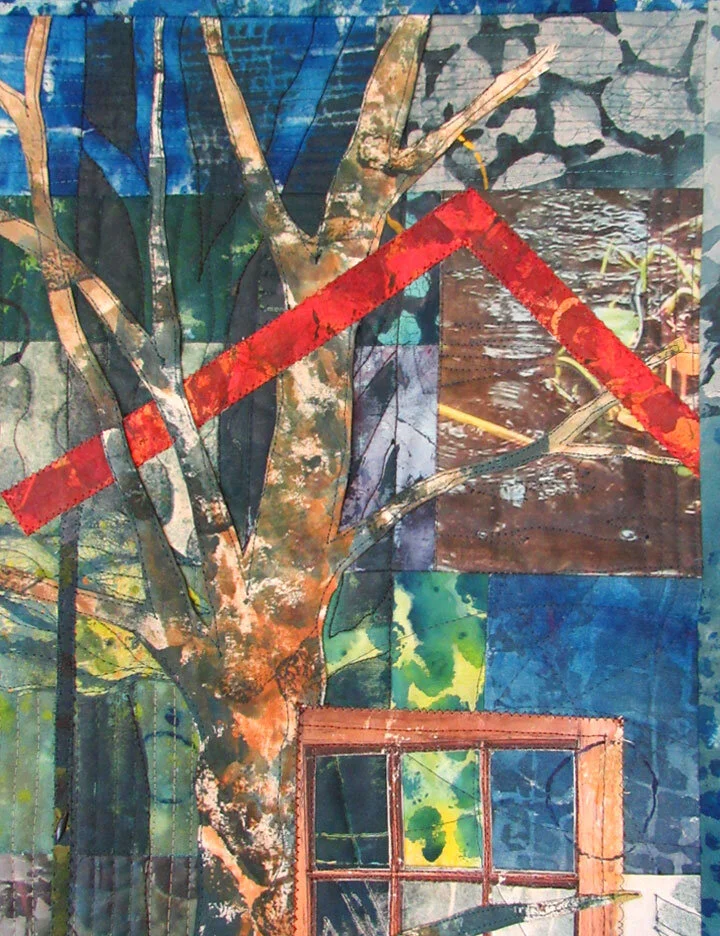
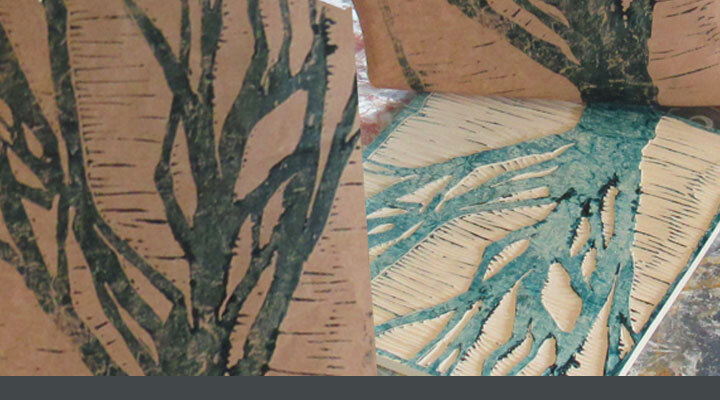
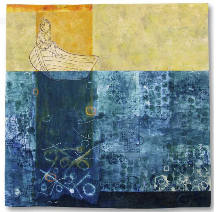
I’ve got two side-by-side trees in this composition so far. The one on the left is printed on MASA rice paper and the one on the right is printed on tissue paper. That was one of the unexpected things. The tissue paper is so reactive to every little nuance on the plate that it picked up interesting shapes and values beyond the box drawn around the tree. So, I adjusted my plan to include those.

bobbibaughstudio-collage-in-progress-tissue-print.jpg

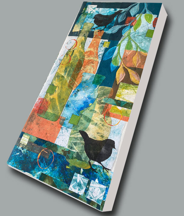
After this morning’s work here’s what I have: two trees plus a little splash of complementary color.

bobbibaughstudio-work-in-progress-tree-collage.jpg

I’ll add more to finish it up, but not too much. I like the white breathing room. I’ll just have to listen to what it tells me.

SOME EXHIBITION NEWS
and AN INVITATION TO WATCH A GREAT EXHIBITION OPENING

bobbibaughstudio-award-quilt-visions-art-museum.jpg

I have been so honored to be a part of Visions 2020 at the Visions Art Museum in San Diego. The jurors selected 37 works to exhibit from 400+ submitted. This year the show has been virtual only. But, at a virtual wine-and-cheese tasting Friday evening, I learned that I was awarded the Miriam Machall Award for Beauty. (There were 6 awards total. Best of Show was awarded to Charlotte Ziebarth. The five other awards are In The Abstract, Color Artistry, Quilts Japan Award , SAQA award and the Award for Beauty.)  I was (still am!) thrilled and stunned. This is an exhibition of exquisite and inspiring artwork. The Museum has put together a catalog you can browse on your own and thirty-minute viewing of the 37 pieces in the show. I enjoyed seeing several in-depth visits. They are very well done. So, if you’d like to take a look, please visit here:

Exhibit Catalog 
 https://visionsartmuseum.org/wp-content/uploads/2020/10/QV2020catalog_Web_01.pdf

Exhibit Virtual Tour Slideshow
https://visionsartmuseum.org/quilt-visions-2020/quilt-visions-2020-online-gallery/

Thank you for reading. I always enjoy questions and comments.
--Bobbi
bobbi@bobbibaughstudio.com

BLOG POSTS: If you would enjoy receiving blog posts by e-mail,  please subscribe here:  I post blogs once a week. BLOGS-BY-EMAIL

NEWSLETTER: If you enjoy more detailed behind-the-scenes stories, as well as FIRST LOOKS at new works and members-only discounts, I hope you’ll become a Studio Insider.  You’ll hear from me about once a month.  HERE


2 Comments
bobbibaughstudio-blog-header-10-18-20.jpg

What is the color of light?

October 18, 2020

This week I’m in the beginning stages of a new quilt dealing with the subject of light. (I will hope to submit this to SAQA global exhibition about LIGHT due at the end of November.)

Light is not so much a color as an experience.

Light is not s much a thing to depict as an effect on the things it touches – or does not touch.

Light is ethereal and changing.

bobbibaughstudio-photo-transfer-light-vines.jpg

I am returning to a favorite photo of vines and light and shadow viewed through the window of an abandoned house. (I shot this image in rural South Carolina.)

My vision is to create original printed and painted fabric to enhance the feel of that light and to serve as transitions from the photo to a section of darkness.

(I know. This is a pretty ethereal vision. But I’m all in now!)

bobbibaughstudio-photo-of-vines.jpg

I’m beginning with a translation – changing the experience of light into a hue. Working from the photo, I’ve discovered a pale celery-green with a tinge of golden yellow that I want to work into my coordinating fabric.

Here’s the palette set-up: Black + Yellow+ white.

bobbibaughstudio-paint-set-up-in-studio.jpg

Black + Yellow = olive green. Go heavy on the black and it’s deep olive green. Add white to that to get a range of  celery tones.

Black + yellow with a heavier concentration of yellow = mustard yellow. Add white to that to get a range of creamy yellow tones.

bobbibaughstudio-mixing-paints.jpg

I’m going to sponge this onto muslin to get an all-over tone. Then the texture and pattern will be created by subsequent layers of a slightly different hue.

bobbibaughstudio-acrylic-paint-wash-on-fabric.jpg

Just a thought about entering exhibitions: I find this very inspiring. I like responding to a specific theme, and I even like it when there are specific size restraints. (This one’s pretty open. I can be from 30”-46”H x 34-60”W.) But I have learned from experience only to enter exhibits in which the piece I create is one that would have interested me anyway. It should fit into a body of work or have other interest to me in case I am not accepted, or if the work comes back to me after the exhibit.

Just a thought about repeating elements from one quilt to the next: I’ve decided that I like doing this. I have returned to the photos of the vines in the windows for several works. Each time I use it a bit differently. Because it’s an original photo, I now consider it part of my working vocabulary, like a favorite hand-cut stencil or relief print bloc.

Here are two other previously created quilts that incorporate this photo:

This is the Way to Get In” This quilt was in Florida Craftsman’s Contemporary Fibers Show earlier this year and is now in the Q=A=Q exhibit at the Schweinfurth Art Center in Auburn, NY. On my website, HERE

“Something Else Will Grow There.” I created this as part of my  “Home is What You Remember” show at Arts on Douglas in 2018 . On my website, HERE

Just one more thought about Exhibitions: Sometimes they bring nice surprises. I was thrilled this week to learn that my quilt “Overlooked” (below) won FIRST PLACE at Material II Fiber Exhibit at d’art Center in Norfolk, VA.  (Whooo-Wheee!) The gallery made a nice video of judges remarks so I was able to watch watch on You Tube.. You could learn more about this quilt on my website, HERE

bobbibaughstudio-art-quilt-overlooked.jpg

THE WEEK AHEAD: Early voting begins in Florida this week. I  signed up to volunteer as a poll-watcher. I’m looking forward to being a small part of the whole process.

Stay well. Happy creating.

Thank you for reading. I always enjoy questions and comments.
Bobbi
bobbi@bobbibaughstudio.com

BLOG POSTS: If you would enjoy receiving blog posts by e-mail,  please subscribe here:  I post blogs once a week. BLOGS-BY-EMAIL

NEWSLETTER: If you enjoy more detailed behind-the-scenes stories, as well as FIRST LOOKS at new works and members-only discounts, I hope you’ll become a Studio Insider.  You’ll hear from me about once a month.  NEWSLETTER


Tags art quilt, light, color of light, in the studio, exhibiting
1 Comment
bobbibaughstudio-blog-header-10-11-20.jpg

While Approaching the Distance

October 11, 2020

Today I’ve done some walking through the distance in a new work I just delivered to Arts on Douglas Gallery in New Smyrna. (artsondouglas.net)

There are some things I was pleased with in this collage, called “While Approaching the Distance.”

BOBBIB~1.JPG

For readers who are artmakers, I hope you don’t mind if I talk through out loud about some composition basics. I know it helps me periodically to remember Art 101 kinds of things.

For readers who are art lovers but not artmakers, I hope a look inside some composition basics provides richer tools for looking at and appreciating artwork of all kinds.

THINGS FAR AWAY NEED TO BE LESS INTENSE: This might be a matter of being less distinct (like blurred trees in the distance of a forest), or it might mean a more subdued hue, or it might mean the medium used with less intensity. In this collage, I created the sky on sheer polyester as a monotype. That fabric almost always yields a softer look than muslin.

BOBBIBAUGHSTUDIO-SKY-DETAIL-COLLAGE.jpg

I also really like this piece at the base of the sky. It was a serendipitous event in a fabric-printing session. My plate was wet and the fabric was wet,  I pressed it on the plate and it created a nice loose imprint.

BOBBIBAUGHSTUDIO-DETAIL-2-SKY-COLLAGE.jpg

A BIT OF WHITE CAN BE MAGIC. I discover in my own work that I like most works that have some underneath white showing through. Perhaps because that’s the aesthetic of watercolor painting, and I love watercolor. The space between the sea and the sky  and the bits of white around the edge are important to this composition. (This is really written as a note to myself. I am so frequently tempted to fill up every little inch.)

BOBBIBAUGHSTUDIO-WHITE-SPACE-DETAIL.jpg

THINGS CLOSE UP SHOULD BE MORE INTENSE The rocks and the dancing trapezoid forms in the foreground are the darkest values. I have not made a lot of difference between these parts. So, to me, they all function as a group. The black circles and the trapezoids are in the same plane. They are all in front of the ocean but related ambiguously to each other. I had fun with that. If I had wanted more depth within this area, some things would have to be even bigger and possibly overlapped shapes behind them.

bobbibaughstudio-foreground-detail-collage.jpg

COMPLEMENTS “POP” This work has a very limited palette – mostly blue and orange plus black and white. (The “brown” sand is actually and orange base that been subdued by mixing with blue.) Where the two main colors interact, there will be contrast and maybe a little energy. In the sky, the orange shapes – even though quite pale – are not hard to distinguish from the sky. In the foreground, the orange triangular shape interacts with the teal blue honeycomb pattern.

bobbibaughstudio-color-contrast-sky.jpg
bobbibaughstudio-contrast-colors--foreground.jpg

When I ask myself what’s important to me when I create a piece of art, I like the analogy of a favorite book. It’s my hope that one can return to it over and over again and still find something new. When I create storytelling works, the content and the memory will be a big part of that. With an abstract composition, it’s got to be all about the interaction of the varying elements.

Thank you for reading. I always enjoy questions and comments.
--Bobbi
bobbi@bobbibaughstudio.com

BLOG POSTS: If you would enjoy receiving blog posts by e-mail,  please subscribe here:  I post blogs once a week. BLOGS-BY-EMAIL

NEWSLETTER: If you enjoy more detailed behind-the-scenes stories, as well as FIRST LOOKS at new works and members-only discounts, I hope you’ll become a Studio Insider.  You’ll hear from me about once a month.  NEWSLETTER


Comment
bobbibaughstudio-blog-header-10-4-20.jpg

Above the water. Into the Water.

October 4, 2020

For several weeks a large quilt-in-progress has been in various stages on my easel. Now, close to its completion is among the most interesting stages to me.

I have filled the space with images of water.

Photo transfers of water.

Painted and printed fabric to suggest water.

Stitching to create motion and ripples.

And, up to this stage, it is mostly as I had planned the work to be. Along with the water I have incorporated some window images to draw the viewer into the experience of looking into water.

Without doing more, I found this work to be pleasing. There’s a lot to look at and I like the palette. But it wasn’t “there” yet. I love to sit next to a body of water, or with my feet in the water, and just look down. The experience of looking through the surface to what’s below is mesmerizing. It stirs memories and emotions.

If I want my finished artwork to recreate an experience something like that (and I do!) I will need to create some layers to look through, and have some things in the background to discover

Here is a detail of one corner to show some of how that’s working.

bobbibaughstudio-detail-water-quilt.jpg

Depths below: The tree shape In the background was created by stenciling over the background fabric squares, allowing the shape of a tree to show through. I stitched its edges with a heavy thread so it would show up. Still, this is a very subtle shape, and one you might not even notice at first.

Images in front: The brown-toned tree has been physically collaged to the front of the quilt. It has a bit of thickness, so it actually appears in the front. (I may go in and do a bit more shadowing on its edges. This section is close to done, but not completely done.)

Messing with what’s possible; The tree and the roof of the house are interacting. In real life, a tree could not simultaneously be in font of and within and behind a house as it is here. This begins to create emotional layers. We know now that this is not real in the same way as a photograph is real. There are recognizable elements, but they move forward and back as in a dream.

This tree-window-water detail shows more of that layering.

bobbibaughstudio-detail-art-quilt-water-tree-window.jpg

I enjoy creating works with a storytelling component. I want the visual elements to stir up thoughts and memories, and provide a way for a viewer to insert her own stories. Different people will look at images of water and see different things, and feel different memories.

That’s the final layer, and the one I can’t predict. Interacting with the work is the purpose of creating it, and it’s the layer the viewer will provide.

………………………

One more poetry reminder: I am a volunteer with SAQA (Studio Art Quilt Associates) Florida Region, coordinating the poetry portion of a book project. We’ll be publishing in early spring 2021. The book is  an artistic collaboration between SAQA textile artists and poets. We are encouraging ALL poets (no need to be a textile artist or a SAQA member) to submit short works about Florida underwater life, especially FISH.  DEADLINE TO SUBMIT IS OCTOBER 31. NO FEES. You can request information and timeline Here. 

SAQAFlaPoetryProject@gmail.com

That email will be answered by me, and I’ll get the information right out to you. THANK YOU!

Thank you for reading. I always enjoy questions and comments.
--Bobbi
bobbi@bobbibaughstudio.com

BLOG POSTS: If you would enjoy receiving blog posts by e-mail,  please subscribe here:  I post blogs once a week. BLOGS-BY-EMAIL

NEWSLETTER: If you enjoy more detailed behind-the-scenes stories, as well as FIRST LOOKS at new works and members-only discounts, I hope you’ll become a Studio Insider.  You’ll hear from me about once a month.  NEWSLETTER

In Artmaking Thoughts Tags art quilt in progress, layers in artwork, water, trees, windows
Comment
bobbibaughstudio-blog-header-still-life-9-27-20.jpg

Rediscovering Still Life

September 27, 2020

Earlier this week I was looking at some glass bottles on the windowsill next to where I sew.

They reminded me of some earlier still life collages I had created. Around 2010 I was seeking a new artmaking medium and decided to see where mixed media collage could go. I decided to take a simple image of a flower in a glass bottle and recreate it fifty times in fifty works of art. (A good friend agreed to look at them as they progressed, to keep me accountable.) The plan was to do one a week for fifty weeks. I ended up creating them much sooner. And I learned more than I could have imagined.

A few years later I did a set of six still life collages featuring glass bottles and other elements. They have all gone to collector’s homes.

So… maybe the time is right to create a new series.

bobbibaughstudio-gesso-prep-muslin-for-collage.jpg

I have some deep-cradle birch panels that I plan to use for mounting. (I’m all for letting “let’s-use-what-materials-and-framing-I-already-have-on-hand” be part of inspiration.) I will collage onto muslin. Above, I’m prepping the muslin: giving it a coat of watered down exterior house primer to serve as a gesso. This will stiffen up the muslin. Less puckering when collaging. Able to be stitched. Wraps the wooden board nicely.

I started with some sketches.

bobbibaughstudio-sketch-for-still-life-collage.jpg

But, I allowed things to change as I worked my way through the composition.

bobibaughstudio-blue-bottle-outline-still-life.jpg

Some things I especially like about still life depicting bottles:

Transparency. The points of overlap are interesting, allowing the color to change as the bottle shows other bottles or other shapes behind.

Materials: Both rice paper and sheer fabric can be monotype printed with patterns that are interesting in the interior of a bottle.

Abstraction: Creating a still life is actually an exercise in seeing shapes and creating patterns. My way of working is not so much to depict a specific collection of objects on a surface in a real space. Elements move around. This allows the shapes to suggest spaces as the work evolves. I’m working in a composition space of 12” x 24”. The work will either be tall and skinny or wide and short. This helps to keep me from getting stuck in seeing just a realistic space.

bobbibaughstudio-detail-still-life-collage.jpg

Mixed subject matter:  Along with the bottles, so far I have introduced a fish, some pitchers, little birds and a gear.  Squares and lines are also part of the pictures..

Palette exercises: I plan to print up some pieces in different palettes. My next one will be mostly greys with white and yellow. All this is great practice for when I tackle my next large work.

Here’s how this finished work will look mounted on the panel with muslin-wrapped edge.

bobbibaughstudio-still-life-collage-on-board.jpg

Thank you for reading. I always enjoy questions and comments.
--Bobbi

bobbi@bobbibaughstudio.com

PS The still life collages are experimental works-in-progress, and this was my first. So… none on my website yet. But, if this image appeals to you, let me know. It’s 12”W x 24”H, ready-to-hang, for $289 (tax and shipping in continguous US included) You would make my day!

BLOG POSTS: If you would enjoy receiving blog posts by e-mail,  please subscribe here:  I post blogs once a week. BLOGS-BY-EMAIL

NEWSLETTER: If you enjoy more detailed behind-the-scenes stories, as well as FIRST LOOKS at new works and members-only discounts, I hope you’ll become a Studio Insider.  You’ll hear from me about once a month.  NEWSLETTER


In Artmaking Thoughts Tags collage, glass bottles, still life, mixed media, artwork on board, ready-to-hang
10 Comments
bobbibaughstudio-blog-header-9-20-20.jpg

Thank You, cream cheese and butter

September 20, 2020

As if we needed any further reasons to love cream cheese and butter…

The little cartons in which they are packaged are just right for hand-cut small stencils. The boxes are a nice thin card stock, with a bit of waxy or plasticized coating so they hold up to a bit of paint or other liquid. They cut easily.  And it’s just a weird little pleasure to open up the seams of the box, flatten them out and have them waiting for the work that requires a small shape.

bobbibaughstudio-cutting-a-stencil.jpg

These stencils are for small branch-like shapes that will be part of underground roots. I am using these as a positive shape. (That is, the shape I see cut out in the stencil is the shape that will receive the painted image.)

One of the great things about a stencil is that it can also be used as a negative. If I put this little limb shape down on the fabric and then painted over it, the paint would go onto the background, and the limb would show through as the color of the fabric underneath.

bobbibaughstudio-stencil-positive-negative-blog-9-20-20.jpg

The cardboard stencils are opaque, so I use tracings of the shape to position over the place I will be printing. That way the stencils will hit in the right spot. Position the tracing, then put the stencil on top, then pull out the tracing paper (I usually use wax paper,) tape or hold down the stencil, then apply the paint. Experiment with different brushes, sponges and rollers to see what you like best for paint application.

bobbibaughstudio-stencil-w-placement-markers.jpg

Here’s how the little root ended up in underground rocks-and-root quilt:

bobbibaughstudio-detail-quilt-rocks-roots.jpg

I did not start out to be a fan of stencils. It’s just something that has happened as I have worked out many studio experiments and come up with surface design methods that work for me. So, a few things I’ve learned:

Using stencils helps you to think about positive and negative shape.

Using stencils allows you to create mirror-image shapes: Print from one side, then turn it upside down and print in the other direction.

Using stencils can help you to develop your own personal vocabulary of textures and shapes. I think it’s fine to use commercially produced stencils for learning. My preference for creating art is only to use my own hand-cut shapes. They will be uniquely mine.

Stencils allow a mix of precision and looseness. Get a tight fit between stencil and background, control the paint amount closely, and get a nice clean edge. Or, try sponge painting wet over the shape for a looser look.

bobbibaughstudio-fabric-printed-w-stncils-wht-paste.jpg

These fabrics show the result of wet over-paintng, plus using the stencil to create a wheat paste resist in a pattern.

Creating artwork in fabric is important and very rewarding to me. I love the creative methods of high-tech, photography-based imaging that are available. I also enjoy very low-tech methods that allow me to mix things up.

And, of course, the excuse to enjoy a nice Everything Bagel with cream cheese!

PS – If you would like to look at more details of works I’ve created that use a lot of stencils, I invite you to browse the fabric-and-paper collages on my website. You’ll find a variety of color, patterns and subject matter. HERE

Thank you for reading. I always enjoy questions and comments.
--Bobbi
bobbi@bobbibaughstudio.com

BLOG POSTS: If you would enjoy receiving blog posts by e-mail,  please subscribe here:  I post blogs once a week. BLOGS-BY-EMAIL

NEWSLETTER: If you enjoy more detailed behind-the-scenes stories, as well as FIRST LOOKS at new works and members-only discounts, I hope you’ll become a Studio Insider.  You’ll hear from me about once a month.  NEWSLETTER


Tags surface design, in the studio, stencils, collage, acrylics
Comment
bobbibaughstudio-blog-header-9-14-20.jpg

Art about US – What unites, divides US

September 13, 2020

The folks next door may not be just like me. And I am not just like them. But we’re all folks living out the lives we know.

I am so pleased to be part of an upcoming exhibit curated by Touchstone Gallery in Washington, DC. It’s called “US – What Unites us, What Divides us.” I was accepted into one of their shows last year, and so I have a sense of the kind of work the gallery is interested in. It’s a top-notch gallery with great quality work; I suspect some will be pretty edgy, and much will be social commentary. A pretty good time for that.

bobbibaughstudio-sing-the-songs-quilt-in-progress-1.jpg

But, as I thought about submitting an entry, I had to work with what work I had created, and I chose to focus on the simplest of common human experiences. We all come from a home or family of some kind, and it helps to form us. Good or bad. So, all of us have that in common.

Here’s a look at the work I submitted, “Sing the Songs that We Learned There.”

bobbibaughstudio-sing-the-songs-that-we-learned-quilt.jpg

INSIDE – The focal point of this work is the variety inside each house. I mixed up colors and patterns to show the vitality of different lives.

BO32BC~1.JPG

UNDERNEATH – All of the houses have roots, and all of the roots go down into a common underground. As different as all of our lives are, we have that in common.

bobbibaughstudio-sing-the-songs-that-we-learned-roots.jpg

THE LITTLE BIRDS – Birds seemed like just the right commentators for this work. Are they the ones who used to live in the houses and now sing the songs they learned? Are they survivors? Are they like the Greek chorus, providing the commentary?

bobbibaughstudio-sing-the-songs-that-we-learned-house-bird.jpg

CHILDLIKE SIMPLICITY – I wrote in my artist statement that all of my fabric-imaging methods are simple and very low-tech. And that I delight in this. I believe artists can create either dull works or interesting works using either simple or complex art-making methods. It’s not about the method. I think the simple child-like house shapes as a means of expressing life complexity is an interesting choice.

bobbibaughstudio-sing-the-songs-that-we-learned-house.jpg

The “US” exhibit will be a virtual exhibit (so ANYBODY can see it!) appearing on the website for Touchstone Gallery. It should be live to see on this Friday September 18. I can’t wait to see the rest of the art. I hope you’ll take a look too. It will be here:  www.touchstonegallery.com

Who knows what we will learn?

And, about learning: I am trying to educate myself about the parts of our country’s history that I have not studied well, and to understand the experiences of people different from me. Oh how I have loved reading “The Warmth of Other Suns by Isabel Wilkerson.

Isabel-Wilkerson-Warmth-of-Other-Suns.jpg

It’s the story of the great migration of Southern blacks to the Northern cities of the US from the Jim Crow era through the 1960’s. It’s full of history and things to learn. And, because Ms. Wilkerson traces the stories of three specific families, it reads like a novel. I deeply recommend this one.

Till next time. May we all keep learning, And all keep creating.

The Quilt “Sing the Songs That We learned There” is on my website. If you would like to learn more, visit HERE.

Thank you for reading. I always enjoy questions and comments.
Bobbi

bobbi@bobbibaughstudio.com

BLOG POSTS: If you would enjoy receiving blog posts by e-mail,  please subscribe here:  I post blogs once a week. BLOGS-BY-EMAIL

NEWSLETTER: If you enjoy more detailed behind-the-scenes stories, as well as FIRST LOOKS at new works and members-only discounts, I hope you’ll become a Studio Insider.  You’ll hear from me about once a month.  NEWSLETTER


In Artmaking Thoughts Tags QUILT, quilt exhibit, touchstone gallery, sing the songs that we learned there, quilts out home, quilts about home
Comment
bobbibaughstudio-blog-header-9-6-2020.jpg

Digging (and Stitching) into Rocks

September 6, 2020

Rocks. And Roots

A little digging in the garden is therapeutic. This week I pulled out weeds in a circular area around our big oak tree to make breathing room for some perennial peanuts, a nice little ground cover with yellow flowers. Then I mulched it.  I’m not crazy about stooping down and sweating. But I like digging in the dirt with my hands.

Last year we did some digging out of a garden right by our driveway and revealed this group of rocks and roots.

bobbibaughstudio-inspiration-photo-rocks.jpg

Maybe it’s better not to let artists do the gardening. Immediately I was running for my camera to capture the image.

I walk on it. I look at it from above. “Just” dirt. But, only a shovel-full below the surface and a foot off the driveway, this dirt revealed beautiful and complex interactions.

It’s the inspiration for my current large art quilt project.

First: the photos. I did a little enhancing in PhotoShop to add let the colors pop. Then I transferred the photo onto muslin. (My method is to work from laser color copies, on paper, from my local print shop. I transfer to muslin with gel medium.) I will blend the seams with paint once it’s all assembled and quilted.

bobbibaughstudio-detail-work-in-progress-rocks-quilt.jpg

The next major step in the piece has been the creation of a body of fabrics to complement the rocks. I want vivid color to give voice to the intricacies and vitality I discovered in this rocks-root-photo.

bobbibaughstudio-printed-fabrics-for-art-quilt.jpg

Now I am putting them together. Here I’m stitching into the photo of the rocks and roots. The backing is grey eco felt, which will be the backing of the quilt. I am using a heavy black thread to trace selective parts of the photo.

bobbibaughstudio-stitching-photo-of-rocks.jpg

That’s as far as I’ve gotten on this project so far. I expect it to unfold over the next month or so.

I hope on this labor day weekend you are finding time for labor or tasks that are meaningful to you, and finding time for nourishing projects, and taking time to think of and thank people who work nine-to-fives (or more) to keep us all going.

Stay healthy and creative.

PS – Need to exercise the other side of your brain? How about writing a little POETRY! I’m a volunteer for SAQA’s Fresh Fish project, which will produce a book combining visual art + poetry on the subject of Florida underwater life, especially FISH. Give it a try. Might be fun. Or refer this to poets you know. It’s FREE. Anyone may submit poems. Deadline is October 31.

To get all the details, rules and timeline, request a prospectus here:
SAQAFlaPoetryProject@gmail.com

Thank you for reading. I always enjoy questions and comments.
--Bobbi

bobbi@bobbibaughstudio.com

BLOG POSTS: If you would enjoy receiving blog posts by e-mail,  please subscribe here:  I post blogs once a week. BLOGS-BY-EMAIL

NEWSLETTER: If you enjoy more detailed behind-the-scenes stories, as well as FIRST LOOKS at new works and members-only discounts, I hope you’ll become a Studio Insider.  You’ll hear from me about once a month.  NEWSLETTER


Comment
bobbibaughstudio-blog-header-8-30-20.jpg

Printing a Forest

August 30, 2020

This morning I went into the studio primed and enthusiastic about doing some relief printing. I like to work in a series and I’ve been thinking about a series based on a tree.

bobbibaughstudio-photo-of-tree.jpg

I was in a park recently and photographed some tees. For now, I wanted to start with a wider one. I like its pattern of branches. It’s interesting with its leaves and Spanish moss. But I thought it would also be interesting simplified. So my challenge would  be to see how different I can make a series of collaged works, all starting with the same image.

bobbibaughstudio-carved-relief-block-tree-image.jpg

Here’s my printing block. I carved it yesterday. This is about 9” x 11”. Because I’m printing by hand, I carved an E-Z Cut. (As the name implies, they are really easy to cut. But, being soft rubber, they would not hold up under the pressure of a printing press.)

I started with some blue and some burnt umber dark. I mixed it just a little. I wanted most of the mixing to occur on the brayer working across the plate.

bobbibaughstudio-acrylic-paints-for-relief-print.jpg
Brayering the paint onto the plate and mixing the color at same time.

Brayering the paint onto the plate and mixing the color at same time.

bobbibaughstudio-relief-print-on-tissue-paper.jpg

My first impression was onto white tissue paper. It’s perfect for picking up delicate nuances on the block. But oh-so-delicate. It wants to rip just by being looked at! (Note: this is not the carved block of the tree. This is another linoleum block I had, using for experimenting.) Now for some trees.

I printed onto brown kraft paper.

I printed onto cotton muslin and sheer polyester.

I printed onto rice paper.

And I printed onto a sateen fabric.

Printing onto Kraft paper

Printing onto Kraft paper

Printing onto sheer polyester

Printing onto sheer polyester

Printing onto rice paper

Printing onto rice paper

Some of the prints I made were onto pieces with some color and image already on them from previous monotypes.  (The picture above – rice paper – is printing onto a previously printed sheet.) Here’s one with the tree printed over a celestial sky that I think is interesting.

Sateen fabric. The celestial sky had alsready been monotype printed when I added the tree. This was a piece I had in my stash of printed fabric

Sateen fabric. The celestial sky had alsready been monotype printed when I added the tree. This was a piece I had in my stash of printed fabric

Here’s some of the “forest” on my floor after most of the printing was done.

bobbibaughstudio-forest-of-relief-prints.jpg

Next up… gluing!  I’ll be composing these into collages on watercolor paper.

This week’s good news; I’m oh-so-happy to announce that my quilt “This is the Way to Get In” was accepted into Q=A=Q (Quilt = Art = Quilts) at the Schweinfurth Art Center in Auburn, NY. The exhibit will be up from October 15, 2020 till January 9, 2021. It’s a show with an excellent reputation. This year 71 entries were accepted of 364 submitted. A nice affirmation.

“This is the way to Get In”   Art Quilt  42” x 42”   2019

“This is the way to Get In” Art Quilt 42” x 42” 2019

Thank you for reading. I always enjoy questions and comments.
--Bobbi
bobbi@bobbibaughstudio.com

BLOG POSTS: If you would enjoy receiving blog posts by e-mail,  please subscribe here:  I post blogs once a week on Sunday evening. BLOGS-BY-EMAIL

NEWSLETTER: If you enjoy more detailed behind-the-scenes stories, as well as FIRST LOOKS at new works and members-only discounts, I hope you’ll become a Studio Insider.  You’ll hear from me about once a month.  NEWSLETTER


Comment
bobbibaughstudio-blog-header-8-23-20.jpg

Looking THROUGH – in a coupla ways

August 23, 2020

Several different studio projects this week are connected by the idea of looking THROUGH.

Looking through a transparent color complement
 I’ve started creating a new set of matted collages using hand-printed fabrics from my bins of quilt leftovers. Recently most of my collages have been based on landscapes. I wanted to play with squares and rectangles – just shapes – in a more quilterly way.

bobbibaughstudio-blue-fabric-collage-background.jpg

After I got down the squares and rectangles, I realized that these very pleasing shapes were not a finished composition. Rather, they are backgrounds. To make them come alive, I’m painting over the rectangular shapes with thin glazes of acrylic, rounded shapes, and in a complementary color to what’s underneath.

bobbibaughstudio-stenciling-fabric-collage.jpg
bobbibaughstudio-detail-paint-overlay-on-collage.jpg

I like the way all the parts now speak to each other in a completely new way.

(I finished two of these collages. There are links to the completed works at the end of this blog post if you’d like to learn more.)

Looking through the history
I’ve worked more on the figures in the historical quilt I posted abut last week. I ended up collaging some of the dried grassy shapes inside the interior of each figure. Again, I was pleased with how this began to unify all the sections. And it’s way more interesting than my first method, which was a simple semi-transparent whitewash within the figure.

bobbibaughstudio-detail-historical-quilt.jpg

I will be submitting this quilt to an upcoming juried exhibition. So, I have to set aside any more pictures for a while. (In a month or so when I know the outcome of jurying I will post the finished quilt.)

Looking through to the Memory

bobbibaughstudio-detail-look-through-to-the-memory.jpg

A quilt I completed in 2019  titled “Look Through to the Memory” has been accepted into Quilt Visions 2020 at the Visions Museum in San Diego. The exhibit will run October through January. In preparing some supporting documentation for the exhibit, I created a short video. It shows the quilt in close-up sections and includes a poem I wrote based on the work. This is a dream-and-memory-based work and it is my hope that it evokes thought and stirs the emotions of the viewer.

If you’d enjoy seeing the video (about 2 minutes) you can find it on You Tube HERE.

Here are the links for the new fabric collages I described at the top of this post: 

Matted Collages: Seen in a New Way, Revelations, HERE

Thank you for reading. I always enjoy questions and comments.
--Bobbi

BLOG POSTS: If you would enjoy receiving blog posts by e-mail,  please subscribe here:  I post blogs once a week. BLOGS-BY-EMAIL

NEWSLETTER: If you enjoy more detailed behind-the-scenes stories, as well as FIRST LOOKS at new works and members-only discounts, I hope you’ll become a Studio Insider.  You’ll hear from me about once a month.  NEWSLETTER


Comment
bobbibaughstudio-blog-header-8-16-20-Characters.jpg

Adding characters to the story

August 16, 2020

My work-in-progress with the not-so-green-grasses (last week’s post) took a new direction this week.

I have created all the parts and could finally pin them up on my easel for a look at the big picture. I had put together exactly what I planned and what I sketched, but it was lacking.  (Darn Hate it when that happens!) I decided to add some characters.

This piece is inspired by the abandoned warehouse used for years as a packing plant for orange growers. I had already iinserted some small historical photos into the windows and the grassy area.

This is the photo which appears - small - in two places in the quilt

This is the photo which appears - small - in two places in the quilt

But it just wasn’t enough to evoke the sense of time past that I had hoped for. So, I tried enlarging one of the figures from the historical photo and added an orange picker on a ladder based on more photos I have found from the era

(Just a note: I was happy to see on the historical sites I visited notes that these photos are all in the public domain. They date from the early twentieth century and have no photographer attribution. Very important to check before using photos in artwork.)

I used rough pencil sketches in PhotoShop to move the figures around and decide on a final placement.

Two of the PhotoShop mockups I created to experiment with placement

Two of the PhotoShop mockups I created to experiment with placement

I like the one on the right. Next, I sketched the figures on gessoed muslin. (I prep it for painting with exterior white house primer, applied with a wet natural sponge.) I want the look of a simplified linear figure. But, stenciling or painting that directly on my quilt surface could be way too tricky. The painted line on a surface that’s already stitched and not completely flat was likely to raise problems.

On my easel - drawing the figures onto muslin.

On my easel - drawing the figures onto muslin.

Painting the figures

Painting the figures

The black painted area will be applied in once piece, collaged into place and then machine stitched. The white areas will all be cut away. This morning I started the cutting.

bobbibaughstudio-cutting-muslin-figures-for-art-quilt.jpg

This is a new method for me to depict figures in a fabric work. I’m pretty much making it up as I go. The idea is to have the elements of the historical memory – the dried grass and the deep red-and-oranges of the fruit – to actually be visible through the characters. I want them to be in the history. I think the simplified lines will define the figures, without making them portraits of particular people.

That’s what I hope will happen. I’ll let you know how it turns out.

If you’d like to see more… On the way to thinking through this method for depicting figures in a quilt, I revisited some of my other pieces that include a figure. In each case, I went about it in a different way. If you’d like to see more, you can check out these links on my website.

The Lord Giveth and the Interstate Taketh Away:
Transparent silhouette stenciled with acrylics over a photo transfer HERE

Neither Here Nor There
Drawing with oil pastels + acrylic wash, over and under sheer polyester HERE

Saying the Magic Words
Drawing with oil pastels on muslin, overpainted with matte medium HERE


Thank you for reading. I always enjoy questions and comments.
--Bobbi

bobbi@bobbibaughstudio.com

BLOG POSTS: If you would enjoy receiving blog posts by e-mail,  please subscribe here:  I post blogs once a week. BLOGS-BY-EMAIL

NEWSLETTER: If you enjoy more detailed behind-the-scenes stories, as well as FIRST LOOKS at new works and members-only discounts, I hope you’ll become a Studio Insider.  You’ll hear from me about once a month.  NEWSLETTER


3 Comments
bobbibaughstudio-blog-header-grasse-prints-8-9-20.jpg

Grass. Not always greener

August 9, 2020

A project I have working in the studio has me looking closely at grass. As pattern. As a symbol.

I do a lot of wetlands collages in deeply hued shades of green and blue. So, I’m used to looking at grass forms with a lot of color. This project is asking me to pull way way back on the color so the grass can be a way to depict events that have passed and a sense of loss.

This project began with a bike ride several months ago. We drove to DeLeon Springs and parked the car by the railroad tracks on Lake Winona Road. We rode from there then returned. As I looked around I realized that we were right next to the deserted Strawn Historic Packing House. It’s been closed since a destructive freeze killed the orange crop in 1983 and subject to fire, vandalism and neglect since then.

The deserted warehouse is beautiful. Poignant and filled with memory. I decided it would be interesting subject matter for a history-memory quilt. My goal is to create a strong contrast between a vibrant orange section to represent the once-thriving business and dried grass to represent the past and loss.

Here is the foreground of the photo I shot on that day on the bike ride.

bobbibaughstudio-photo-of-dried-grass.jpg

Here is a that image transferred to muslin and on my easel as part of the quilt-in-progress.

bobbibaughstudio-photo-transfer-grass-weeds.jpg

I’m happy with the realism and detail of the photo transfer. Now I needed to create some grass-like patterns to enhance the feeling of that overgrown weed and grass area by the warehouse.

This is a section of the quilt that I’ve printed and stitched together. (I am working in sections, quilting-as-I-go.)

(I’ve also incorporated a small historic photo and some text into this section.)

(I’ve also incorporated a small historic photo and some text into this section.)

bobbibaughstudio-rice-paper-monotype-grass.jpg

This is monotype printing on rice paper. I bonded the rice paper to muslin (with matte medium) after printing so that I can work with it like any other fabric. The image is a ghost print: Natural grasses were put on my printing plate as a stencil. I printed that image on some other fabric or paper. The image that remained (the ghost) on the plate was beautifully detailed. I pulled these prints from that plate.

bobbibaughstudio-monotype-grass-on-muslin.jpg

This is muslin monotype printed with natural grass forms on the plate to act as a resist. The paint on the plate colored the background, but the grass blocked out the fabric behind it. I mixed these colors by blending cadmium yellow medium with black. The result is a wonderful range of olive green hues. (In some print pulls I added just a tad of white to the mix.)

So far, I love this muted palette and the way the patterns are coming together. I’ll have this memory-in-progress in the studio over the next month.

JUST A REMINDER… GOT POETRY?
I am the volunteer coordinator for a project of SAQA (Studio Art Quilt Associates) Florida Region. It will be a book with textile artworks depicting fish and other underwater life. The fish will be created by SAQA members. To go along with the textile art in the book, we are looking for short poems on the subject of fish (or any other kind of underwater life) in Florida. All poets welcome! If you are a poet I hope you will submit work. If you know poets I hope you will spread the word. You can request a complete prospectus with timeline and details here: SaqaFlapoetryProject@gmail.com.

Thank you for reading. I always enjoy questions and comments.
--Bobbi

bobbi@bobbibaughstudio.com

BLOG POSTS: If you would enjoy receiving blog posts by e-mail,  please subscribe here:  I post blogs once a week. BLOGS-BY-EMAIL

NEWSLETTER: If you enjoy more detailed behind-the-scenes stories, as well as FIRST LOOKS at new works and members-only discounts, I hope you’ll become a Studio Insider.  You’ll hear from me about once a month.  NEWSLETTER


1 Comment
bobbibaughstudio-blog-header-8-2-2020.jpg

WORDS -- ART -- WORDS

August 2, 2020

I’ve been working lately to exercise the other half of my brain.

Words. The beautiful sounds of words. The expressive quality of words. How words are like pictures. How they flow together in musical ways.

I’m not much of a scientist, but somewhere in my world understanding I came to grasp that energy forms are interchangeable: light, electricity, sound are all forms of energy and can be converted from one to another. I think words and images are like that. They form one another. Complete on another. Enrich one another.

I am so grateful that several friends and I have been gathering together since June in a weekly writing group. Already I can tell how much it means to each of us. As with visual artmaking groups, it’s great to have a group of art(writing) buddies for camaraderie and encouragement. And, by its nature, writing encourages deeper sharing and meaningful friendships.

If you have thought you’d like to write – or write more, or dig deeper – but don’t know how to start, I recommend Natalie Goldberg’s book “Writing Down the Bones.” She’s a great motivator and teacher. (I enjoy her poetry very much too.) We use her method. In short, we draw a topic from a bowl and write flat-out for ten minutes. Ding! Time’s up. Read aloud and share. The idea is to let the writing spill, not to worry about punctuation and grammar or constructing a prose piece. Just fill up pages for ten minutes.

natalie-goldberg-book.jpg

This is still a pretty new experience for me. But, already, I am discovering how the journals filled with writing are like sketchbooks filled with idea drawings and compositions. I have relied on visual sketchbooks for years, and sometimes just set aside time to go back through them again. “Oh, I remember that idea.” The writing journals capture raw ideas. Refining into well-crafted prose or poetry can come later.

bobbibaughstudio-writing-journal-in-studio.jpg

The artists that I find I admire most are artists who are thoughtful – in the sense of having thoughts. Their art is about something. The something may be social commentary or philosophy, or may be purely aesthetic considerations. But the thought adds to the depth of the visual artwork.

Words deepen thought. I have had the experience of not even knowing that I possessed a given idea or perspective till I wrote it down. The writing actually helps to give order to the thoughts and deepen them.

The Museum of Art DeLand sponsored a poetry project this summer. Writers were asked to respond to one of a number of works from the Museum’s permanent collection. There will be an exhibit later this month of the artworks with the selected poems next to them. I was pleased to have a poem selected. (After the public event has taken place, I’ll share my poem and the artwork here.)

JUST FOR FUN 1 - Another brain exercise… Lately I’ve become obsessed with completing the daily word jumble in the newspaper. I love rearranging letters in words to find new words, and these jumbles are a variation on that.

I wondered yesterday, “How hard is it to come up with those jumbles?” So, just for fun, I created one and put it together. Have fun playing!

BOBBIBAUGHSTUDIO-JUMBLE-GAME-FOR-BLOG.jpg

JUST FOR FUN 2 – I discovered some printed fabric and rice paper I created some time ago. Purple, mauve and pink. Not my usual palette. But I had created a stencil of a giant bee that I really like. I’ve put together two collages. If you’d like to see the finished works, they are on my website HERE.

These are the bee collages in progress n my worktable.

These are the bee collages in progress n my worktable.

Thank you for reading.
I always enjoy questions and comments.

--Bobbi
bobbi@bobbibaughstudio.com

BLOG POSTS: If you would enjoy receiving blog posts by e-mail,  please subscribe here:  I post blogs once a week. BLOGS-BY-EMAIL

NEWSLETTER: If you enjoy more detailed behind-the-scenes stories, as well as FIRST LOOKS at new works and members-only discounts, I hope you’ll become a Studio Insider.  You’ll hear from me about once a month.  NEWSLETTER


Comment
bobbibaughstudio-blog-header-the-blues-7-26-20.jpg

Thinking about the blues

July 26, 2020

Whenever I think about blue, I remember a long-running joke between myself and a customer when I was in the commercial printing business. We sold political campaign printing, mostly to local candidates. I worked closely with a very nice man who was running for City Commission as a first-time candidate. He wanted an attention-getting color for his signs. Red? Green? Yellow with black? What did I think?

And I told him, “Nobody doesn’t like blue.” He thought that was too funny. And he used blue for his campaign. And for years after, whenever we would see each other in town, he would repeat to me “nobody doesn’t like blue, you know.”

Except that, for some time as I began to work with paints on textiles, I thought that I didn’t like blue. I perceived myself as an orange-sepia-umber earthtone kinda gal. Then I stepped back and looked at my body of work. Apparently, I’m quite at home with blue.

On my worktable… a recent batch of fabrics with mixed blues

On my worktable… a recent batch of fabrics with mixed blues

I just ran out of Cerulean Blue and have placed an order for more. (People frequently ask about what brand paints I like. I use Nova Color Paint – Artex Mfg. – in California. They do not know I am writing this and they don’t pay me. They just have good paint, reasonably priced, in-wide-mouth jars that I really like. They are actually the manufacturer and I like that. The only disadvantage is paying shipping from California to Florida. But, I group my orders so it’s not so bad.)

I only order a limited palette of colors – basically the primaries plus two browns (burnt sienna and burnt umber) plus black and white. I mix all my colors from these.

Cerulean blue had to grow on me. Used out-of the jar straight it’s really a pretty uninteresting blue.  (Actually, most colors used straight-out-of-the-jar are uninteresting, or at least less interesting than when mixed with something else.) But what a great mixing blue! I use a lot of teal colors, and I create these mostly with Cerulean plus one of the browns. I also mix my greys, and Cerulean + orange + white makes a wonderful grey.

bobbibaughstudio-blue-paints-used-in-studio.jpg

The other blue I keep on hand is phthalo blue. It’s deep and intense and wonderful. But, a little goes a really long way. It’s dangerous to mix with because it comes on so strong.

This week I had a visitor in my studio picking up some collages she’d purchased. The large quilt-in-progress is on my easel. It’s always helpful to hear feedback on unfinished works. I was grateful to hear her say, “Oh. I just love those windows and all that blue. I could get lost in this work.”

See. Nobody doesn’t like blue.

My current art quilt-in-progress at the composition stage

My current art quilt-in-progress at the composition stage

Detail of the same quilt-in-progress on my easel

Detail of the same quilt-in-progress on my easel

If you’d like to see another quilt that  features windows along with hand-printed fabrics,, take a look on my website at Connecting to the Invisible HERE

If you’d like to see another quilt that  features a deep blue palette, take a look on my website at Tide Pools – Tide Pulls HERE

Thank you for reading.
I always enjoy questions and comments.
--Bobbi
bobbi@bobbibaughstudio.com

BLOG POSTS: If you would enjoy receiving blog posts by e-mail,  please subscribe here:  I post blogs once a week. BLOGS-BY-EMAIL

NEWSLETTER: If you enjoy more detailed behind-the-scenes stories, as well as FIRST LOOKS at new works and members-only discounts, I hope you’ll become a Studio Insider.  You’ll hear from me about once a month.  NEWSLETTER


Comment
bobbibaughstudio-blog-header-7-19-20.jpg

From Inspiration to out-the-door…

July 19, 2020

I’m thinking this evening about the whole process of artmaking. Inspiration to out-the-door. Because, well I am in a studio filled with packing boxes and things to ship.

bobbibaughstudio-making-shipping-boxes.jpg

For readers who are artmakers, you may participate in this whole process, or only part of it. For readers who are patrons (THANK YOU!!) it may not always be easy to see the artist’s job beyond the creative in-the-studio part.

A friend in the DeLand art community once described what it means to be a working artist. Step 1 – all alone in the studio, the artist says, ”Wow. I made something. This feels good.” Step 2, the artist, often with great trepidation, shows the work to somebody else. “Look. I made this. What do you think?” (That’s how all those drawings of dinosaurs get on Grandma’s refrigerator.) Then, step three, “I made this and would you like to purchase it from me?”

It is certainly A-OK to have artmaking be intensely meaningful and personal and never attempt to show it to anybody or sell. It’s not a bad thing.

But I know many artists who dream of step three but for one reason or another just don’t get there. My advice is: do it. Go for it.

From my experience as an artmaker, I can say that the completion of the whole art process — getting a finished work in the hands of someone who values it enough to pay for it, is just about the most pleasing and rewarding thing there is. I am honored and grateful every time I sell a piece of artwork.

bobbibaughstudio-placing-collage-in-mat.jpg

There is definitely math involved in the process. How much does it cost me to produce a piece of art? How much could I reasonably sell it for? What kind of investment in materials and supplies do I need to get going?  Can I launch this effort with the expectation of just coming our a little ahead, or do I need to actually make a living?

And there are personal decisions. Some people find the process of selling terrifying. I understand that to the core. It’s hard. It takes practice. And there are choices. Face to face contact with patrons – as at street festivals? Pursuing sales through a gallery? Creating a website and finding customers online? All can work, all can fail, and not every method suits every artist.

For me, my driving motivation is that I love to create artwork. I waited a long time to reach the point in life where I can do this. And I am diligent in my studio practice and I fairly prolific. The creating is what I like most.

So… now that I have (I say this very gratefully) had a nice surge of recent sales — I get to create more!

An art quilt-in-progress in my studio

An art quilt-in-progress in my studio

Thank you for reading.

I always enjoy questions and comments.
--Bobbi
bobbi@bobbibaughstudio.com

BLOG POSTS: If you would enjoy receiving blog posts by e-mail,  please subscribe here:  I post blogs once a week. BLOGS-BY-EMAIL

NEWSLETTER: If you enjoy more detailed behind-the-scenes stories, as well as FIRST LOOKS at new works and members-only discounts, I hope you’ll become a Studio Insider.  You’ll hear from me about once a month.  NEWSLETTER


Comment
bobbibaughstudio-blog-header-7-12-20.jpg

Wading into the River's Edge... Printmaking Pleasure

July 12, 2020

Yesterday morning… I just got lost in some monotype printing. Not much to say. I had gathered my materials the night before: some blank rice paper to print, some blank fabric to print, and some previously printed fabric to print over. I knew I wanted some grass-like images for a few new wetlands collages. And I let it roll…

Ink the plate. Press. Pull. Maybe press again. Re-Ink.

The original image. The ghost image. Press. Pull. Repeat.

Allow the images to appear.

bobbibaughstudio-1blue-monotype-patterns.jpg
bobbibaughstudio-2green-onotypes-w-red-yellow.jpg
bobbibaughstudio-3green-mnotype-on-rice-paper.jpg
bobbibaughstudio-4mixed-pieces-monotype-printed.jpg
bobbibaughstudio-5layered-grass-mnotype.jpg
bobbibaughstudio-6monotype-on-brown-rice-paper.jpg
bobbibaughstudio-7two-pieces-monotype-grass-shapes.jpg
bobbibaughstudio-8monotype-blend-blue-green.jpg

This morning… Beginning the collages.

Yup. This is just how I hoped it would turn out.

bobbibaughstudio-brayer-and-collage-in-the-studio.jpg

I create new collaged works regularly. and post them to the Wednesday Collage Gallery on my website. This batch will be on m website later this week. You can see more HERE.


Thank you for reading. I always enjoy questions and comments.
--Bobbi

bobbi@bobbibaughstudio.com

BLOG POSTS: If you would enjoy receiving blog posts by e-mail, please subscribe here:  I post blogs once a week. BLOGS-BY-EMAIL

NEWSLETTER: If you enjoy more detailed behind-the-scenes stories, as well as FIRST LOOKS at new works and members-only discounts, I hope you’ll become a Studio Insider.  You’ll hear from me about once a month.  NEWSLETTER


Tags printmaking, collage, monotype, ricepaper, florida wetlands, river, grass
2 Comments
bobbibaughstudio-7-5-2020-blog-post.jpg

I wonder what that cow is looking at?

July 5, 2020

An outing!
(An unusual life event in this era of mostly staying at home.)

This week we left home for a few hours to venture out into the world for a visit downtown to the Museum of Art-DeLand. Their current exhibit features printmaking in a number of techniques by a wide variety of artists.  (On exhibit through Sept 13. Well worth the trip.) I looked closely at great artwork and just gobbled it up!

Artists are drawn to printmaking. As the Museum signage pointed out, most of the artists shown are better known for other mediums, including painting and sculpture. But the unique experiences of printmaking draw artists to a print studio for at least some part of their career.

I love printmaking. I am always intrigued by the technical aspects. How did the artist get that image on the plate? In what order did the colors go down onto the paper? I stood up close and analyzed the marks on serigraphs, etchings and lithography.

I want to share two small etchings by Edward Hopper that caught my eye. (Hopper is one of my favorite painters. I always learn when I study his work.) These two little works are not so much about technique; the images were manually scribed in the etching plate, the artist’s hand working much like pen and ink drawing.  What I love is Hopper’s elegant composition.

I shot two photos with my phone, and now I have them up on my desktop to see what I can learn.

An etching by Edward Hopper  A Woman at a Railing

An etching by Edward Hopper A Woman at a Railing

An etching by Edward Hopper  “A Cow in a Pasture”

An etching by Edward Hopper “A Cow in a Pasture”

MY FIRST LESSON – Foreground drawing you into the scene
Hopper’s paintings often use interior framing devices – looking through a doorway or window, for example. In these two works it’s much simpler.  A character close to the foreground is looking off to the distance. We are invited to follow their gaze and see what they are seeing.

edward-hopper-etching-detail.jpg

This woman is leaning on the railing and looking off toward the sky. What drew her to this scene? If we look with her, what will we see?

edwatd-hopper-etching-detail.jpg

I wonder what the cow is looking at?

MY SECOND LESSON – Intentional detail choices
In both works, the artist’s drawing hand is visible with a beautiful light touch. But every part of the work is not drawn with the same amount of detail. . It keeps things lively. The large architectural form behind the girl at the railing could have been rendered in a lot more detail. But the artist chose to be selective.

MY THIRD LESSON – Look at that beautiful empty space!
In the etching of the woman, nearly half of the composition is empty sky. In the etching of the cow it’s about a third of the space.  Because it’s an etching, even those “empty”spaces have the very slight tone of the ink on the plate.  I find this emptiness beautiful.

In my own textile work, printing pattern on fabric is part of the process. I need to regularly remind myself that “empty” areas are important in a good composition. Here’s one where I thought I got it right. The big, empty yellow sky is an important part of the storytelling.

“ADRIFT” Art Quilt  42” X 42”  2019            More information on this quilt HERE

“ADRIFT” Art Quilt 42” X 42” 2019 More information on this quilt HERE

My wish for anyone reading is that you are able to find things around you to appreciate and to inspire you. My little Museum outing will be staying with me for weeks ahead.

An opportunity and a request…
Do you write? Do you know writers?  I am a volunteer in a project by Studio Art Quit Associates – Florida Region, to create a book in the spring that combines visual art (textiles works created by SAQA members) with POETRY. All poets are welcomed to submit. The project is titled “Fresh Fish” and features works about Florida underwater life: fish, shrimp, seaweed, mermaids, coral, lobsters and more. If you enjoy writing poetry, I invite you to create a poem and send it in. Or help spread the word to poets you know. We are reviewing works now and through October 30. You can request a prospectus with all details and timeline here:

SaqaFlaPoetryProject@gmail.com

Thanks for your help. Have fun creating!
(I am enjoying creating a few fish for the project. I’ll be submitting poetry too.)

Thank you for reading. I always enjoy questions and comments.
--Bobbi
bobbi@bobbibaughstudio.com

BLOG POSTS: If you would enjoy receiving blog posts by e-mail,  please subscribe here:  I post blogs once a week. BLOGS-BY-EMAIL

NEWSLETTER: If you enjoy more detailed behind-the-scenes stories, as well as FIRST LOOKS at new works and members-only discounts, I hope you’ll become a Studio Insider.  You’ll hear from me about once a month.  NEWSLETTER


Comment
bobbibaughstudio-blog-header-monotype-6-29-20.jpg

One Thing Leads to Another

June 28, 2020

In the studio this morning… enjoying a printmaking session with acrylics and rice paper – I discovered one thing leading to another.

What led to the printmaking was a household project, some new planters for the garden. We cut a rain barrel in half, (to be used as a planter) then spray painted it so it would blend into the foliage and be more interesting. I created the stencils I used for printmaking for spraying the barrels. (If you look closely you can also see some interesting two-tone green patterns behind the white palms. I placed leaves and branches on the barrel and sprayed around them. The effect looks great close-up, but just didn’t have enough “pop” from a distance.)

bobbibaughstudio-the-inspiration-stencil-on-planter.jpg

So… now I had a nice new stencil pattern tempting me to do some printing.

bobbibaughstudio-mixing-color-using-brayer.jpg

1 I mixed up some green with my brayer, using phthalo blue and cadmium yellow. Nice bright green resulted, and using the brayer to blend kept the blending loose.  2. Then I brayered the color on the plate.

bobbibaughstudio-printing-background-brite-grn.jpg

3. The first pulls I made off the plate were just for background color. No stencil yet. I made several sheets like this, each with a little different appearance of the green.

Stencil time.

bobbibaughstudio-blog-monotype-pics-4-5-6.jpg

4. I had cut this stencil out of a manila file folder. That’s thick enough to hold up for multiple uses and thin enough to lay down flat. With some darker green already on the plate, I pressed down the stencil.  5. One of  the sheets I had already printed with some background light-bright green is ready to press into the stencil. 6 Here I’ve printed from the stencil . I have a green palm on a lighter green background.

Look at the wonderful image that remained on the plate. That’s the ghost. In any kind of printmaking that uses a plate – either manual hand-printed as I’m doing, or when working with a press – after the image is printed, a ghost image remains on the plate. This is where one thing leads to another. The prints from these ghosts create some of the most interesting layers.

bobbibaughstudio-monotype-blog-pic-7.jpg

7 This is one of the sheets that already had two plate passes: one for the background, and another for the palm pattern. Now I’m going to print the ghost that was left on the plate onto this sheet.

bobbibaughstudio-monotype-prints-palm-stencil.jpg

Working with multiple plate passes for most of the sheets, I created a stack of paper that I think will create some interesting collage elements. (See how the theme keeps going. The printing isn’t the end. Collage next. One thing leads to another.)

This is a close-up of one of the sheets that I thought resulted in some great layers and textures.

bobbibaughstudio-detail-monotype-print-rice-paper.jpg

As I was working through this printing session, I was reminded of a collaged work I created several years ago printing from actual palm fronds. It’s one of my favorites. I love the incredible detail of the palms that’s picked up by the hand printmaking methods.

bobbibaughstudio-detail-palm-frond-triptych.JPG

This is a detail of one panel. The whole work is a triptych: three framed pieces each 24” x 24”. If you’d like to see more, it’s on my website HERE.

Thank you for reading.

I always enjoy questions and comments.
--Bobbi

bobbi@bobbibaughstudio.com

BLOG POSTS: If you would enjoy receiving blog posts by e-mail,  please subscribe here:  I post blogs once a week. BLOGS-BY-EMAIL

NEWSLETTER: If you enjoy more detailed behind-the-scenes stories, as well as FIRST LOOKS at new works and members-only discounts, I hope you’ll become a Studio Insider.  You’ll hear from me about once a month.  NEWSLETTER


In Artmaking Thoughts Tags stencils, monotype printing, collage, monotype collage, alm fronds, green
Comment
bobbibaughstudio-blog-headers-6-22-2020.jpg

Beginning (Seeing) a New Thing

June 21, 2020

This week I was ready to begin something new.

I’ve had a new series in mind for a while. I want to continue to develop the imagery of windows, but use it in some new ways. (My most recent body of work has been deeply in the world of storytelling. Now I want to explore windows and shapes differently.)

This is my first inspiration. It’s an interesting window I photographed on an old house in central Florida.

bobbibaughstudio-closeupwindow-photograph.jpg

I have made photo transfers of this window, three in a row. Right away, something interesting happens. By repeating the image, it becomes both a window and a pattern. I can begin to think of the new work as composition.

Photo-transfers in progress, hanging out to dry after scrubbing off the paper

Photo-transfers in progress, hanging out to dry after scrubbing off the paper

From the get-go, I  just want to confess that I really struggle with value and hue. When I get the values right, I can tell. A composition will just “pop.” When I don’t get the values right, it’s just hard to make the piece come alive.

I understand value easily in black and white. Easy. White is lightest. Grey is middle value. Black is darkest. Got it.

But, if I cam going to work in colors, it’s harder. Blue can be dark or light. When blue is next to yellow, which is stronger? Darker? Lighter? There are lots of variables.

So, for this new work I’m trying to spend some time in the value-thinking stage.

Here’s a little mock-up I did of the work in PhotoShop. I’ve imported the actual windows, and they are in the right size proportion to the finished work. (This piece will be about 36”H x 47”W)

bobbibaughstudio-quilt-mockup-shapes-color.jpg

The window is the only thing, so far, that’s real. All the other parts will not be solids, and may not be the colors shown. At this point, I just want a composition that will bring attention to the windows and provide strong contrasts.

One way to see values is to convert colors to black and white. My Photoshop mock-up does not have much vibrant color in it anyway. But, when I convert it to black and white I can tell if I still have a good pattern and strong contrasts

bobbibaughstudio-quilt-mockup-shapes-blk-wht.jpg

So far, I think I’m headed in a good direction.

I have kept this paper mock-up pinned to my easel this week as I’ve begun to print fabrics. It serves as a size pattern, so I know how much I need to create  of each fabric I have in mind. And, as I mix up the colors and decide on the imagery for each section, I can compare it to the other sections, trying to keep true to my value pattern.

Here are some parts hanging on my easel  this afternoon.

bobbibaughstudio-photo-transfer-w-printed-fabric-in-studio.jpg

More to come! I will be working on this piece for a while.

Meanwhile, I’ve created a few paper collages, just to keep things fresh. (And because it helps me to have some “Done!” projects in the midst of longer term projects.) Here is a close-up of “Dignifying the Moment.”

bobbibaughstudio--dignifying-the-moment-collage-water-detail.jpg

This is an abstract landscape with a large heron centered in the scene. I enjoyed creating a feel of water alongside other pattern in this work. I mixed up rice paper, sheer fabric and muslin.

If you’d like to see the whole work – as well as other recent collages – please visit the Wednesday Collage Gallery on my website, HERE.

Thank you for reading. I always enjoy questions and comments.
--Bobbi

bobbi@bobbibaughstudio.com

BLOG POSTS: If you would enjoy receiving blog posts by e-mail,  please subscribe here:  I post blogs once a week. BLOGS-BY-EMAIL

NEWSLETTER: If you enjoy more detailed behind-the-scenes stories, as well as FIRST LOOKS at new works and members-only discounts, I hope you’ll become a Studio Insider.  You’ll hear from me about once a month.  NEWSLETTER


4 Comments
bobbibaughstudio-blog-header-6-13-2020-flying-away.jpg

Want to Fly Away?

June 14, 2020

I have begun a writing project: a body of poetry to go with a number of my art quilts. (OK. This is more a case of pulling an idea off the storage shelf and breathing new life into it. I have started and stopped the project a few times over the last year and a half. Letting it simmer.)

Looking back through my works, I rediscovered the concept of flying. It has appeared in various forms since I’ve been working in textiles. As I go through my writing notes, I can see why. It was such a powerful dream when I was a little girl. I dreamed of flying out of my bedroom window at night. I dreamed of standing up on the footstool and raising my arms, letting the air lift me as I saw it lift the birds.

I believe this is a universal longing. Flying looks so effortless and freeing when you look at birds!

One of my earliest art quilts was inspired by the idea of flying away. I took a small family snapshot of my sister and me stuffed into a little lawn chair and transformed it into a dream. (I’m the one on the left with my little feet sticking straight out).

bobbibaughstudio-magical-lawnchair-quilt-detail-1.JPG

One of the great things about depicting flying is that it’s an opportunity to depict the sky and what’s seen below. Here’s the whole quilt.

FLIGHT OF THE MAGICAL LAWNCHAIR. This quilt won First place in the Evolutions 2014 Exhibit at the Rocky mountain Quilt Museum, Golden, CO.

FLIGHT OF THE MAGICAL LAWNCHAIR. This quilt won First place in the Evolutions 2014 Exhibit at the Rocky mountain Quilt Museum, Golden, CO.

Here’s  the current draft of a poem I wrote inspired by this childhood dream. (I post this as an act of bravery and accountability for the project. I have not posted or shared any of my poetry before).

It was there I believed

I could fly

standing on the footstool

the one with cut-outs in the legs.

I played pat-the-paw game with the dog

through the openings. It creaked.

With outstretched arms

Tippy-toe fingers

and seeing it so clearly

the rise and dip as I flew

my own brick house below.

Seeing into my bedroom window

small and dark

with one bright stripe of light

across the floor from

my friend the moon.

Flying can be scary. I used the metaphor of flight in this 3-panel work, “Wingwalker.” I like the way this image can stir more than one emotion. In one sense, being up on the wing is a great adventure. It would also be dangerous and terrifying.

WINGWALKER.   Awarded the Mixed Media Award, October 2019 “64 Arts Exhibit,” Buchanan Art Center, Monmouth, IL

WINGWALKER. Awarded the Mixed Media Award, October 2019 “64 Arts Exhibit,” Buchanan Art Center, Monmouth, IL

The process of flying away might sometimes be a little more timid. This is “Fledgling.” The little girls has made it as far as the telephone wire. Thinking about what’s next? Listening to advice from the birds?

bobbibaughstudio-fledgling-art-quilt.JPG

If you’d like to see more about the art in this post, please visit my website.

FLIGHT OF THE MAGICAL LAWNCHAIR
WINGWALKER
FLEDGLING

The bird image in this blog post header is from a new paper work I created this week.  On my website here.  TAKING FLIGHT


Another poetry project.. Want to write?
Can you help spread the word?


I am a volunteer participant in a project to create an Art+Poetry book for the Florida Region of SAQA. It’s going to be a wonderful, artful collaboration. Please participate, or share this information with writers or writer groups you may know. Thanks!

Call-for-Poetry-SaqaFlaPoetryProject.jpg

Thank you for reading. I always enjoy questions and comments.
--Bobbi

bobbi@bobbibaughstudio.com

BLOG POSTS: If you would enjoy receiving blog posts by e-mail,  please subscribe here:  I post blogs once a week. BLOGS-BY-EMAIL

NEWSLETTER: If you enjoy more detailed behind-the-scenes stories, as well as FIRST LOOKS at new works and members-only discounts, I hope you’ll become a Studio Insider.  You’ll hear from me about once a month.  NEWSLETTER


3 Comments
← Newer Posts Older Posts →

Please sign up to receive new blog posts via e-mail

SUBSCRIBE


Welcome

I write to dig a little deeper into the process of artmaking.

  • April 2026
    • Apr 19, 2026 Turn it over one more time Apr 19, 2026
    • Apr 12, 2026 Bird Symbols Apr 12, 2026
    • Apr 5, 2026 Putting together wood patterns Apr 5, 2026
  • March 2026
    • Mar 29, 2026 Building the Boat Mar 29, 2026
    • Mar 22, 2026 Sprint – Trudge – Sprint Mar 22, 2026
    • Mar 15, 2026 Memory – to Story – to Artwork Mar 15, 2026
    • Mar 1, 2026 Monoprinting a Watercolor Sky Mar 1, 2026
  • February 2026
    • Feb 22, 2026 DIG DEEPER Feb 22, 2026
    • Feb 15, 2026 Hello Sunshine Feb 15, 2026
    • Feb 8, 2026 Mostly Hidden Feb 8, 2026
    • Feb 1, 2026 Color Exploration: Red /Not Red – White / Not White Feb 1, 2026
  • January 2026
    • Jan 25, 2026 Learning Jan 25, 2026
    • Jan 18, 2026 Following the Path Home Jan 18, 2026
    • Jan 11, 2026 Landing Places Jan 11, 2026
    • Jan 4, 2026 Composing Over a Grid Jan 4, 2026
  • December 2025
    • Dec 28, 2025 A Look Ahead Dec 28, 2025
    • Dec 14, 2025 How Ideas Come Dec 14, 2025
    • Dec 7, 2025 Doorways into the story Dec 7, 2025
  • November 2025
    • Nov 30, 2025 Leftovers Part II Nov 30, 2025
    • Nov 16, 2025 Leftovers – Part I Nov 16, 2025
    • Nov 9, 2025 Circles and Circles Nov 9, 2025
    • Nov 2, 2025 Home sweet little home Nov 2, 2025
  • October 2025
    • Oct 26, 2025 Paint lesson re-discovered, and a story Oct 26, 2025
    • Oct 19, 2025 Risk. . . and Accessing Power Oct 19, 2025
    • Oct 12, 2025 American Dream Dream Oct 12, 2025
    • Oct 5, 2025 Letting Ideas Unfold Oct 5, 2025
  • September 2025
    • Sep 28, 2025 Powerful storytelling. Sep 28, 2025
    • Sep 21, 2025 Lessons from Paper Collage Sep 21, 2025
    • Sep 14, 2025 Tip-Toeing on the Volcano Edge Sep 14, 2025
    • Sep 7, 2025 Full of Life; Beautiful; Clipped Sep 7, 2025
  • August 2025
    • Aug 31, 2025 Storytelling Doors Aug 31, 2025
    • Aug 24, 2025 Sun Experiments: What Worked. What Didn’t Aug 24, 2025
    • Aug 17, 2025 Artists Sticking Together Aug 17, 2025
    • Aug 10, 2025 The Pull of Storytelling Aug 10, 2025
    • Aug 3, 2025 Thinking of Water Aug 3, 2025
  • July 2025
    • Jul 27, 2025 Conclusions and Beginnings Jul 27, 2025
    • Jul 20, 2025 Placing the objects. Placing the viewer. Jul 20, 2025
    • Jul 13, 2025 Edging toward the finish line Jul 13, 2025
    • Jul 6, 2025 July 4 Reflections Jul 6, 2025
  • June 2025
    • Jun 29, 2025 Moving in Circles Jun 29, 2025
    • Jun 22, 2025 Conversations between paper and fabric Jun 22, 2025
    • Jun 15, 2025 A learning and wondering smorgasbord Jun 15, 2025
    • Jun 8, 2025 Adding a Layer – In reverse Jun 8, 2025
    • Jun 1, 2025 Possibilities Unfolding Jun 1, 2025
  • May 2025
    • May 25, 2025 Seeing Possibilities May 25, 2025
    • May 18, 2025 Pattern Practicing May 18, 2025
    • May 4, 2025 Glorious Color May 4, 2025
  • April 2025
    • Apr 27, 2025 Beyond the Trees. What’s Next? Apr 27, 2025
    • Apr 20, 2025 Three brave women Apr 20, 2025
    • Apr 13, 2025 Some Found-Object Printing Step-by-Step Apr 13, 2025
    • Apr 6, 2025 To Future Historians Apr 6, 2025
  • March 2025
    • Mar 30, 2025 Organic Complexity! Mar 30, 2025
    • Mar 23, 2025 Trees Don't Do... Mar 23, 2025
    • Mar 16, 2025 LEAF LESSONS Mar 16, 2025
    • Mar 9, 2025 Feeling My Way Along the Path Mar 9, 2025
    • Mar 2, 2025 Studio Tour Musings Mar 2, 2025
  • February 2025
    • Feb 23, 2025 Reminders. Like warm Rocks Feb 23, 2025
    • Feb 16, 2025 Work-in-Progress . . . and meanwhile Feb 16, 2025
    • Feb 9, 2025 Familiar Forms Feb 9, 2025
    • Feb 2, 2025 Not every brick Feb 2, 2025
  • January 2025
    • Jan 26, 2025 Into the Light Jan 26, 2025
    • Jan 19, 2025 The fairytale forest Jan 19, 2025
    • Jan 12, 2025 Pulling – Connecting – The Memory Threads Jan 12, 2025
    • Jan 5, 2025 Don’t Go Hiking Alone! Jan 5, 2025
  • December 2024
    • Dec 29, 2024 Envisioning. Prepping. Beginning. Dec 29, 2024
    • Dec 15, 2024 Celebrating the Messages of Birds Dec 15, 2024
    • Dec 8, 2024 Composition Study Dec 8, 2024
    • Dec 1, 2024 Look at your own art. And Learn Dec 1, 2024
  • November 2024
    • Nov 24, 2024 How It Gets There Nov 24, 2024
    • Nov 17, 2024 Theme and Variations: Blue Nov 17, 2024
    • Nov 10, 2024 Thoughts from the Interior Nov 10, 2024
    • Nov 3, 2024 Harmony and Differences Nov 3, 2024
  • October 2024
    • Oct 27, 2024 After the Fire Oct 27, 2024
    • Oct 20, 2024 Talking about art Oct 20, 2024
    • Oct 13, 2024 Contrasts and Connections Oct 13, 2024
    • Oct 6, 2024 Discovering What is There Oct 6, 2024
  • September 2024
    • Sep 29, 2024 Reimagining a concept Sep 29, 2024
    • Sep 22, 2024 A “Yes” and some “Maybes” Sep 22, 2024
    • Sep 15, 2024 Art-Thinking Inspiration Sep 15, 2024
    • Sep 8, 2024 Kicking Leaves Sep 8, 2024
    • Sep 1, 2024 The Pull of Water Sep 1, 2024
  • August 2024
    • Aug 25, 2024 Bearing Witness Aug 25, 2024
    • Aug 18, 2024 Sienna discoveries Aug 18, 2024
    • Aug 11, 2024 Studio Buried Treasure Aug 11, 2024
    • Aug 4, 2024 Bobbi’s Blog 8-4-24… Underwater Evolution Aug 4, 2024
  • July 2024
    • Jul 28, 2024 From idea to image on fabric Jul 28, 2024
    • Jul 21, 2024 Puttin' My Feet Up Jul 21, 2024
    • Jul 14, 2024 Giving the Paint Someplace To Go Jul 14, 2024
    • Jul 7, 2024 Part II: Still Life Experiments Jul 7, 2024
  • June 2024
    • Jun 30, 2024 Still Life Experimenting Jun 30, 2024
    • Jun 23, 2024 Water Drops Jun 23, 2024
    • Jun 16, 2024 Simply. Pleasing. Printing Jun 16, 2024
    • Jun 9, 2024 Pod Image Experiments Jun 9, 2024
    • Jun 2, 2024 Printing Patterns – Same and Different Jun 2, 2024
  • May 2024
    • May 26, 2024 Diving Into Green May 26, 2024
    • May 19, 2024 Workin’ Fast N Loose May 19, 2024
    • May 12, 2024 Bringing Leaves to Life May 12, 2024
    • May 5, 2024 Looking into water May 5, 2024
  • April 2024
    • Apr 28, 2024 Side by Side Composing Apr 28, 2024
    • Apr 21, 2024 Musical Patterns Apr 21, 2024
    • Apr 14, 2024 Bobbi’s Blog 4-14-24… Absorbing – The vocabulary of life. Apr 14, 2024
    • Apr 7, 2024 Learning from the Paint Apr 7, 2024
  • March 2024
    • Mar 31, 2024 Colors: Neutrals and Complements Mar 31, 2024
    • Mar 24, 2024 About bravery Mar 24, 2024
    • Mar 17, 2024 In the beginning was… Mar 17, 2024
    • Mar 10, 2024 Experiencing Rhythms. Patterns. Bummers. Mar 10, 2024
    • Mar 3, 2024 C’mom in! Mar 3, 2024
  • February 2024
    • Feb 25, 2024 Saying (Writing) The Next Word Feb 25, 2024
    • Feb 18, 2024 Printing-Deep-Color-Builds Feb 18, 2024
    • Feb 11, 2024 Sketchbook Lessons Feb 11, 2024
    • Feb 4, 2024 Theme and Variation – Color Feb 4, 2024
  • January 2024
    • Jan 28, 2024 Light in the Attic Window Jan 28, 2024
    • Jan 21, 2024 The box on the porch. And other surprises. Jan 21, 2024
    • Jan 14, 2024 Color in Context Jan 14, 2024
    • Jan 7, 2024 Through What’s-Between to the Memory. Jan 7, 2024
  • December 2023
    • Dec 31, 2023 The Parts Come Together Dec 31, 2023
    • Dec 24, 2023 Unexpected Studio Visitor Dec 24, 2023
    • Dec 17, 2023 The Good of Simple Dec 17, 2023
    • Dec 10, 2023 Home is Where… Dec 10, 2023
    • Dec 3, 2023 The Making of the Bread Dec 3, 2023
  • November 2023
    • Nov 26, 2023 The deep longing for Art Nov 26, 2023
    • Nov 19, 2023 Bringing Things Along Nov 19, 2023
    • Nov 12, 2023 Getting a do-over. To get it right. Nov 12, 2023
    • Nov 5, 2023 Screen Printing Stick Patterns Nov 5, 2023
  • October 2023
    • Oct 29, 2023 Surface Design and going INTO the story Oct 29, 2023
    • Oct 22, 2023 On the Road Oct 22, 2023
    • Oct 15, 2023 Entering Sacred Spaces Oct 15, 2023
    • Oct 8, 2023 Gut-Punch Art Oct 8, 2023
    • Oct 1, 2023 A peek behind the scenes Oct 1, 2023
  • September 2023
    • Sep 24, 2023 The story comes together Sep 24, 2023
    • Sep 17, 2023 Experiments: Relief Printing Sep 17, 2023
    • Sep 10, 2023 Remembering ABC Sep 10, 2023
    • Sep 3, 2023 Art from the soil Sep 3, 2023
  • August 2023
    • Aug 27, 2023 The story that was already there Aug 27, 2023
    • Aug 20, 2023 Artmaking Rhythms Aug 20, 2023
    • Aug 13, 2023 Bobbi’s Blog 8-13-23… Scaling things UP! Aug 13, 2023
    • Aug 6, 2023 Reaching into the depths Aug 6, 2023
  • July 2023
    • Jul 30, 2023 Edging into Ideas Jul 30, 2023
    • Jul 23, 2023 Shipping – Showing - Storing Jul 23, 2023
    • Jul 16, 2023 A little orange magic Jul 16, 2023
    • Jul 9, 2023 Ideas Evolve Jul 9, 2023
    • Jul 2, 2023 Some Screen Printing Jul 2, 2023
  • June 2023
    • Jun 25, 2023 Beast on the Loose! Jun 25, 2023
    • Jun 18, 2023 Listening With Your Eyes Jun 18, 2023
    • Jun 11, 2023 Hand Printing Patterns Jun 11, 2023
    • Jun 4, 2023 A bird environment work-in-progress Jun 4, 2023
  • May 2023
    • May 28, 2023 Some envisioning required here May 28, 2023
    • May 21, 2023 Meanwhile, outside the studio May 21, 2023
    • May 14, 2023 Making Art That Speaks to You May 14, 2023
    • May 7, 2023 Hard to Resist May 7, 2023
  • April 2023
    • Apr 30, 2023 In the Forest Apr 30, 2023
    • Apr 23, 2023 “Click.” Photo. Now what? Apr 23, 2023
    • Apr 16, 2023 What Shall I take into the Studio today? Apr 16, 2023
    • Apr 9, 2023 Is Like a Day Without Sunshine Apr 9, 2023
    • Apr 2, 2023 Some days are like this Apr 2, 2023
  • March 2023
    • Mar 26, 2023 Constructing a First Layer Mar 26, 2023
    • Mar 19, 2023 What will you be when you grow up? Mar 19, 2023
    • Mar 12, 2023 Finding your window time Mar 12, 2023
    • Mar 5, 2023 Presentation is . . . Mar 5, 2023
  • February 2023
    • Feb 26, 2023 But something was missing Feb 26, 2023
    • Feb 19, 2023 After the idea, Before the Construction Feb 19, 2023
    • Feb 12, 2023 A walk through the studio Feb 12, 2023
    • Feb 5, 2023 Inside a Child’s World Feb 5, 2023
  • January 2023
    • Jan 29, 2023 Memory Shadows Jan 29, 2023
    • Jan 22, 2023 Work -- Ideas -- in progress Jan 22, 2023
    • Jan 15, 2023 Composing with real objects Jan 15, 2023
    • Jan 8, 2023 Thinking about “Things” and Words Jan 8, 2023
    • Jan 1, 2023 Neutral Thoughts (and not so neutral thoughts) Jan 1, 2023
  • December 2022
    • Dec 25, 2022 Inspirations Dec 25, 2022
    • Dec 18, 2022 Edges – Crisp or Squishy Dec 18, 2022
    • Dec 11, 2022 See what you Get. And Then. . . Dec 11, 2022
  • November 2022
    • Nov 27, 2022 Within the artwork - a journey Nov 27, 2022
    • Nov 20, 2022 From the Streets Nov 20, 2022
    • Nov 13, 2022 Creating artwork. Showing artwork. Nov 13, 2022
    • Nov 6, 2022 Finding Meaning in the Small Nov 6, 2022
  • October 2022
    • Oct 30, 2022 Returning to an idea Oct 30, 2022
    • Oct 23, 2022 Design and Collage – Some Ideas and Tips Oct 23, 2022
    • Oct 16, 2022 How She Got There Oct 16, 2022
    • Oct 9, 2022 Building Color on Color Oct 9, 2022
    • Oct 2, 2022 After the Storm Oct 2, 2022
  • September 2022
    • Sep 25, 2022 This 'n That and finishing touches Sep 25, 2022
    • Sep 18, 2022 Ideas in a small space Sep 18, 2022
    • Sep 11, 2022 Building Layers toward Warm Sep 11, 2022
    • Sep 4, 2022 Working out ideas (over and over!) Sep 4, 2022
  • August 2022
    • Aug 28, 2022 Hello Old Friend Aug 28, 2022
    • Aug 21, 2022 About horizons and abstraction Aug 21, 2022
    • Aug 14, 2022 Sticks. Twigs. Branches. I like ‘em all Aug 14, 2022
    • Aug 7, 2022 In the studio for some screen printing Aug 7, 2022
  • July 2022
    • Jul 31, 2022 Where Do Ideas Come From? Jul 31, 2022
    • Jul 24, 2022 "Home" as visual prose. "Home" as visual poem Jul 24, 2022
    • Jul 17, 2022 All in green: Leaves and shapes Jul 17, 2022
    • Jul 10, 2022 Collage Transitions and Connections Jul 10, 2022
    • Jul 3, 2022 Natural edge collage: Work-in-Progress Jul 3, 2022
  • June 2022
    • Jun 26, 2022 Art that’s ABOUT something Jun 26, 2022
    • Jun 19, 2022 Proving that I am Me Jun 19, 2022
    • Jun 12, 2022 What am I to make of that? Jun 12, 2022
    • Jun 5, 2022 Messages from the birds Jun 5, 2022
  • May 2022
    • May 29, 2022 In the Studio… Is it Working? May 29, 2022
    • May 22, 2022 Just What I Needed to Be Doing May 22, 2022
    • May 15, 2022 Wading deeper into the water May 15, 2022
    • May 8, 2022 Jumping back into the water May 8, 2022
    • May 1, 2022 Variety without Hodge-Podge May 1, 2022
  • April 2022
    • Apr 24, 2022 All about the surface Apr 24, 2022
    • Apr 17, 2022 Simple Methods – Interesting Images Apr 17, 2022
    • Apr 10, 2022 Sun – Porch – Sketchbook Apr 10, 2022
    • Apr 3, 2022 Depth Beyond the Trees Apr 3, 2022
  • March 2022
    • Mar 27, 2022 The Safe Harbor of Strong Women Mar 27, 2022
    • Mar 20, 2022 Creating parts with a voice Mar 20, 2022
    • Mar 13, 2022 Sand and Water and Memories Mar 13, 2022
    • Mar 6, 2022 Studio Tour Take-Aways Mar 6, 2022
  • February 2022
    • Feb 27, 2022 Cleaning. And other artful projects. Feb 27, 2022
    • Feb 20, 2022 Orange Power Feb 20, 2022
    • Feb 13, 2022 Beginnings Feb 13, 2022
    • Feb 6, 2022 TEXT as an artwork element Feb 6, 2022
  • January 2022
    • Jan 30, 2022 Art. Power. Practice. Jan 30, 2022
    • Jan 23, 2022 My Studio Choices Jan 23, 2022
    • Jan 16, 2022 I wonder if I could do it again? Jan 16, 2022
    • Jan 9, 2022 The tangible. And what stirs the pot. Jan 9, 2022
    • Jan 2, 2022 Exploring Layers and Depth Jan 2, 2022
  • December 2021
    • Dec 26, 2021 Here we are. A time in-between. Dec 26, 2021
    • Dec 19, 2021 Some Hand Printing. And Why Dec 19, 2021
    • Dec 12, 2021 Beginning a New Project Dec 12, 2021
    • Dec 5, 2021 Whaddaya Think of This? Dec 5, 2021
  • November 2021
    • Nov 28, 2021 Pivot, Hold on, Move On Nov 28, 2021
    • Nov 21, 2021 Report from the street.. Fall Festival of the Arts DeLand Nov 21, 2021
    • Nov 14, 2021 More Than Just the Making Nov 14, 2021
    • Nov 7, 2021 The very air Nov 7, 2021
  • October 2021
    • Oct 31, 2021 Through the WIndow Oct 31, 2021
    • Oct 24, 2021 Letting the Underneath Show Through Oct 24, 2021
    • Oct 17, 2021 Believing You Can Fly Oct 17, 2021
    • Oct 10, 2021 Projects Across the finish line Oct 10, 2021
    • Oct 3, 2021 A Favorite Chair Revisited Oct 3, 2021
  • September 2021
    • Sep 26, 2021 It just wasn’t right the first time. Sep 26, 2021
    • Sep 19, 2021 Learning from the details Sep 19, 2021
    • Sep 12, 2021 Getting’ out with other artists Sep 12, 2021
    • Sep 5, 2021 Watercolor Sky Sep 5, 2021
  • August 2021
    • Aug 29, 2021 CIRCLES Aug 29, 2021
    • Aug 22, 2021 Landscapes 3 Ways Aug 22, 2021
    • Aug 15, 2021 Words about words about art Aug 15, 2021
    • Aug 8, 2021 Clean Lines, Angles, and Fuzzy Edges. Aug 8, 2021
    • Aug 1, 2021 Welcome to my Working Space Aug 1, 2021
  • July 2021
    • Jul 25, 2021 Printmaking and Collaging Jul 25, 2021
    • Jul 18, 2021 The Mystery of Water Jul 18, 2021
    • Jul 11, 2021 A bit of Watercolor. Hello Old Friend Jul 11, 2021
    • Jul 4, 2021 Soaking in and Listening Jul 4, 2021
  • June 2021
    • Jun 27, 2021 What came next: Wheat Paste Resist Jun 27, 2021
    • Jun 20, 2021 Fabric Printing - Elton John adventure Jun 20, 2021
    • Jun 13, 2021 How to Show What’s Behind Jun 13, 2021
    • Jun 6, 2021 Breathe In and Know... Jun 6, 2021
  • May 2021
    • May 30, 2021 Backdoor Memories May 30, 2021
    • May 23, 2021 Wading into Serenity May 23, 2021
    • May 16, 2021 No Sewing today. Guess I’ll print May 16, 2021
    • May 9, 2021 From a Florida (but, not) artist May 9, 2021
    • May 2, 2021 It began with the two girls May 2, 2021
  • April 2021
    • Apr 25, 2021 From Bobbi’s Blog 4-25-21… Inspiration from changing pace Apr 25, 2021
    • Apr 18, 2021 Art – Poetry – Art Apr 18, 2021
    • Apr 11, 2021 A Secret Garden (Re)Discovered Apr 11, 2021
    • Apr 4, 2021 Some unexpected monotypes Apr 4, 2021
  • March 2021
    • Mar 28, 2021 What to do When You're Stuck Mar 28, 2021
    • Mar 21, 2021 From thought to Underwater Sunlight Mar 21, 2021
    • Mar 14, 2021 Between Make-Believe and Memory Mar 14, 2021
    • Mar 7, 2021 Doing the Work Mar 7, 2021
  • February 2021
    • Feb 28, 2021 We Keep Our Homes Inside Us Feb 28, 2021
    • Feb 21, 2021 Variations on a (Printmaking) theme Feb 21, 2021
    • Feb 14, 2021 Some Surface Design Basics Feb 14, 2021
    • Feb 7, 2021 The face on my easel Feb 7, 2021
  • January 2021
    • Jan 31, 2021 Float Away in Dreams Jan 31, 2021
    • Jan 24, 2021 Reaching for Stars Jan 24, 2021
    • Jan 17, 2021 Starting the day. Capturing a moment. Jan 17, 2021
    • Jan 10, 2021 Sharing Some Studio Trade Secrets Jan 10, 2021
    • Jan 3, 2021 Letting Each Color Do Its Work Jan 3, 2021
  • December 2020
    • Dec 27, 2020 It’s good for you. (Like Spinach!) Dec 27, 2020
    • Dec 20, 2020 Peace in the in-between Dec 20, 2020
    • Dec 13, 2020 What greeted me this morning Dec 13, 2020
    • Dec 6, 2020 Inspiration! Now What? Dec 6, 2020
  • November 2020
    • Nov 29, 2020 Primaries. Mostly. Nov 29, 2020
    • Nov 22, 2020 Sidewalks. Memory. Inspiration. Nov 22, 2020
    • Nov 15, 2020 Words and Images Nov 15, 2020
    • Nov 8, 2020 Artmaking from the gut Nov 8, 2020
    • Nov 1, 2020 Which Approach? Nov 1, 2020
  • October 2020
    • Oct 25, 2020 I LIKE COMPOSITION BEST Oct 25, 2020
    • Oct 18, 2020 What is the color of light? Oct 18, 2020
    • Oct 11, 2020 While Approaching the Distance Oct 11, 2020
    • Oct 4, 2020 Above the water. Into the Water. Oct 4, 2020
  • September 2020
    • Sep 27, 2020 Rediscovering Still Life Sep 27, 2020
    • Sep 20, 2020 Thank You, cream cheese and butter Sep 20, 2020
    • Sep 13, 2020 Art about US – What unites, divides US Sep 13, 2020
    • Sep 6, 2020 Digging (and Stitching) into Rocks Sep 6, 2020
  • August 2020
    • Aug 30, 2020 Printing a Forest Aug 30, 2020
    • Aug 23, 2020 Looking THROUGH – in a coupla ways Aug 23, 2020
    • Aug 16, 2020 Adding characters to the story Aug 16, 2020
    • Aug 9, 2020 Grass. Not always greener Aug 9, 2020
    • Aug 2, 2020 WORDS -- ART -- WORDS Aug 2, 2020
  • July 2020
    • Jul 26, 2020 Thinking about the blues Jul 26, 2020
    • Jul 19, 2020 From Inspiration to out-the-door… Jul 19, 2020
    • Jul 12, 2020 Wading into the River's Edge... Printmaking Pleasure Jul 12, 2020
    • Jul 5, 2020 I wonder what that cow is looking at? Jul 5, 2020
  • June 2020
    • Jun 28, 2020 One Thing Leads to Another Jun 28, 2020
    • Jun 21, 2020 Beginning (Seeing) a New Thing Jun 21, 2020
    • Jun 14, 2020 Want to Fly Away? Jun 14, 2020
    • Jun 7, 2020 Listening. Hearing. Jun 7, 2020
  • May 2020
    • May 31, 2020 Problem-solving and details May 31, 2020
    • May 17, 2020 Just a Bit of Watercolor Sky May 17, 2020
    • May 10, 2020 Printing Life Beneath the Waves May 10, 2020
    • May 3, 2020 Turns out the next step was honeycomb May 3, 2020
  • April 2020
    • Apr 26, 2020 Looking through the leaves Apr 26, 2020
    • Apr 19, 2020 The job of little girls. Figuring things out. Apr 19, 2020
    • Apr 12, 2020 WHAT’S UNDER THERE? MYSTERIES AWAIT Apr 12, 2020
    • Apr 5, 2020 The good life. That didn’t make any sense. Apr 5, 2020
  • March 2020
    • Mar 29, 2020 From my blog 3-29-2020… A big deal in the big city Mar 29, 2020
    • Mar 22, 2020 Life Beneath the Garden Mar 22, 2020
    • Mar 15, 2020 OLD NEWS - The Inside Story Mar 15, 2020
    • Mar 8, 2020 Up to my elbows in photo transfers. Why? Mar 8, 2020
    • Mar 1, 2020 Fearless! Mar 1, 2020
  • February 2020
    • Feb 24, 2020 New projects brewing Feb 24, 2020
    • Feb 18, 2020 Look! I ‘m juggling. (But I’m really just…) Feb 18, 2020
    • Feb 9, 2020 Working large-to-small. Then back again. Feb 9, 2020
    • Feb 2, 2020 A work-in-progress... teal-rust-violet composition Feb 2, 2020
  • January 2020
    • Jan 26, 2020 Piecing Things Together in the Studio Jan 26, 2020
    • Jan 14, 2020 First the little girl. Now the story. Jan 14, 2020
    • Jan 6, 2020 Where does inspiration come from? Jan 6, 2020
  • December 2019
    • Dec 29, 2019 Thank you, Mr. Samuelson (my geometry teacher) Dec 29, 2019
    • Dec 15, 2019 It Can Be So Small a Thing... Dec 15, 2019
    • Dec 1, 2019 Stepping back in (Southern) time Dec 1, 2019
  • November 2019
    • Nov 25, 2019 People Ask... Nov 25, 2019
    • Nov 17, 2019 1 - 2 - 3 - 4 Collage-in-progress Nov 17, 2019
    • Nov 11, 2019 Art-Looking. Art-making. Different. And the Same Nov 11, 2019
    • Nov 3, 2019 GRASSY INTRICACIES Nov 3, 2019
  • October 2019
    • Oct 27, 2019 Have a seat. Here, in my favorite chair Oct 27, 2019
    • Oct 20, 2019 A new project – at the beginning of the process Oct 20, 2019
    • Oct 14, 2019 Achey ladder legs and lots of talking Oct 14, 2019
    • Oct 5, 2019 Grey, Grey, Soft Grey, Grey Oct 5, 2019
  • September 2019
    • Sep 23, 2019 Magical Transparency Sep 23, 2019
    • Sep 15, 2019 Returning to the Burned House… Depicting What is Not There Sep 15, 2019
    • Sep 8, 2019 What Can You Learn From A Vase and a Flower? Sep 8, 2019
  • August 2019
    • Aug 31, 2019 Enjoying the big (tedious) reveal Aug 31, 2019
    • Aug 24, 2019 Going home. Going through the door. Aug 24, 2019
    • Aug 16, 2019 The burned house… portraying what is not there Aug 16, 2019
    • Aug 10, 2019 Art in the big city… How would YOU answer the question? Aug 10, 2019
    • Aug 4, 2019 An honest, seeking question… Aug 4, 2019
  • July 2019
    • Jul 26, 2019 Working backwards as a creative process Jul 26, 2019
    • Jul 19, 2019 Long distance is just not the same Jul 19, 2019
    • Jul 13, 2019 Step-by-step: Watch a Florida river scene come to life Jul 13, 2019
    • Jul 5, 2019 My Little Slice of America Jul 5, 2019
  • June 2019
    • Jun 29, 2019 Same view. Different Things to See Jun 29, 2019
    • Jun 15, 2019 Translating by Trying it Out Jun 15, 2019
    • Jun 8, 2019 This is a test. Only a test. (But it’s a good one!) Jun 8, 2019
    • Jun 2, 2019 Collage Confessions (And a few tips) Jun 2, 2019
  • May 2019
    • May 22, 2019 What turned to dust. What blew away. What remained. May 22, 2019
    • May 17, 2019 Bringing a studio project to its next stage – and Spatter! - and magic May 17, 2019
    • May 9, 2019 Three Projects Brewing in my Studio May 9, 2019
    • May 1, 2019 Trading Aprons May 1, 2019
  • April 2019
    • Apr 25, 2019 Overlooked. A Story Waiting to be Told Apr 25, 2019
    • Apr 18, 2019 THOUGHTS ON ART "GOTTA-DO'S" … AND CHEWING ON PEAS Apr 18, 2019
    • Apr 10, 2019 There’s life on the edge! Apr 10, 2019
    • Apr 4, 2019 Hieronymous Who? And where is he going? Apr 4, 2019
  • March 2019
    • Mar 30, 2019 In honor of Women’s History Month… Thinking about Expectations Mar 30, 2019
    • Mar 25, 2019 Simple forms – Complex ideas Mar 25, 2019
    • Mar 18, 2019 A window into art (and the heart of the artmaker) Mar 18, 2019
    • Mar 12, 2019 Meanwhile, back to Square Two Mar 12, 2019
    • Mar 4, 2019 A Little Video... Art Quilt "Becoming One with the Night" step-by-step Mar 4, 2019
  • February 2019
    • Feb 26, 2019 Making Connections... Does it Matter? Feb 26, 2019
    • Feb 18, 2019 There's Blue. And then there's BLUE! Feb 18, 2019
    • Feb 11, 2019 Rain-soaked sculpture… and 3 art tips we learned Feb 11, 2019
    • Feb 6, 2019 Original. Or not. Feb 6, 2019
  • January 2019
    • Jan 27, 2019 The Little Paper Doll Girl goes on a journey Jan 27, 2019
    • Jan 19, 2019 Work in Progress… Surface Design to get the fabric talking Jan 19, 2019
    • Jan 12, 2019 Four lessons from art masters: Windows Jan 12, 2019
    • Jan 5, 2019 Water Magic Jan 5, 2019
  • December 2018
    • Dec 28, 2018 Two Unanswered Questions Dec 28, 2018
    • Dec 19, 2018 It’s the Little Things – Some Studio Printing Tips Dec 19, 2018
    • Dec 15, 2018 Can we escape the temptation of the photo? Dec 15, 2018
    • Dec 9, 2018 ART. NOT ART. Does it matter? Dec 9, 2018
    • Dec 3, 2018 Life Unseen – Life Unexpected Dec 3, 2018
  • November 2018
    • Nov 28, 2018 The old neighborhood... (and the CHAIR - Part II) Nov 28, 2018
    • Nov 21, 2018 Working from the Outside in (Plus THE CHAIR – Part I) Nov 21, 2018
    • Nov 15, 2018 Speaking of Mary Poppins… Nov 15, 2018
    • Nov 8, 2018 Peeking inside the neighbors' walls – imagining their stories and secrets Nov 8, 2018
    • Nov 3, 2018 A Journey into Memory. Then Waffles. And an Exhibition. Nov 3, 2018
  • October 2018
    • Oct 28, 2018 Grasping hands with the future of the world Oct 28, 2018
    • Oct 21, 2018 News from the Front Lines – my weekend at an outdoor Art Festival Oct 21, 2018
    • Oct 14, 2018 Monotype Printing on Rice Paper and Fabric… What a great Sunday morning of printmaking! Oct 14, 2018
    • Oct 7, 2018 On the Other Side of the Ugly Stage… at last! Oct 7, 2018
  • September 2018
    • Sep 29, 2018 The weight of carrying untold truths. Sep 29, 2018
    • Sep 26, 2018 Morning in the studio… and thoughts about the process Sep 26, 2018
    • Sep 19, 2018 Working through the ugly stage… a work in progress Sep 19, 2018
    • Sep 15, 2018 Well, how would YOU go about drawing seven sheep? Sep 15, 2018
    • Sep 5, 2018 Revisiting the Night Sep 5, 2018
  • August 2018
    • Aug 29, 2018 LIGHT. PATTERN. KEEP LOOKING Aug 29, 2018
    • Aug 21, 2018 Alone – with a lot going on around her… Aug 21, 2018
    • Aug 17, 2018 Three Simple Houses. And More. Aug 17, 2018
    • Aug 12, 2018 Water + Home… putting together two powerful images Aug 12, 2018
    • Aug 5, 2018 Did a bicycle just ride through my artwork? Aug 5, 2018
  • July 2018
    • Jul 28, 2018 Saying goodbye – and hello – to a home Jul 28, 2018
    • Jul 22, 2018 Hmmm… Let’s give this one a try Jul 22, 2018
    • Jul 17, 2018 The one artmaking tool I can’t live without Jul 17, 2018
    • Jul 12, 2018 Out on a limb – the girl in the picture and ME Jul 12, 2018
    • Jul 7, 2018 THE UNEXPECTED WINDOW Jul 7, 2018
    • Jul 1, 2018 Deep Down Roots… Where do they Go? Jul 1, 2018
  • June 2018
    • Jun 21, 2018 A Chance to Talk About My Own Artwork (Oh No!) Jun 21, 2018
    • Jun 14, 2018 Creating a portrait that tells a story Jun 14, 2018
    • Jun 7, 2018 What the child saw, what the child revealed Jun 7, 2018
    • Jun 2, 2018 I STILL wonder about the people across the street. Do you? Jun 2, 2018
  • May 2018
    • May 26, 2018 Striking’ while the sun is hot… the unexpected… and some closeups May 26, 2018
    • May 22, 2018 A Back-and-Forth Dance – Between Painting and Quilting May 22, 2018
    • May 16, 2018 What happens if I actually read -- and follow -- my own “Notes to Self?” May 16, 2018
    • May 10, 2018 A fleeting gift of sunlight... May 10, 2018
    • May 6, 2018 Thinking about nest-building May 6, 2018
    • May 1, 2018 A chicken or the egg kind of question… and does it make a difference? May 1, 2018
  • April 2018
    • Apr 25, 2018 Abandoned… Rediscovered… Remembered… Apr 25, 2018
    • Apr 10, 2018 Gotta Keep Creative… Here’s What I’m Trying Apr 10, 2018
    • Apr 7, 2018 Half awake… and what was revealed. Apr 7, 2018
  • March 2018
    • Mar 31, 2018 ... but then I was wrong! Mar 31, 2018
    • Mar 22, 2018 The need to "Un-Hermit" Mar 22, 2018
    • Mar 18, 2018 Seeing Again… and Remembering! Mar 18, 2018
    • Mar 11, 2018 MIXING REALITIES – PHOTOS AND OTHER WAYS OF BEING REAL Mar 11, 2018
    • Mar 4, 2018 REFLECTIONS - OUTSIDE LOOKING IN Mar 4, 2018
  • February 2018
    • Feb 27, 2018 Talk it through… “Someone who has found a process” Feb 27, 2018
    • Feb 20, 2018 Work-in-Progress… Row House Neighborhood Feb 20, 2018
    • Feb 15, 2018 Once She Could… take a look and let the poem tell the story Feb 15, 2018
    • Feb 11, 2018 One thing leads to another... Feb 11, 2018
    • Feb 4, 2018 The magic that occurs during a studio visit Feb 4, 2018
    • Feb 1, 2018 Life Lesson: Artists know there’s more to work than what you learn in school Feb 1, 2018
  • January 2018
    • Jan 28, 2018 BOREDOM? REALLY? YOU GOTTA-BE-KIDDING-ME Jan 28, 2018
    • Jan 23, 2018 Through the door of a question… Jan 23, 2018
    • Jan 19, 2018 What’s the same… What’s Changing? Seeing Ideas Evolve Jan 19, 2018
    • Jan 16, 2018 Four Lessons from collaboration: an art-for-the-bees weekend at Stetson University Jan 16, 2018
    • Jan 12, 2018 Being a Citizen… From Inside my Art Bubble Jan 12, 2018
    • Jan 8, 2018 Just one more reason (of-oh-so-many-good-ones) to take the road less traveled Jan 8, 2018
    • Jan 6, 2018 SEEING… by hand Jan 6, 2018
    • Jan 4, 2018 Look Deeply and Don't Be Afraid... Jan 4, 2018
    • Jan 3, 2018 Is Juggling a Good Idea? Jan 3, 2018
    • Jan 1, 2018 Last chance – last dance - new creating – no mugwumps Jan 1, 2018
  • December 2017
    • Dec 9, 2017 Right by my Studio WIndow... inspiration for a poem Dec 9, 2017
  • October 2017
    • Oct 22, 2017 Side-By-Side Oct 22, 2017
    • Oct 5, 2017 Expectations; Small and Otherwise Oct 5, 2017
  • September 2017
    • Sep 27, 2017 This little bird has had quite a journey! Sep 27, 2017
    • Sep 24, 2017 Switch-hand sketching… getting out of my rut Sep 24, 2017
    • Sep 17, 2017 Remembering the curiosness of the storm Sep 17, 2017
    • Sep 4, 2017 Note to Self... about work and risks Sep 4, 2017
  • August 2017
    • Aug 31, 2017 WATER - POWER - CHANGE - IN THE VERY SAME BREATH Aug 31, 2017
    • Aug 27, 2017 The Pleasure of Objects Aug 27, 2017
    • Aug 20, 2017 Note to Self... Focus On the Why Aug 20, 2017
    • Aug 16, 2017 Some Unexpected Magic Aug 16, 2017
    • Aug 13, 2017 The weight of the work of one's hands Aug 13, 2017
    • Aug 11, 2017 Haiku Friday - the depths of knowing Aug 11, 2017
    • Aug 7, 2017 Sketching... where it begins Aug 7, 2017
    • Aug 6, 2017 Note to Self - Not shallow... Aug 6, 2017
    • Aug 4, 2017 HAIKU FRIDAY... Aug 4, 2017
    • Aug 3, 2017 Imagining... Without A Net Aug 3, 2017
  • July 2017
    • Jul 31, 2017 FLYING INTO THE UNKNOWN Jul 31, 2017
    • Jul 30, 2017 NOTE TO SELF... RISK-TAKING Jul 30, 2017
    • Jul 28, 2017 Haiku Friday... Dreams Rearranged Jul 28, 2017
    • Jul 26, 2017 Waking from a dream, remembering... Jul 26, 2017
    • Jul 25, 2017 The weight of rocks Jul 25, 2017
    • Jul 24, 2017 Landscapes of Dreams Jul 24, 2017
    • Jul 21, 2017 Haiku Friday... Bird Wisdom Jul 21, 2017
    • Jul 20, 2017 TBT – Fledgling: It’s Time to… Jul 20, 2017
    • Jul 18, 2017 : A Look Inside the Studio… “Neither Here Nor There” Jul 18, 2017
    • Jul 17, 2017 Imagining the In-Between Stages Jul 17, 2017
    • Jul 16, 2017 Sunday Morning Jul 16, 2017
    • Jul 13, 2017 The Gift of Rain Jul 13, 2017
    • Jul 12, 2017 Journeying in Dreams Jul 12, 2017
    • Jul 10, 2017 LONGING FOR WATER Jul 10, 2017
  • June 2017
    • Jun 26, 2017 Paying Attention - Simple Pleasures Jun 26, 2017
    • Jun 6, 2017 ROOTED DISCOVERIES Jun 6, 2017
    • Jun 4, 2017 Five Good things: Resistance through Art to Global Warming Jun 4, 2017
  • May 2017
    • May 22, 2017 Change is Never Easy May 22, 2017

Powered by Squarespace