This week’s writing will involve some time travel.
It goes back to a childhood memory, then to parts of the memory being created in my studio, then back to the thoughts that preceded that artmaking as I developed a vision for this work in progress.
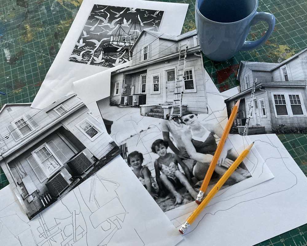
I am creating a work based on a family scrapbook memory. Memory is a good place to begin the artmaking process.
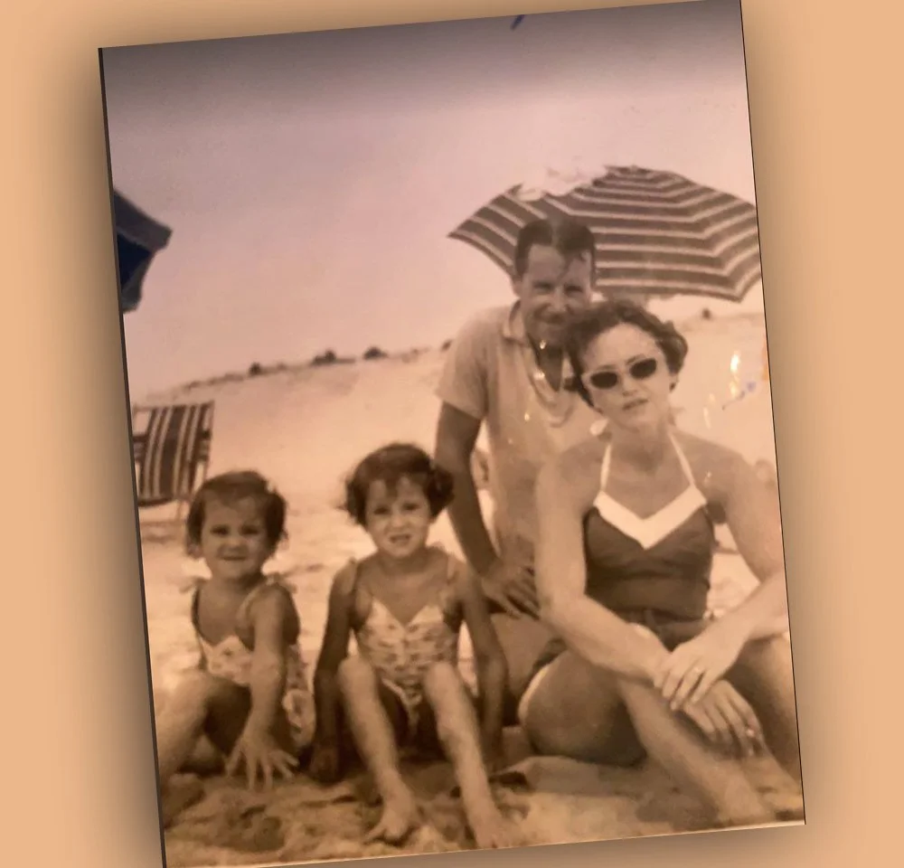
This is my family on a beach vacation when I was about four. The image speaks to me as a personal remembrance of me and the other three members of my family. But I see more here.
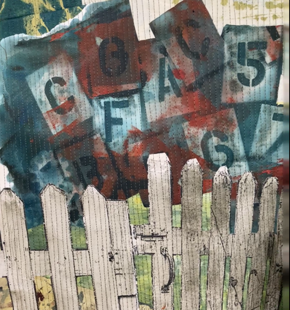
I have come to understand my family’s history in the context of our time. I’m a baby boomer, born into a young family after WWII who wanted to live the simple American dream. Two kids. A house. A picket fence. A nice American life. It was not a bad dream.
But it was rocky.
If I want to tell a story based on my family, I want to express that maybe the dream itself was rocky. There were a lot of forces at work both within my family and in the country and the economics of that post WWII American history. It was not as idyllic as it appeared.
When you have the idea for a story, how to express it might come to you all at once. Or it might take some time and some thinking through of options. The second method is how this one has come together for me.
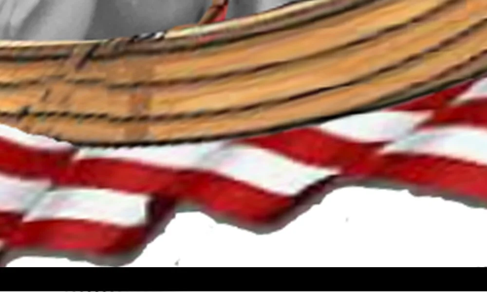
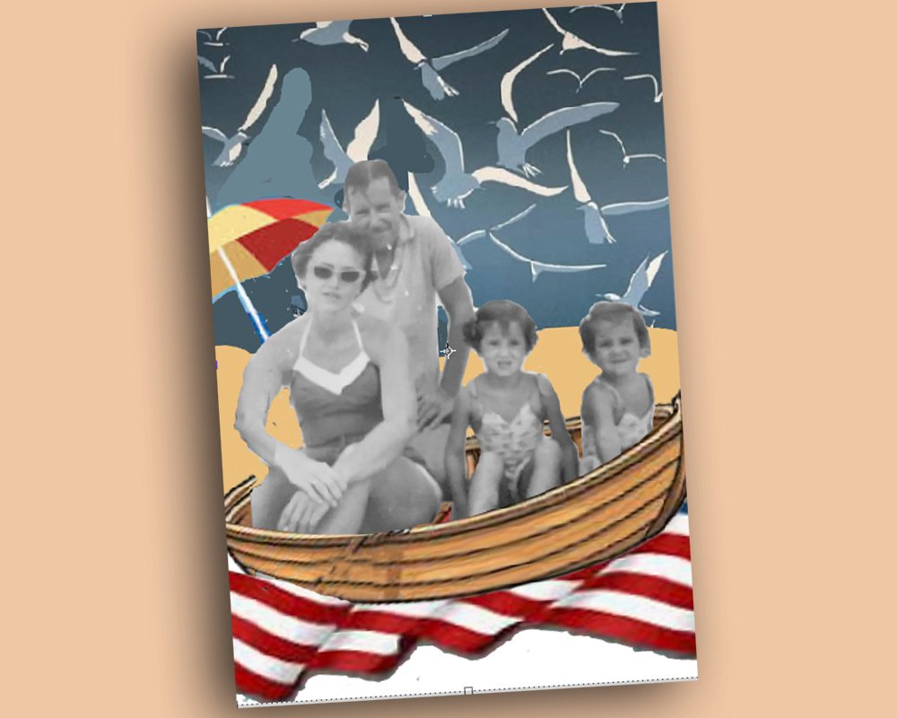
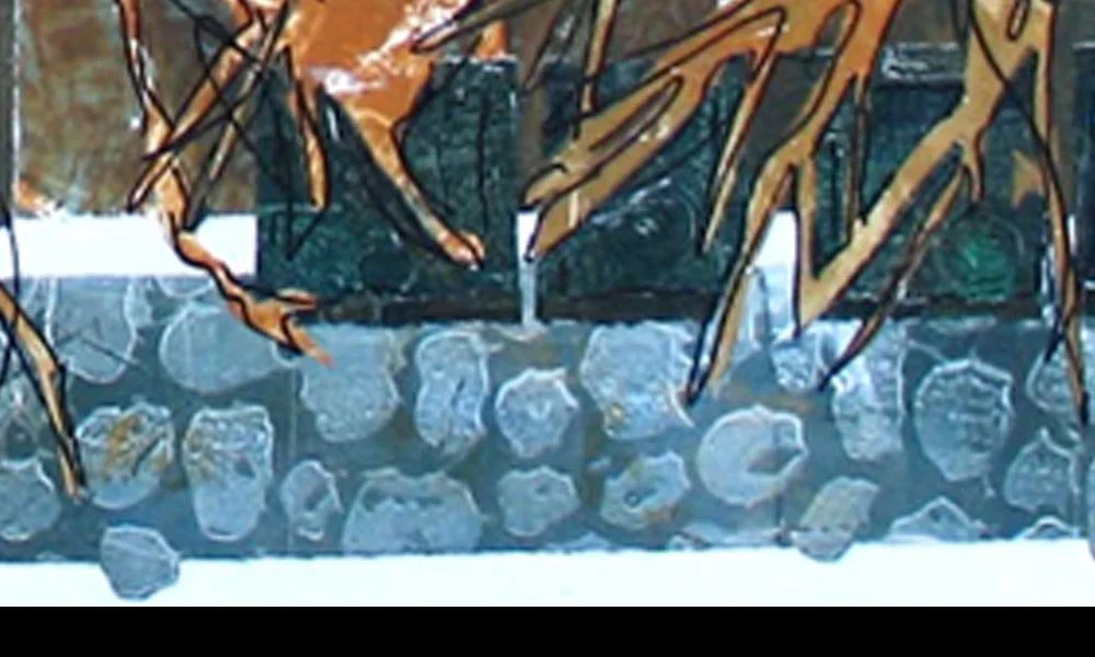
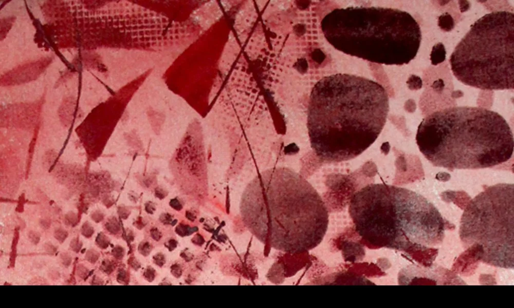
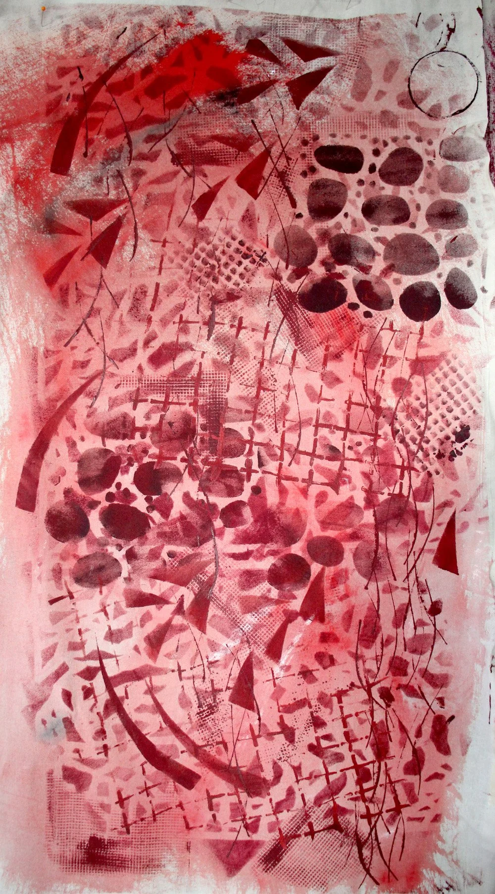
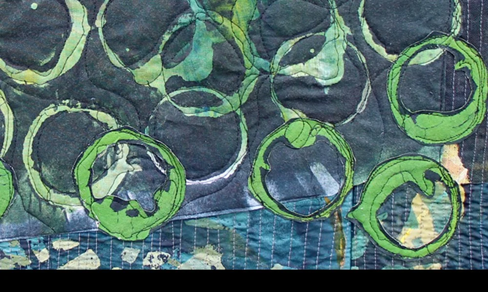
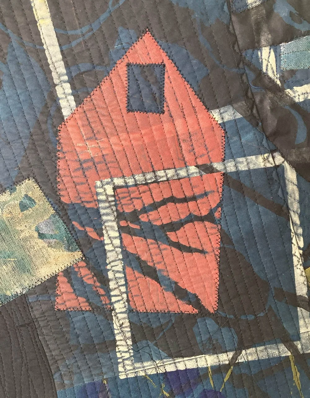
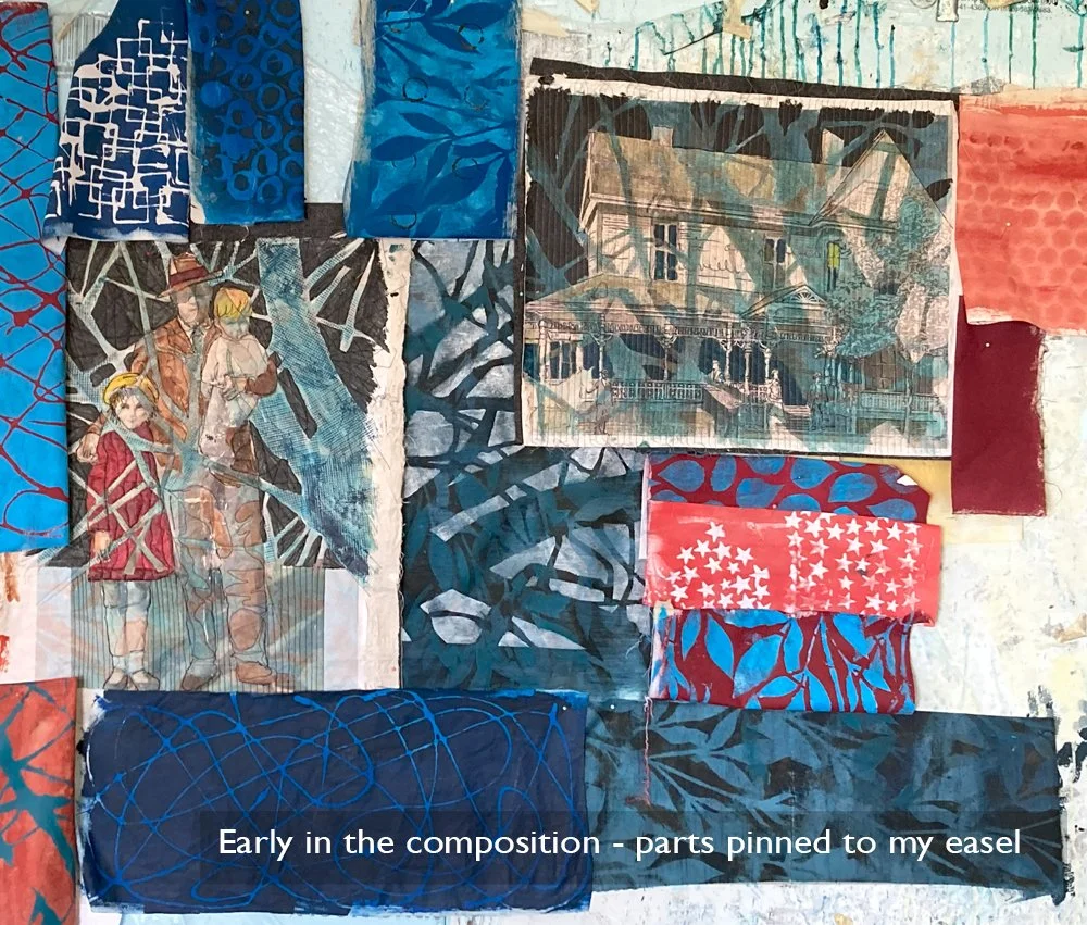
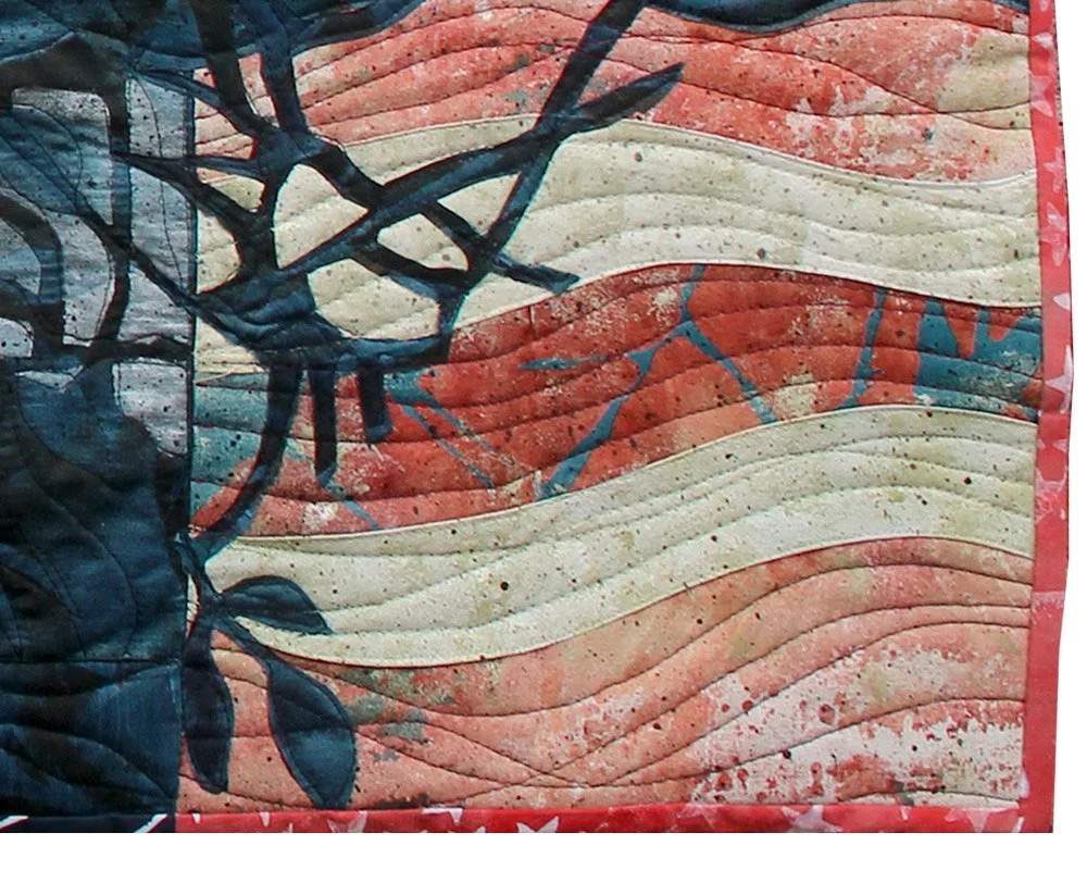
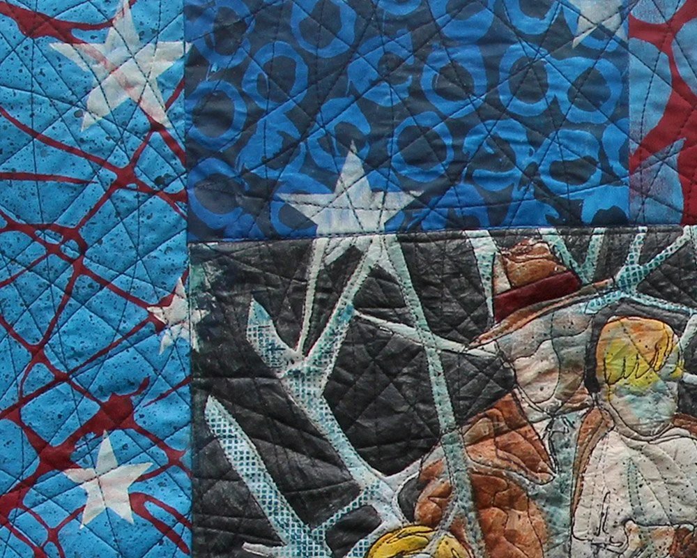
I want to show my family as a universal American family. So I put us in a rocky rowboat. The color and pattern I will put in the seagulls will suggest the stars of the American flag, and the waves of the boat will be red and white stripes, further communicating flag imagery. The rendering of the family will be less representational than in the PhotoShop mockup shown. My hope is that other people can see this group and possibly see their own family experience too. It’s not just about these four particular people.
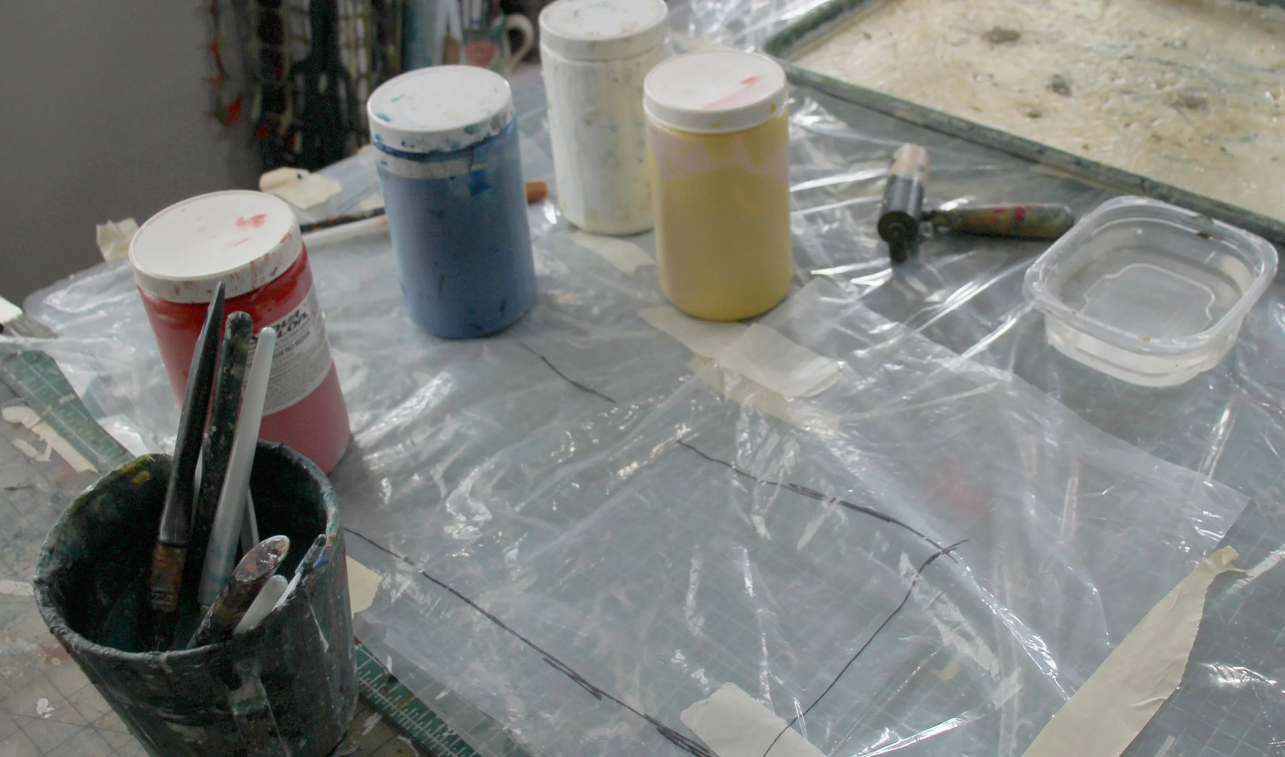
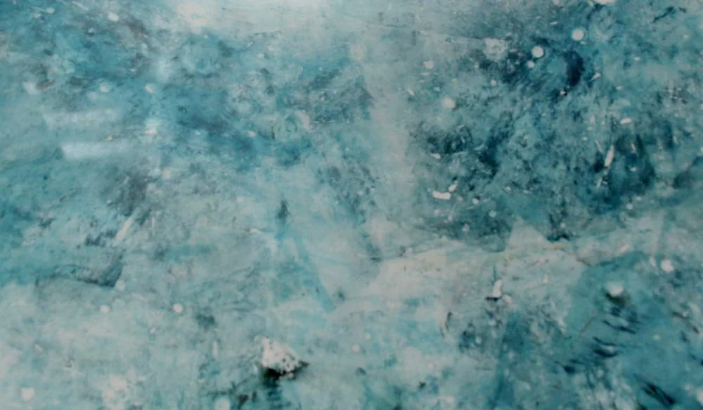
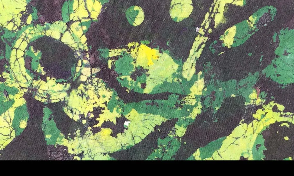
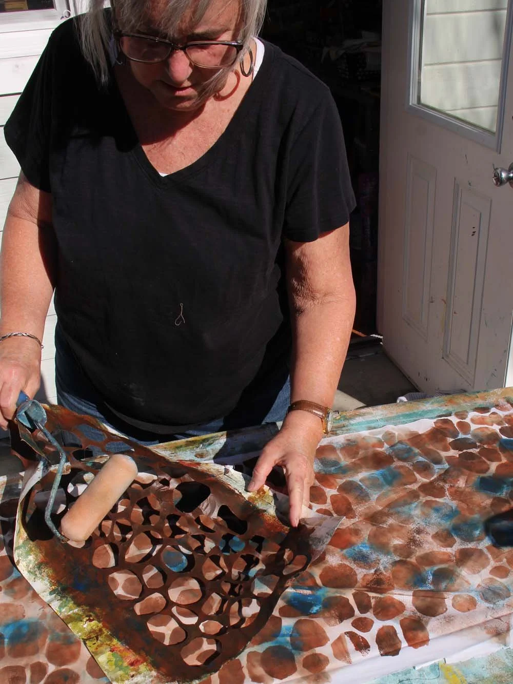
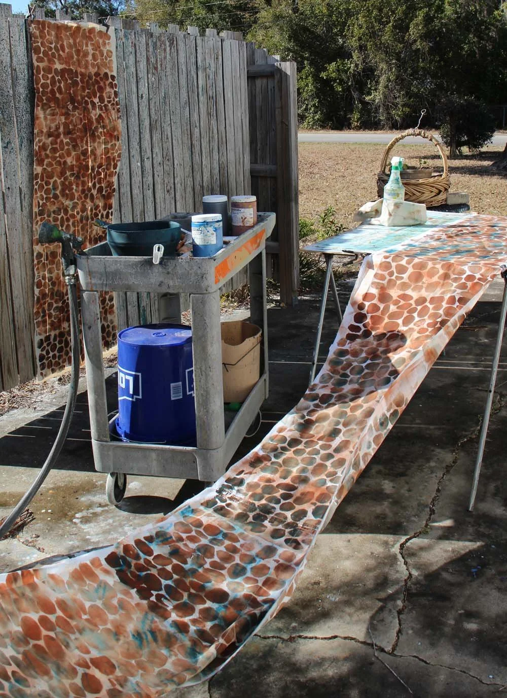
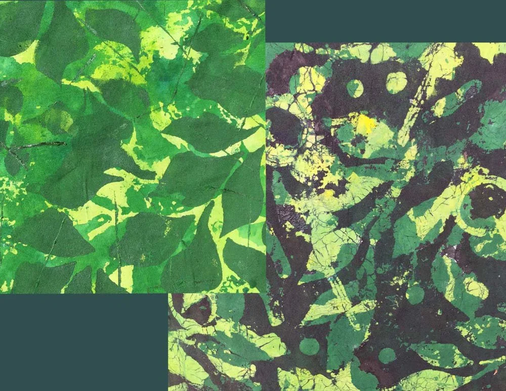
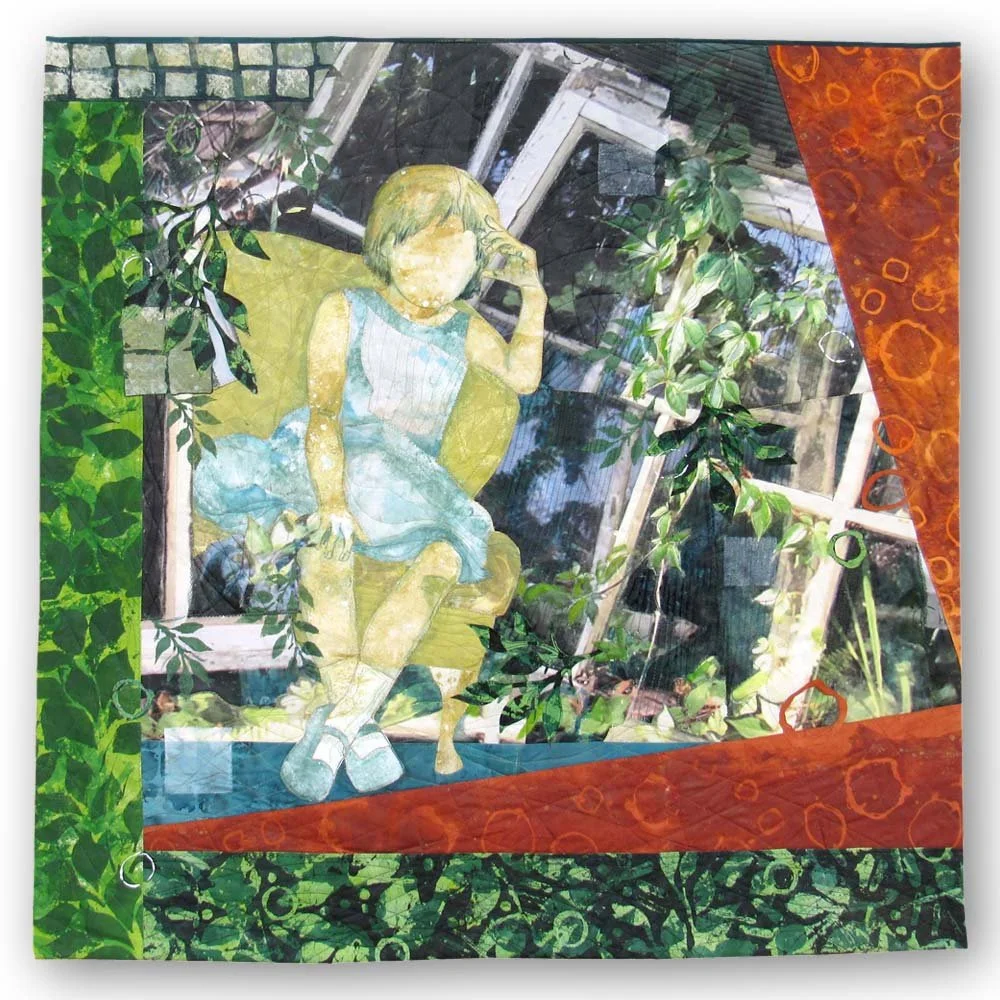
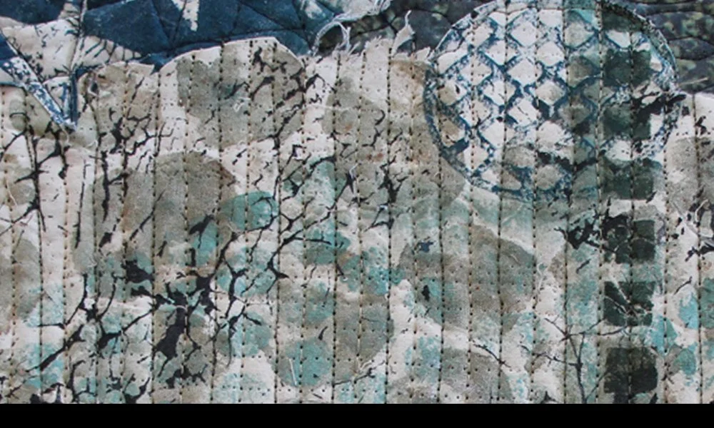
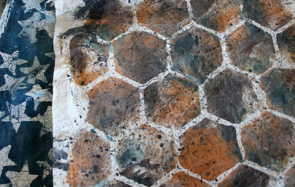
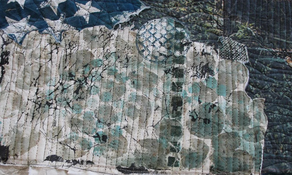
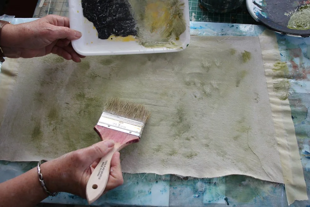
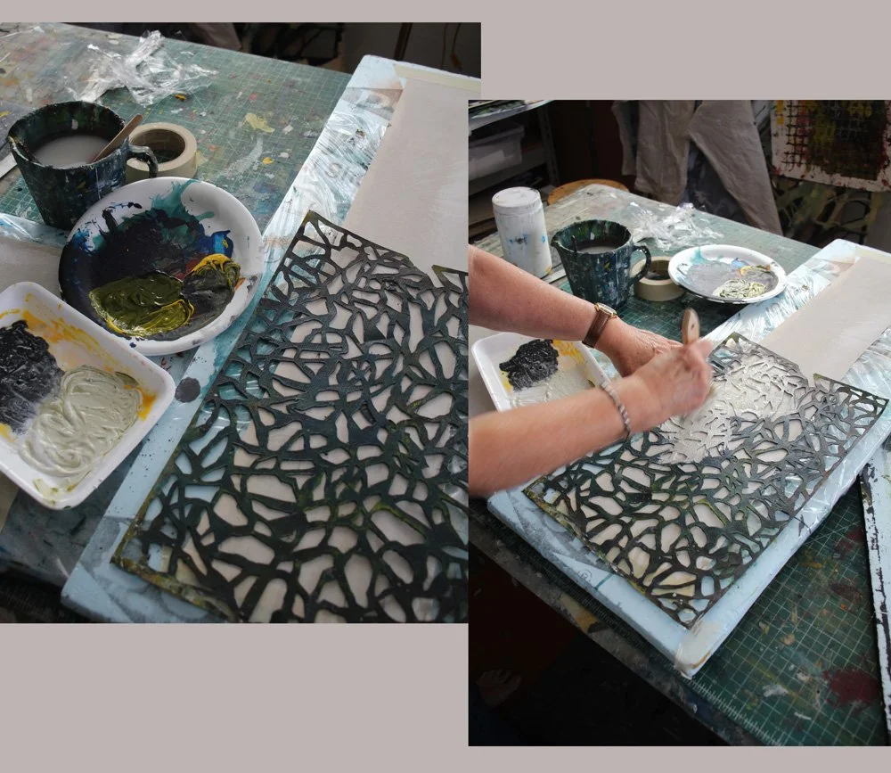
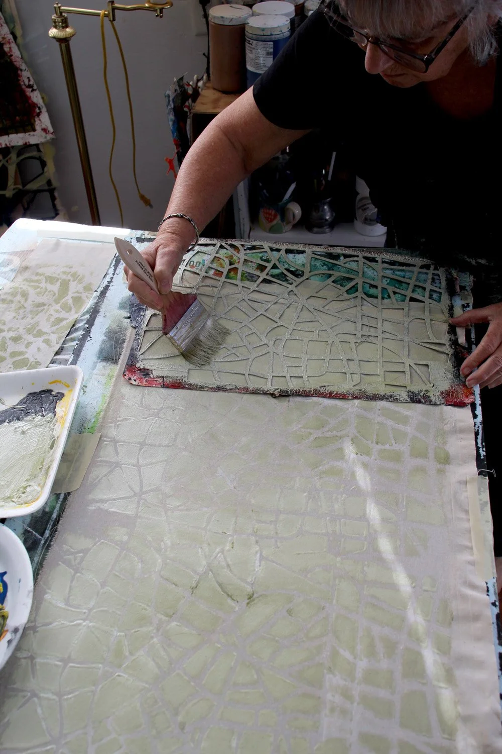
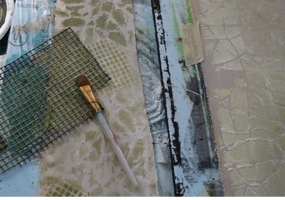
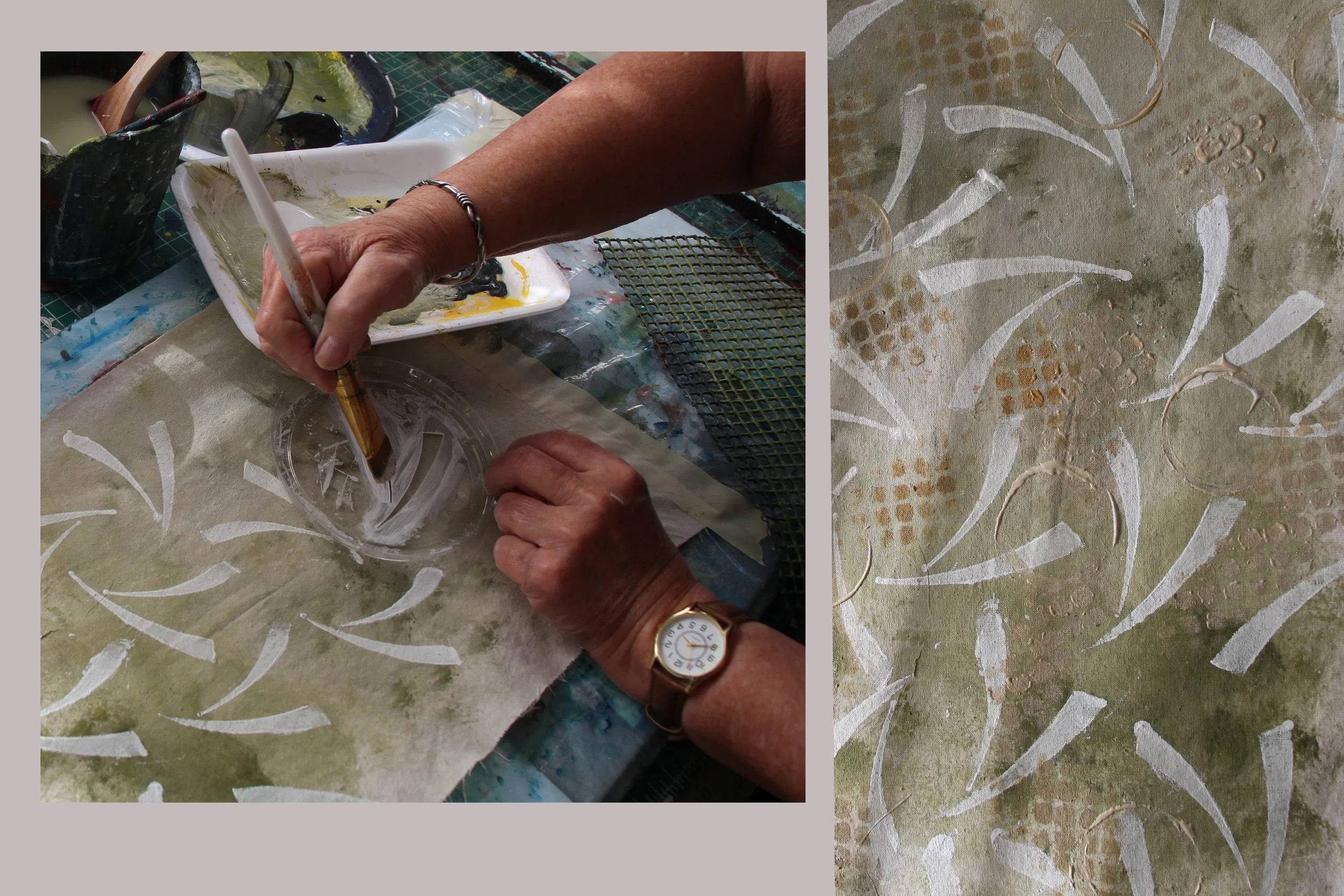
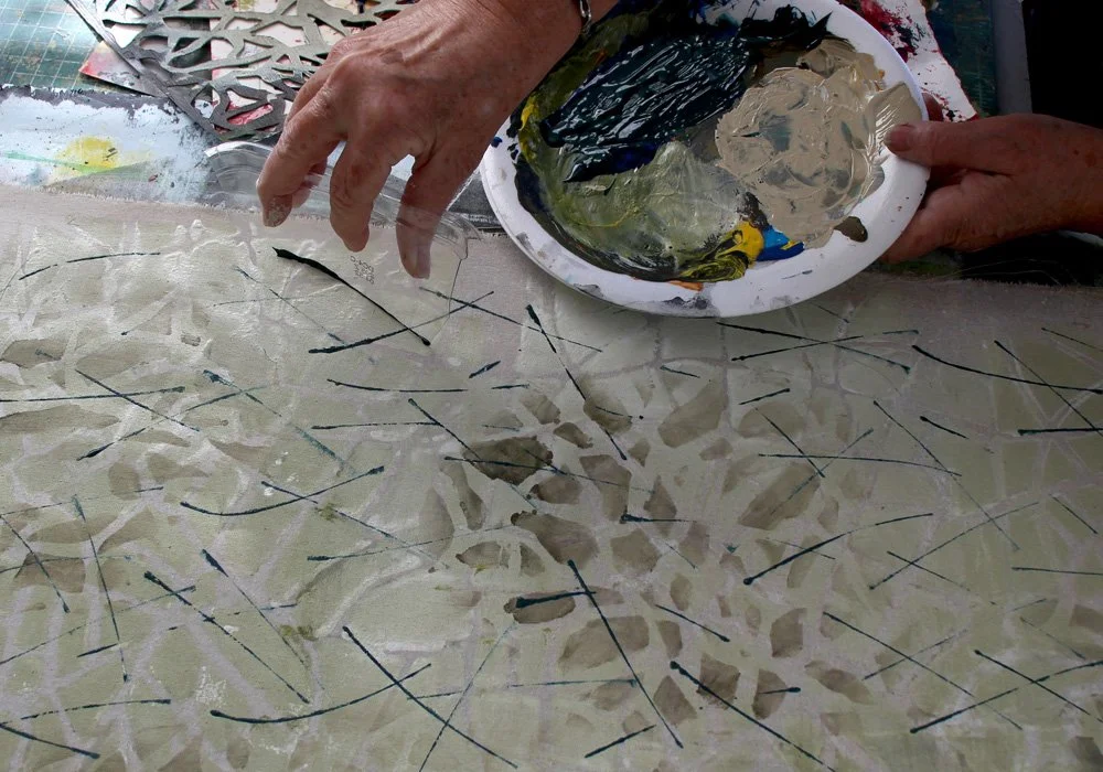
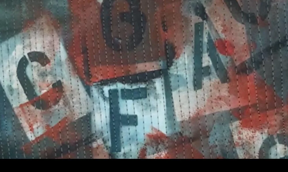
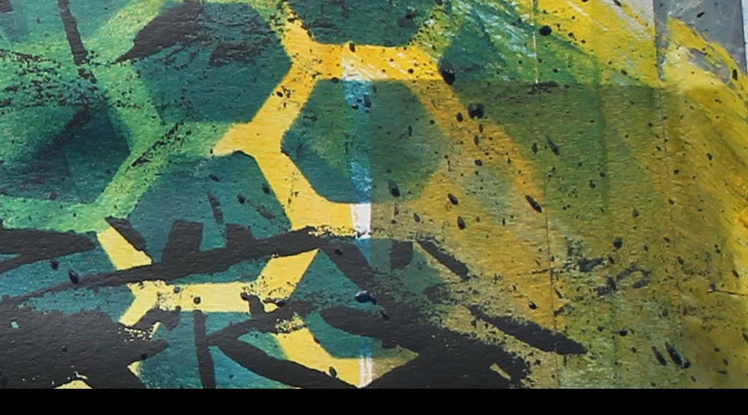
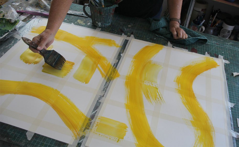
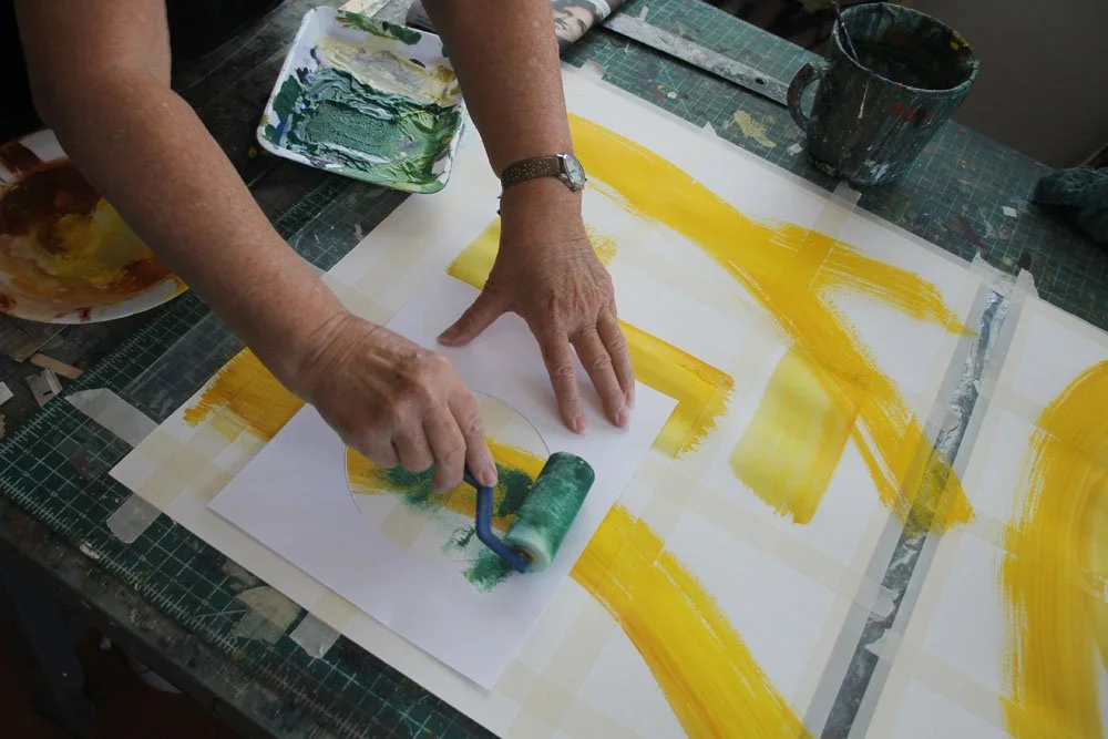
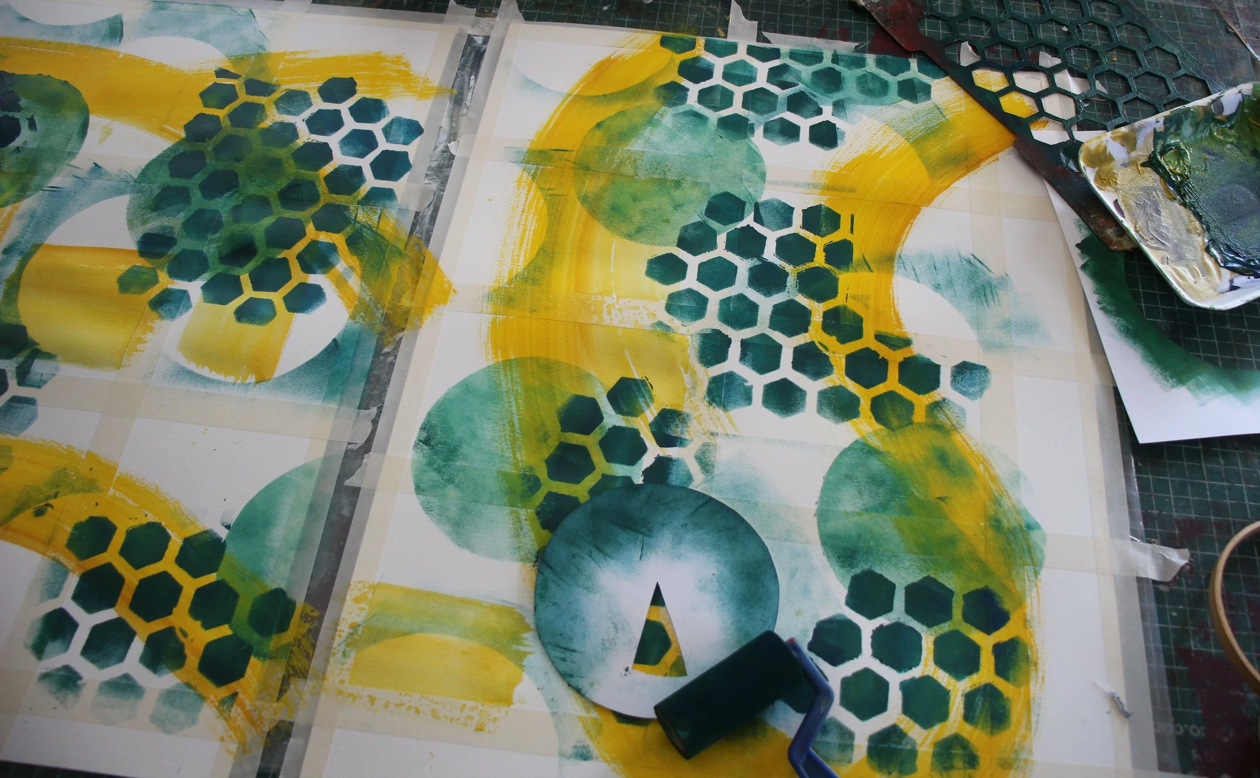
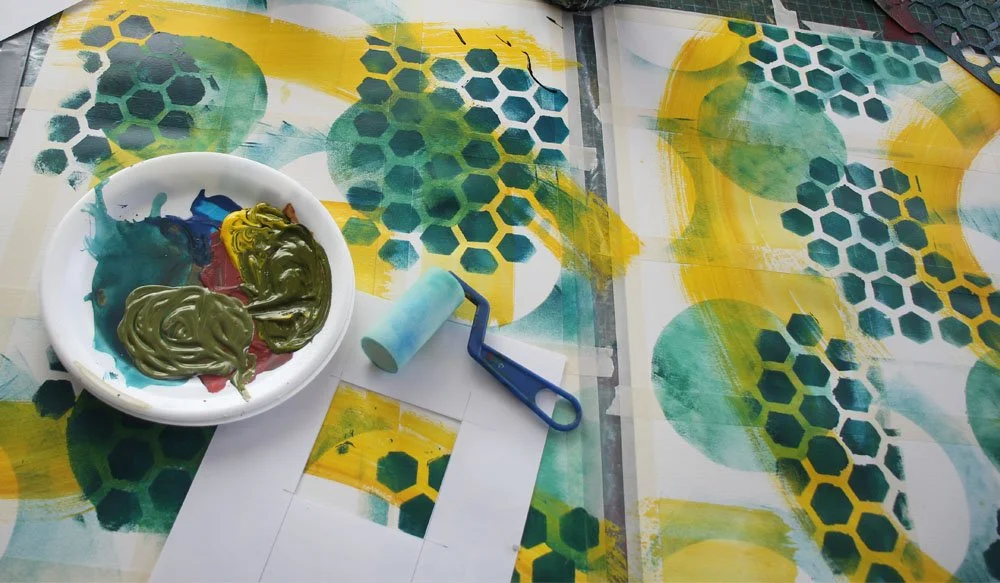
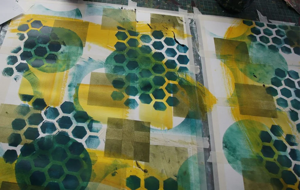
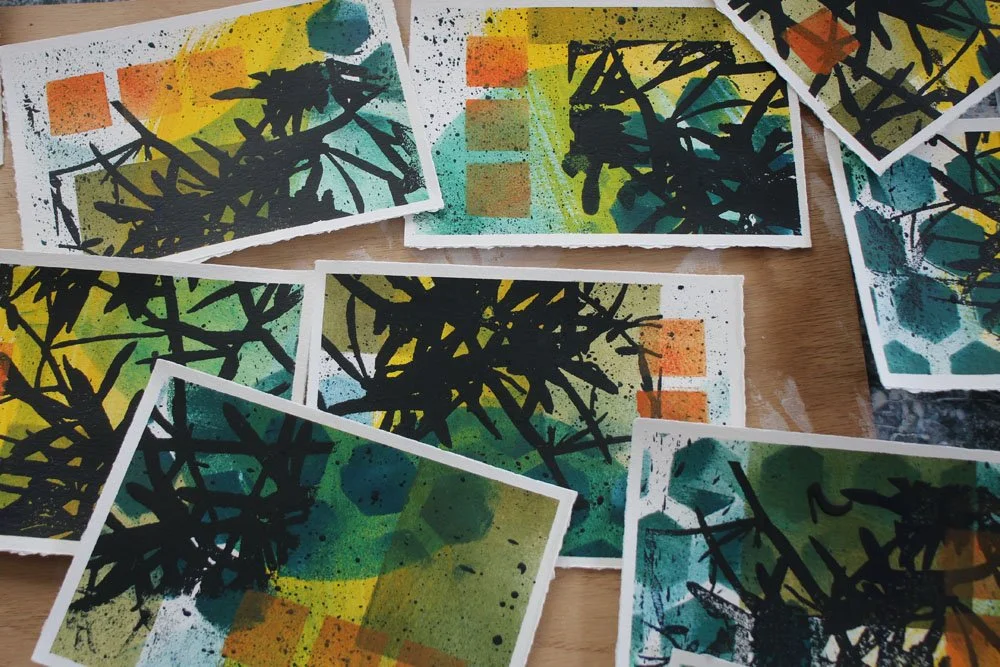
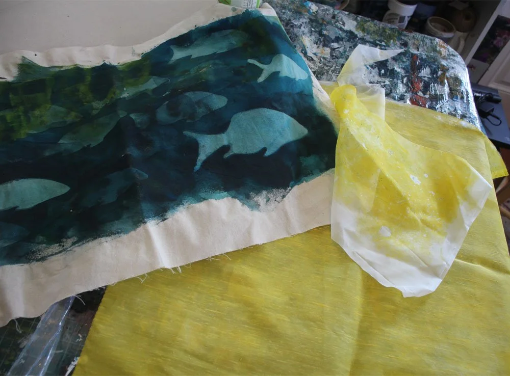
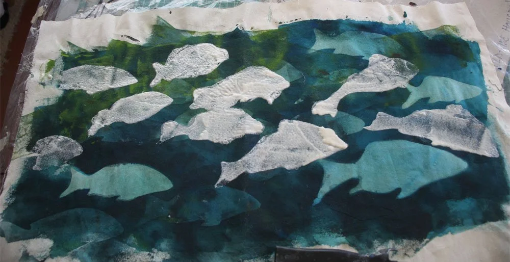
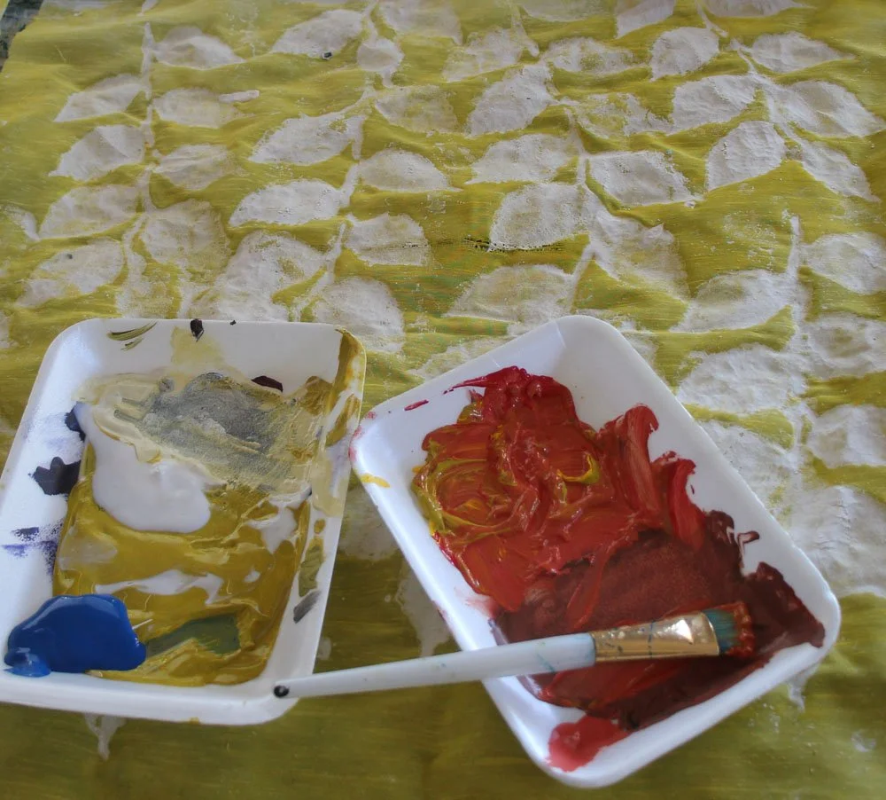
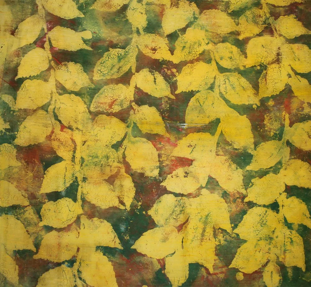
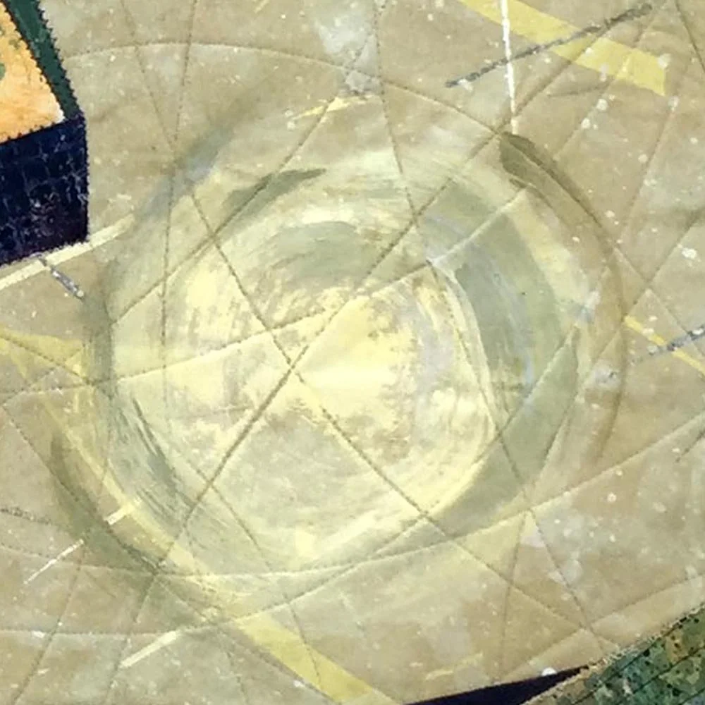
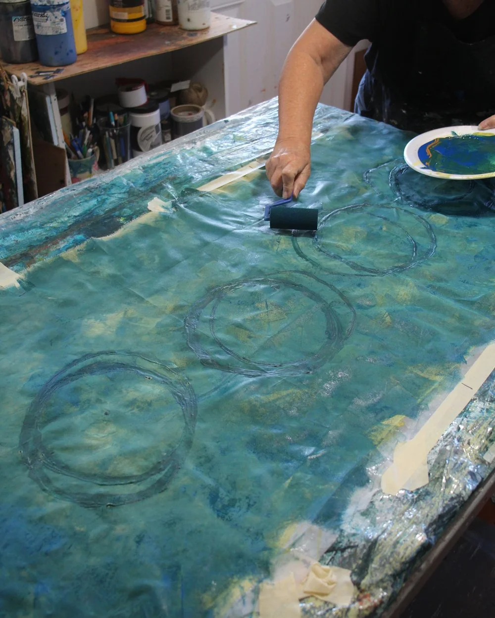
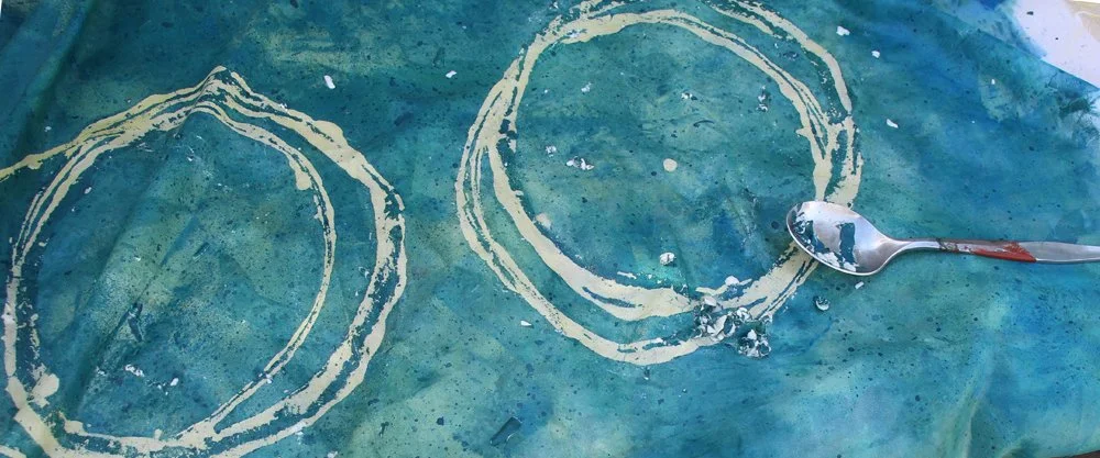
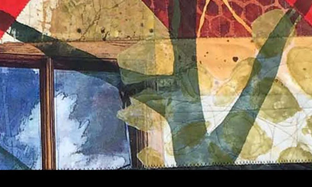
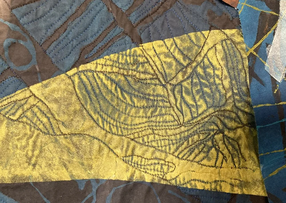
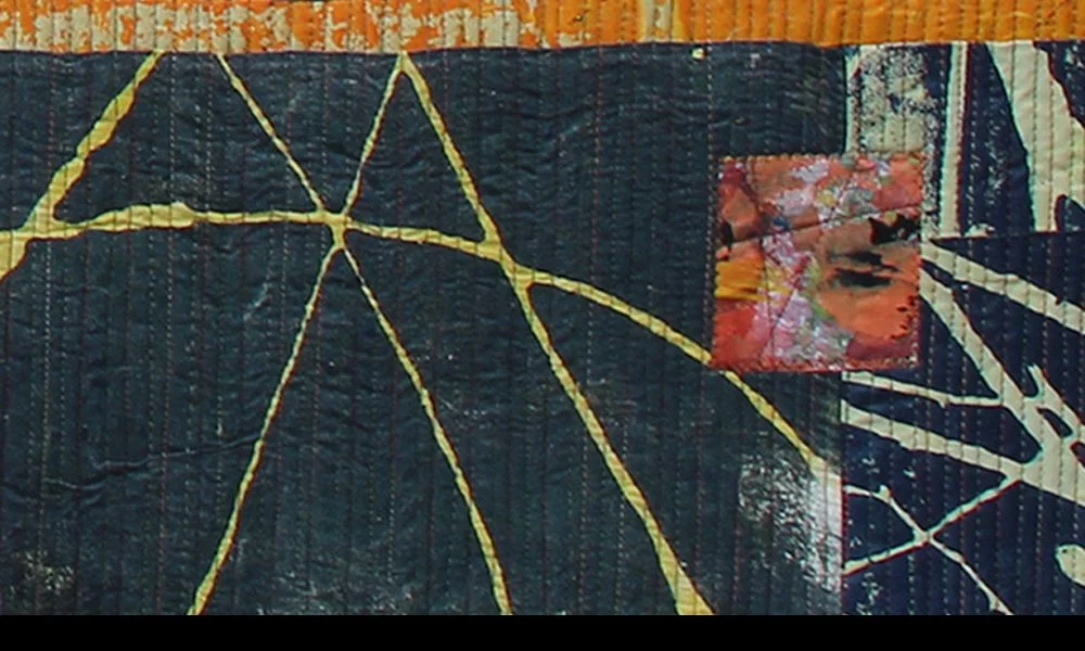
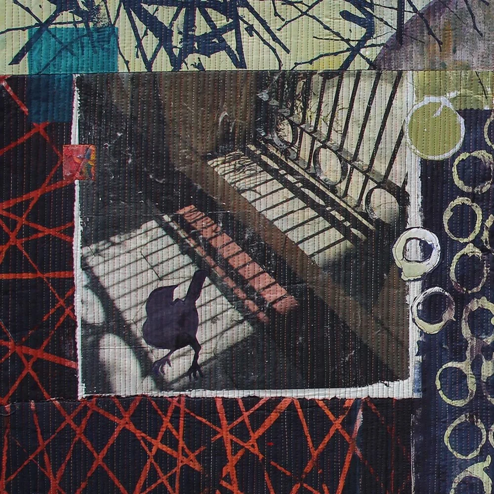
I already experienced time travel as I’ve worked on this piece. As I’ve had time, I’ve worked on the various pieces. (I have already written about creating the FLAG PARTS and THE WATERCOLOR SKY in recent blog posts, in case you’d like to re-read those.)
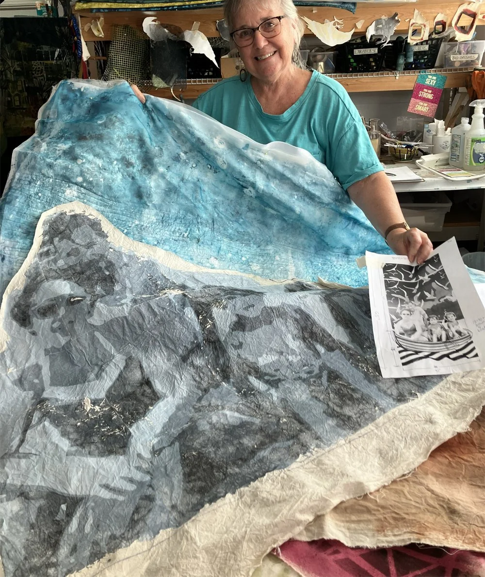
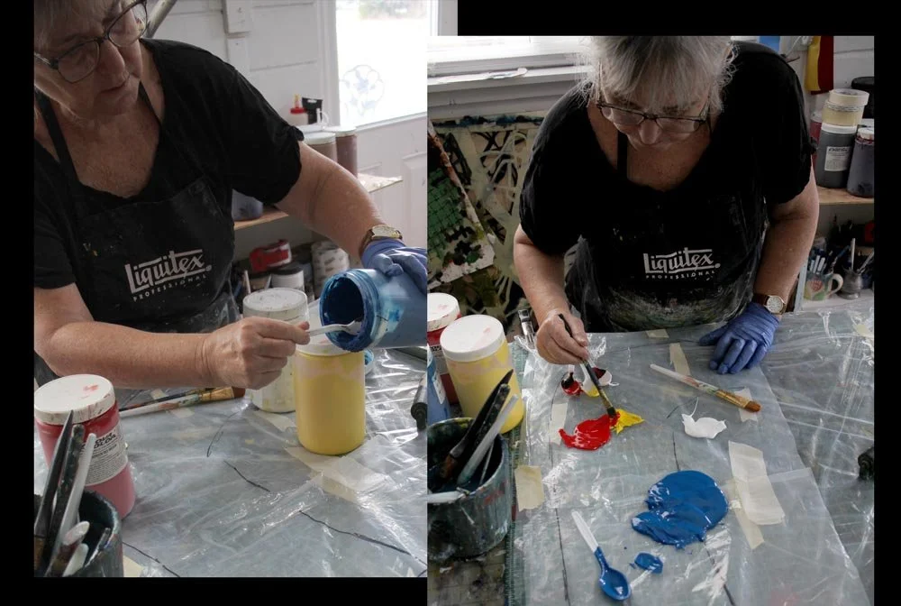
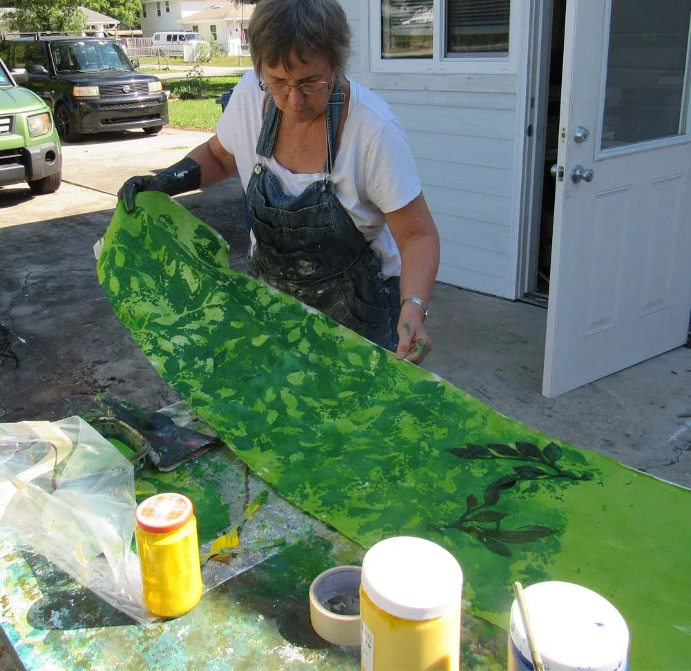
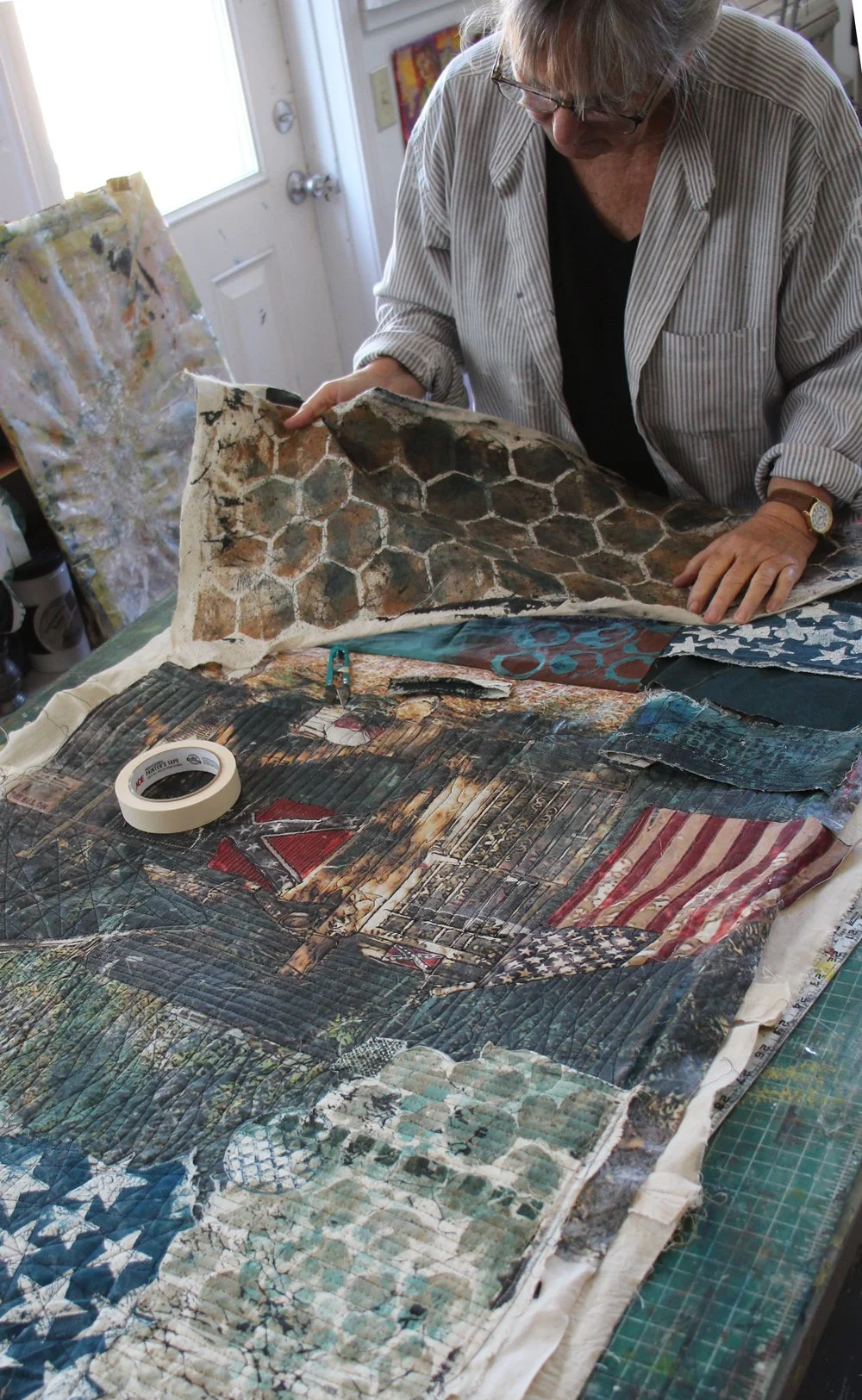
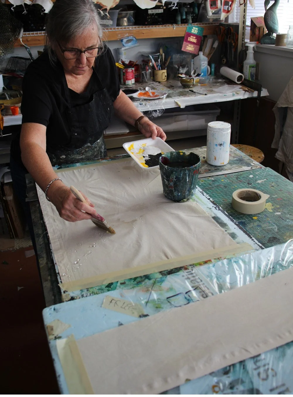
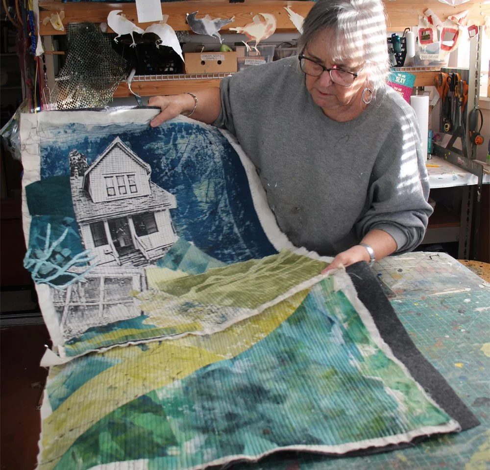
From here to the completion, I’ll be working in order: step-by step. Based on the memory, expanded to a story that interests me, using the parts I have created, I am now ready to start building this piece of artwork. (A nice visitor to my studio during the tour photographed me with the quilt parts, as I told them the story of the piece.)
I hope to write more about this work and how I experience putting it together in the weeks ahead ‑- as I shepherd that initial memory through the process of becoming art.
Thanks so much for following along.
. . . . .
For readers in the Central Florida area, I hope you’ll have a chance to visit Artists In The Garden this Saturday, March 21, 10am – 3pm at Select Growers on US11 in DeLeon Springs. About thirty artists (including me) will be exhibiting in beautiful outdoor pavilions. It’s a lovely event and benefits the educational programs of the Museum of Art DeLand. It’s free to attend. Food and mimosas available! See you there.
. . . . . .
A reminder for those who care about the direction of our country and who are deeply concerned about where it is going: The simple citizenship act of writing to your representative is still a powerful and important act. Compose a few words. Put them in a document you can cut and paste into the “contact form” on your representative’s site. Find your senators and representatives and copy their email addresses into your working document so it’s an easy task. Write. Repeat.
Find your US representatives’ contact HERE: https://www.house.gov/representatives.
Find your senators’ contact HERE; https://www.senate.gov/senators/senators-contact.htm
. . . . . .
For all of us: focus each day
on the good that needs to be done in the world.
Be part of doing it.
Thank you for reading. I always enjoy questions and comments.
--Bobbi
