• All Galleries
  • Events-Exhibits
  • BLOG
  • About
  • CONTACT
Menu

Bobbi Baugh Studio

  • All Galleries
  • Events-Exhibits
  • BLOG
  • About
  • CONTACT
bobbibaughstudio-blog-header-8-2-2020.jpg

WORDS -- ART -- WORDS

August 2, 2020

I’ve been working lately to exercise the other half of my brain.

Words. The beautiful sounds of words. The expressive quality of words. How words are like pictures. How they flow together in musical ways.

I’m not much of a scientist, but somewhere in my world understanding I came to grasp that energy forms are interchangeable: light, electricity, sound are all forms of energy and can be converted from one to another. I think words and images are like that. They form one another. Complete on another. Enrich one another.

I am so grateful that several friends and I have been gathering together since June in a weekly writing group. Already I can tell how much it means to each of us. As with visual artmaking groups, it’s great to have a group of art(writing) buddies for camaraderie and encouragement. And, by its nature, writing encourages deeper sharing and meaningful friendships.

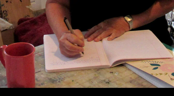
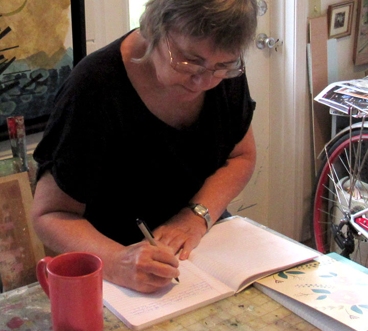
If you have thought you’d like to write – or write more, or dig deeper – but don’t know how to start, I recommend Natalie Goldberg’s book “Writing Down the Bones.” She’s a great motivator and teacher. (I enjoy her poetry very much too.) We use her method. In short, we draw a topic from a bowl and write flat-out for ten minutes. Ding! Time’s up. Read aloud and share. The idea is to let the writing spill, not to worry about punctuation and grammar or constructing a prose piece. Just fill up pages for ten minutes.

natalie-goldberg-book.jpg

This is still a pretty new experience for me. But, already, I am discovering how the journals filled with writing are like sketchbooks filled with idea drawings and compositions. I have relied on visual sketchbooks for years, and sometimes just set aside time to go back through them again. “Oh, I remember that idea.” The writing journals capture raw ideas. Refining into well-crafted prose or poetry can come later.

bobbibaughstudio-writing-journal-in-studio.jpg

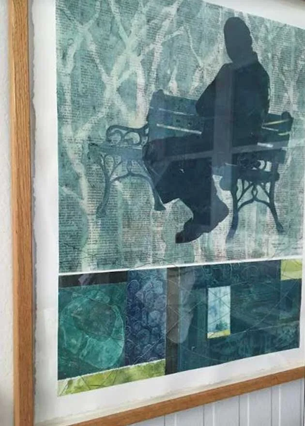
The artists that I find I admire most are artists who are thoughtful – in the sense of having thoughts. Their art is about something. The something may be social commentary or philosophy, or may be purely aesthetic considerations. But the thought adds to the depth of the visual artwork.

Words deepen thought. I have had the experience of not even knowing that I possessed a given idea or perspective till I wrote it down. The writing actually helps to give order to the thoughts and deepen them.

The Museum of Art DeLand sponsored a poetry project this summer. Writers were asked to respond to one of a number of works from the Museum’s permanent collection. There will be an exhibit later this month of the artworks with the selected poems next to them. I was pleased to have a poem selected. (After the public event has taken place, I’ll share my poem and the artwork here.)

JUST FOR FUN 1 - Another brain exercise… Lately I’ve become obsessed with completing the daily word jumble in the newspaper. I love rearranging letters in words to find new words, and these jumbles are a variation on that.

I wondered yesterday, “How hard is it to come up with those jumbles?” So, just for fun, I created one and put it together. Have fun playing!

BOBBIBAUGHSTUDIO-JUMBLE-GAME-FOR-BLOG.jpg

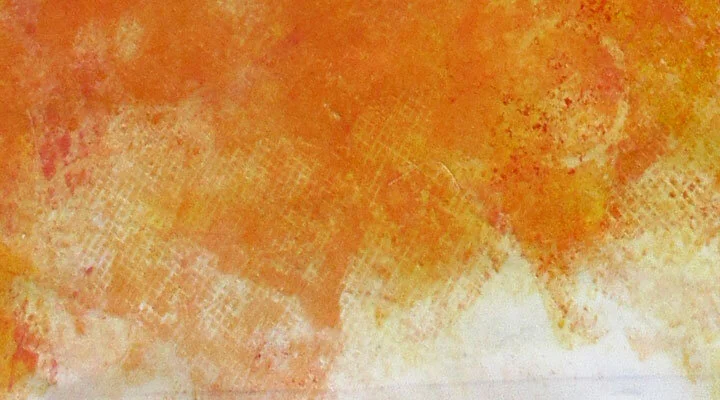
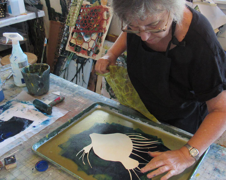
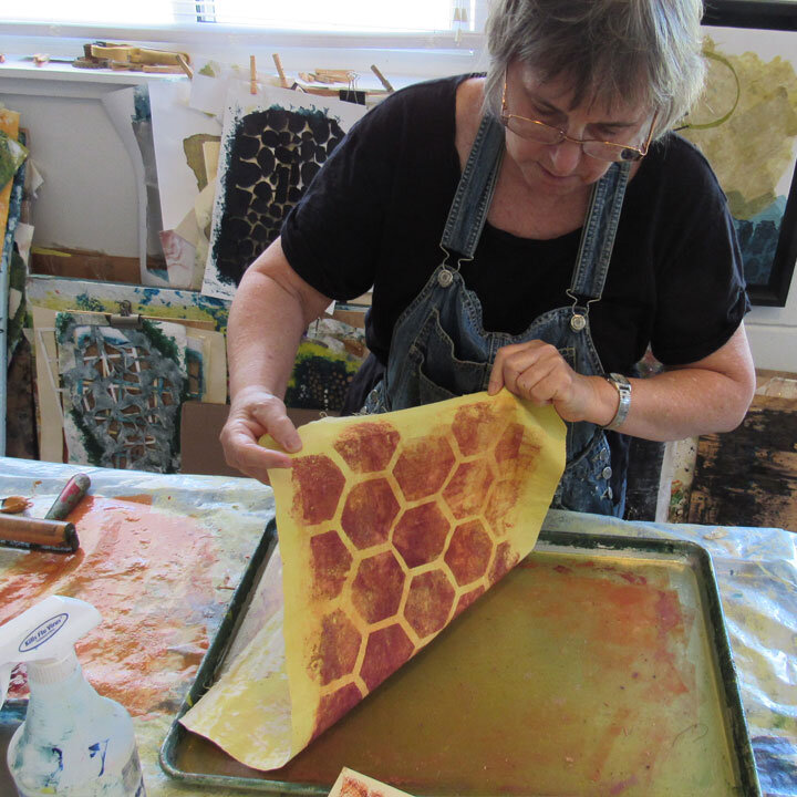
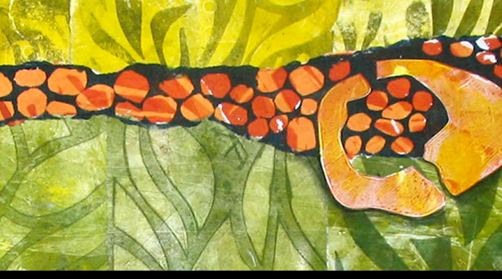
JUST FOR FUN 2 – I discovered some printed fabric and rice paper I created some time ago. Purple, mauve and pink. Not my usual palette. But I had created a stencil of a giant bee that I really like. I’ve put together two collages. If you’d like to see the finished works, they are on my website HERE.

These are the bee collages in progress n my worktable.

These are the bee collages in progress n my worktable.

Thank you for reading.
I always enjoy questions and comments.

--Bobbi
bobbi@bobbibaughstudio.com

BLOG POSTS: If you would enjoy receiving blog posts by e-mail,  please subscribe here:  I post blogs once a week. BLOGS-BY-EMAIL

NEWSLETTER: If you enjoy more detailed behind-the-scenes stories, as well as FIRST LOOKS at new works and members-only discounts, I hope you’ll become a Studio Insider.  You’ll hear from me about once a month.  NEWSLETTER


Comment
bobbibaughstudio-blog-header-the-blues-7-26-20.jpg

Thinking about the blues

July 26, 2020

Whenever I think about blue, I remember a long-running joke between myself and a customer when I was in the commercial printing business. We sold political campaign printing, mostly to local candidates. I worked closely with a very nice man who was running for City Commission as a first-time candidate. He wanted an attention-getting color for his signs. Red? Green? Yellow with black? What did I think?

And I told him, “Nobody doesn’t like blue.” He thought that was too funny. And he used blue for his campaign. And for years after, whenever we would see each other in town, he would repeat to me “nobody doesn’t like blue, you know.”

Except that, for some time as I began to work with paints on textiles, I thought that I didn’t like blue. I perceived myself as an orange-sepia-umber earthtone kinda gal. Then I stepped back and looked at my body of work. Apparently, I’m quite at home with blue.

On my worktable… a recent batch of fabrics with mixed blues

On my worktable… a recent batch of fabrics with mixed blues

I just ran out of Cerulean Blue and have placed an order for more. (People frequently ask about what brand paints I like. I use Nova Color Paint – Artex Mfg. – in California. They do not know I am writing this and they don’t pay me. They just have good paint, reasonably priced, in-wide-mouth jars that I really like. They are actually the manufacturer and I like that. The only disadvantage is paying shipping from California to Florida. But, I group my orders so it’s not so bad.)

I only order a limited palette of colors – basically the primaries plus two browns (burnt sienna and burnt umber) plus black and white. I mix all my colors from these.

Cerulean blue had to grow on me. Used out-of the jar straight it’s really a pretty uninteresting blue.  (Actually, most colors used straight-out-of-the-jar are uninteresting, or at least less interesting than when mixed with something else.) But what a great mixing blue! I use a lot of teal colors, and I create these mostly with Cerulean plus one of the browns. I also mix my greys, and Cerulean + orange + white makes a wonderful grey.

bobbibaughstudio-blue-paints-used-in-studio.jpg

The other blue I keep on hand is phthalo blue. It’s deep and intense and wonderful. But, a little goes a really long way. It’s dangerous to mix with because it comes on so strong.

This week I had a visitor in my studio picking up some collages she’d purchased. The large quilt-in-progress is on my easel. It’s always helpful to hear feedback on unfinished works. I was grateful to hear her say, “Oh. I just love those windows and all that blue. I could get lost in this work.”

See. Nobody doesn’t like blue.

My current art quilt-in-progress at the composition stage

My current art quilt-in-progress at the composition stage

Detail of the same quilt-in-progress on my easel

Detail of the same quilt-in-progress on my easel

If you’d like to see another quilt that  features windows along with hand-printed fabrics,, take a look on my website at Connecting to the Invisible HERE

If you’d like to see another quilt that  features a deep blue palette, take a look on my website at Tide Pools – Tide Pulls HERE

Thank you for reading.
I always enjoy questions and comments.
--Bobbi
bobbi@bobbibaughstudio.com

BLOG POSTS: If you would enjoy receiving blog posts by e-mail,  please subscribe here:  I post blogs once a week. BLOGS-BY-EMAIL

NEWSLETTER: If you enjoy more detailed behind-the-scenes stories, as well as FIRST LOOKS at new works and members-only discounts, I hope you’ll become a Studio Insider.  You’ll hear from me about once a month.  NEWSLETTER


Comment
bobbibaughstudio-blog-header-7-19-20.jpg

From Inspiration to out-the-door…

July 19, 2020

I’m thinking this evening about the whole process of artmaking. Inspiration to out-the-door. Because, well I am in a studio filled with packing boxes and things to ship.

bobbibaughstudio-making-shipping-boxes.jpg

For readers who are artmakers, you may participate in this whole process, or only part of it. For readers who are patrons (THANK YOU!!) it may not always be easy to see the artist’s job beyond the creative in-the-studio part.

A friend in the DeLand art community once described what it means to be a working artist. Step 1 – all alone in the studio, the artist says, ”Wow. I made something. This feels good.” Step 2, the artist, often with great trepidation, shows the work to somebody else. “Look. I made this. What do you think?” (That’s how all those drawings of dinosaurs get on Grandma’s refrigerator.) Then, step three, “I made this and would you like to purchase it from me?”

It is certainly A-OK to have artmaking be intensely meaningful and personal and never attempt to show it to anybody or sell. It’s not a bad thing.

But I know many artists who dream of step three but for one reason or another just don’t get there. My advice is: do it. Go for it.

From my experience as an artmaker, I can say that the completion of the whole art process — getting a finished work in the hands of someone who values it enough to pay for it, is just about the most pleasing and rewarding thing there is. I am honored and grateful every time I sell a piece of artwork.

bobbibaughstudio-placing-collage-in-mat.jpg

There is definitely math involved in the process. How much does it cost me to produce a piece of art? How much could I reasonably sell it for? What kind of investment in materials and supplies do I need to get going?  Can I launch this effort with the expectation of just coming our a little ahead, or do I need to actually make a living?

And there are personal decisions. Some people find the process of selling terrifying. I understand that to the core. It’s hard. It takes practice. And there are choices. Face to face contact with patrons – as at street festivals? Pursuing sales through a gallery? Creating a website and finding customers online? All can work, all can fail, and not every method suits every artist.

For me, my driving motivation is that I love to create artwork. I waited a long time to reach the point in life where I can do this. And I am diligent in my studio practice and I fairly prolific. The creating is what I like most.

So… now that I have (I say this very gratefully) had a nice surge of recent sales — I get to create more!

An art quilt-in-progress in my studio

An art quilt-in-progress in my studio

Thank you for reading.

I always enjoy questions and comments.
--Bobbi
bobbi@bobbibaughstudio.com

BLOG POSTS: If you would enjoy receiving blog posts by e-mail,  please subscribe here:  I post blogs once a week. BLOGS-BY-EMAIL

NEWSLETTER: If you enjoy more detailed behind-the-scenes stories, as well as FIRST LOOKS at new works and members-only discounts, I hope you’ll become a Studio Insider.  You’ll hear from me about once a month.  NEWSLETTER


Comment
bobbibaughstudio-blog-header-7-12-20.jpg

Wading into the River's Edge... Printmaking Pleasure

July 12, 2020

Yesterday morning… I just got lost in some monotype printing. Not much to say. I had gathered my materials the night before: some blank rice paper to print, some blank fabric to print, and some previously printed fabric to print over. I knew I wanted some grass-like images for a few new wetlands collages. And I let it roll…

Ink the plate. Press. Pull. Maybe press again. Re-Ink.

The original image. The ghost image. Press. Pull. Repeat.

Allow the images to appear.

bobbibaughstudio-1blue-monotype-patterns.jpg
bobbibaughstudio-2green-onotypes-w-red-yellow.jpg
bobbibaughstudio-3green-mnotype-on-rice-paper.jpg
bobbibaughstudio-4mixed-pieces-monotype-printed.jpg
bobbibaughstudio-5layered-grass-mnotype.jpg
bobbibaughstudio-6monotype-on-brown-rice-paper.jpg
bobbibaughstudio-7two-pieces-monotype-grass-shapes.jpg
bobbibaughstudio-8monotype-blend-blue-green.jpg

This morning… Beginning the collages.

Yup. This is just how I hoped it would turn out.

bobbibaughstudio-brayer-and-collage-in-the-studio.jpg

I create new collaged works regularly. and post them to the Wednesday Collage Gallery on my website. This batch will be on m website later this week. You can see more HERE.


Thank you for reading. I always enjoy questions and comments.
--Bobbi

bobbi@bobbibaughstudio.com

BLOG POSTS: If you would enjoy receiving blog posts by e-mail, please subscribe here:  I post blogs once a week. BLOGS-BY-EMAIL

NEWSLETTER: If you enjoy more detailed behind-the-scenes stories, as well as FIRST LOOKS at new works and members-only discounts, I hope you’ll become a Studio Insider.  You’ll hear from me about once a month.  NEWSLETTER


Tags printmaking, collage, monotype, ricepaper, florida wetlands, river, grass
2 Comments
bobbibaughstudio-7-5-2020-blog-post.jpg

I wonder what that cow is looking at?

July 5, 2020

An outing!
(An unusual life event in this era of mostly staying at home.)

This week we left home for a few hours to venture out into the world for a visit downtown to the Museum of Art-DeLand. Their current exhibit features printmaking in a number of techniques by a wide variety of artists.  (On exhibit through Sept 13. Well worth the trip.) I looked closely at great artwork and just gobbled it up!

Artists are drawn to printmaking. As the Museum signage pointed out, most of the artists shown are better known for other mediums, including painting and sculpture. But the unique experiences of printmaking draw artists to a print studio for at least some part of their career.

I love printmaking. I am always intrigued by the technical aspects. How did the artist get that image on the plate? In what order did the colors go down onto the paper? I stood up close and analyzed the marks on serigraphs, etchings and lithography.

I want to share two small etchings by Edward Hopper that caught my eye. (Hopper is one of my favorite painters. I always learn when I study his work.) These two little works are not so much about technique; the images were manually scribed in the etching plate, the artist’s hand working much like pen and ink drawing.  What I love is Hopper’s elegant composition.

I shot two photos with my phone, and now I have them up on my desktop to see what I can learn.

An etching by Edward Hopper  A Woman at a Railing

An etching by Edward Hopper A Woman at a Railing

An etching by Edward Hopper  “A Cow in a Pasture”

An etching by Edward Hopper “A Cow in a Pasture”

MY FIRST LESSON – Foreground drawing you into the scene
Hopper’s paintings often use interior framing devices – looking through a doorway or window, for example. In these two works it’s much simpler.  A character close to the foreground is looking off to the distance. We are invited to follow their gaze and see what they are seeing.

edward-hopper-etching-detail.jpg

This woman is leaning on the railing and looking off toward the sky. What drew her to this scene? If we look with her, what will we see?

edwatd-hopper-etching-detail.jpg

I wonder what the cow is looking at?

MY SECOND LESSON – Intentional detail choices
In both works, the artist’s drawing hand is visible with a beautiful light touch. But every part of the work is not drawn with the same amount of detail. . It keeps things lively. The large architectural form behind the girl at the railing could have been rendered in a lot more detail. But the artist chose to be selective.

MY THIRD LESSON – Look at that beautiful empty space!
In the etching of the woman, nearly half of the composition is empty sky. In the etching of the cow it’s about a third of the space.  Because it’s an etching, even those “empty”spaces have the very slight tone of the ink on the plate.  I find this emptiness beautiful.

In my own textile work, printing pattern on fabric is part of the process. I need to regularly remind myself that “empty” areas are important in a good composition. Here’s one where I thought I got it right. The big, empty yellow sky is an important part of the storytelling.

“ADRIFT” Art Quilt  42” X 42”  2019            More information on this quilt HERE

“ADRIFT” Art Quilt 42” X 42” 2019 More information on this quilt HERE

My wish for anyone reading is that you are able to find things around you to appreciate and to inspire you. My little Museum outing will be staying with me for weeks ahead.

An opportunity and a request…
Do you write? Do you know writers?  I am a volunteer in a project by Studio Art Quit Associates – Florida Region, to create a book in the spring that combines visual art (textiles works created by SAQA members) with POETRY. All poets are welcomed to submit. The project is titled “Fresh Fish” and features works about Florida underwater life: fish, shrimp, seaweed, mermaids, coral, lobsters and more. If you enjoy writing poetry, I invite you to create a poem and send it in. Or help spread the word to poets you know. We are reviewing works now and through October 30. You can request a prospectus with all details and timeline here:

SaqaFlaPoetryProject@gmail.com

Thanks for your help. Have fun creating!
(I am enjoying creating a few fish for the project. I’ll be submitting poetry too.)

Thank you for reading. I always enjoy questions and comments.
--Bobbi
bobbi@bobbibaughstudio.com

BLOG POSTS: If you would enjoy receiving blog posts by e-mail,  please subscribe here:  I post blogs once a week. BLOGS-BY-EMAIL

NEWSLETTER: If you enjoy more detailed behind-the-scenes stories, as well as FIRST LOOKS at new works and members-only discounts, I hope you’ll become a Studio Insider.  You’ll hear from me about once a month.  NEWSLETTER


Comment
bobbibaughstudio-blog-header-monotype-6-29-20.jpg

One Thing Leads to Another

June 28, 2020

In the studio this morning… enjoying a printmaking session with acrylics and rice paper – I discovered one thing leading to another.

What led to the printmaking was a household project, some new planters for the garden. We cut a rain barrel in half, (to be used as a planter) then spray painted it so it would blend into the foliage and be more interesting. I created the stencils I used for printmaking for spraying the barrels. (If you look closely you can also see some interesting two-tone green patterns behind the white palms. I placed leaves and branches on the barrel and sprayed around them. The effect looks great close-up, but just didn’t have enough “pop” from a distance.)

bobbibaughstudio-the-inspiration-stencil-on-planter.jpg

So… now I had a nice new stencil pattern tempting me to do some printing.

bobbibaughstudio-mixing-color-using-brayer.jpg

1 I mixed up some green with my brayer, using phthalo blue and cadmium yellow. Nice bright green resulted, and using the brayer to blend kept the blending loose.  2. Then I brayered the color on the plate.

bobbibaughstudio-printing-background-brite-grn.jpg

3. The first pulls I made off the plate were just for background color. No stencil yet. I made several sheets like this, each with a little different appearance of the green.

Stencil time.

bobbibaughstudio-blog-monotype-pics-4-5-6.jpg

4. I had cut this stencil out of a manila file folder. That’s thick enough to hold up for multiple uses and thin enough to lay down flat. With some darker green already on the plate, I pressed down the stencil.  5. One of  the sheets I had already printed with some background light-bright green is ready to press into the stencil. 6 Here I’ve printed from the stencil . I have a green palm on a lighter green background.

Look at the wonderful image that remained on the plate. That’s the ghost. In any kind of printmaking that uses a plate – either manual hand-printed as I’m doing, or when working with a press – after the image is printed, a ghost image remains on the plate. This is where one thing leads to another. The prints from these ghosts create some of the most interesting layers.

bobbibaughstudio-monotype-blog-pic-7.jpg

7 This is one of the sheets that already had two plate passes: one for the background, and another for the palm pattern. Now I’m going to print the ghost that was left on the plate onto this sheet.

bobbibaughstudio-monotype-prints-palm-stencil.jpg

Working with multiple plate passes for most of the sheets, I created a stack of paper that I think will create some interesting collage elements. (See how the theme keeps going. The printing isn’t the end. Collage next. One thing leads to another.)

This is a close-up of one of the sheets that I thought resulted in some great layers and textures.

bobbibaughstudio-detail-monotype-print-rice-paper.jpg

As I was working through this printing session, I was reminded of a collaged work I created several years ago printing from actual palm fronds. It’s one of my favorites. I love the incredible detail of the palms that’s picked up by the hand printmaking methods.

bobbibaughstudio-detail-palm-frond-triptych.JPG

This is a detail of one panel. The whole work is a triptych: three framed pieces each 24” x 24”. If you’d like to see more, it’s on my website HERE.

Thank you for reading.

I always enjoy questions and comments.
--Bobbi

bobbi@bobbibaughstudio.com

BLOG POSTS: If you would enjoy receiving blog posts by e-mail,  please subscribe here:  I post blogs once a week. BLOGS-BY-EMAIL

NEWSLETTER: If you enjoy more detailed behind-the-scenes stories, as well as FIRST LOOKS at new works and members-only discounts, I hope you’ll become a Studio Insider.  You’ll hear from me about once a month.  NEWSLETTER


In Artmaking Thoughts Tags stencils, monotype printing, collage, monotype collage, alm fronds, green
Comment
bobbibaughstudio-blog-headers-6-22-2020.jpg

Beginning (Seeing) a New Thing

June 21, 2020

This week I was ready to begin something new.

I’ve had a new series in mind for a while. I want to continue to develop the imagery of windows, but use it in some new ways. (My most recent body of work has been deeply in the world of storytelling. Now I want to explore windows and shapes differently.)

This is my first inspiration. It’s an interesting window I photographed on an old house in central Florida.

bobbibaughstudio-closeupwindow-photograph.jpg

I have made photo transfers of this window, three in a row. Right away, something interesting happens. By repeating the image, it becomes both a window and a pattern. I can begin to think of the new work as composition.

Photo-transfers in progress, hanging out to dry after scrubbing off the paper

Photo-transfers in progress, hanging out to dry after scrubbing off the paper

From the get-go, I  just want to confess that I really struggle with value and hue. When I get the values right, I can tell. A composition will just “pop.” When I don’t get the values right, it’s just hard to make the piece come alive.

I understand value easily in black and white. Easy. White is lightest. Grey is middle value. Black is darkest. Got it.

But, if I cam going to work in colors, it’s harder. Blue can be dark or light. When blue is next to yellow, which is stronger? Darker? Lighter? There are lots of variables.

So, for this new work I’m trying to spend some time in the value-thinking stage.

Here’s a little mock-up I did of the work in PhotoShop. I’ve imported the actual windows, and they are in the right size proportion to the finished work. (This piece will be about 36”H x 47”W)

bobbibaughstudio-quilt-mockup-shapes-color.jpg

The window is the only thing, so far, that’s real. All the other parts will not be solids, and may not be the colors shown. At this point, I just want a composition that will bring attention to the windows and provide strong contrasts.

One way to see values is to convert colors to black and white. My Photoshop mock-up does not have much vibrant color in it anyway. But, when I convert it to black and white I can tell if I still have a good pattern and strong contrasts

bobbibaughstudio-quilt-mockup-shapes-blk-wht.jpg

So far, I think I’m headed in a good direction.

I have kept this paper mock-up pinned to my easel this week as I’ve begun to print fabrics. It serves as a size pattern, so I know how much I need to create  of each fabric I have in mind. And, as I mix up the colors and decide on the imagery for each section, I can compare it to the other sections, trying to keep true to my value pattern.

Here are some parts hanging on my easel  this afternoon.

bobbibaughstudio-photo-transfer-w-printed-fabric-in-studio.jpg

More to come! I will be working on this piece for a while.

Meanwhile, I’ve created a few paper collages, just to keep things fresh. (And because it helps me to have some “Done!” projects in the midst of longer term projects.) Here is a close-up of “Dignifying the Moment.”

bobbibaughstudio--dignifying-the-moment-collage-water-detail.jpg

This is an abstract landscape with a large heron centered in the scene. I enjoyed creating a feel of water alongside other pattern in this work. I mixed up rice paper, sheer fabric and muslin.

If you’d like to see the whole work – as well as other recent collages – please visit the Wednesday Collage Gallery on my website, HERE.

Thank you for reading. I always enjoy questions and comments.
--Bobbi

bobbi@bobbibaughstudio.com

BLOG POSTS: If you would enjoy receiving blog posts by e-mail,  please subscribe here:  I post blogs once a week. BLOGS-BY-EMAIL

NEWSLETTER: If you enjoy more detailed behind-the-scenes stories, as well as FIRST LOOKS at new works and members-only discounts, I hope you’ll become a Studio Insider.  You’ll hear from me about once a month.  NEWSLETTER


4 Comments
bobbibaughstudio-blog-header-6-13-2020-flying-away.jpg

Want to Fly Away?

June 14, 2020

I have begun a writing project: a body of poetry to go with a number of my art quilts. (OK. This is more a case of pulling an idea off the storage shelf and breathing new life into it. I have started and stopped the project a few times over the last year and a half. Letting it simmer.)

Looking back through my works, I rediscovered the concept of flying. It has appeared in various forms since I’ve been working in textiles. As I go through my writing notes, I can see why. It was such a powerful dream when I was a little girl. I dreamed of flying out of my bedroom window at night. I dreamed of standing up on the footstool and raising my arms, letting the air lift me as I saw it lift the birds.

I believe this is a universal longing. Flying looks so effortless and freeing when you look at birds!

One of my earliest art quilts was inspired by the idea of flying away. I took a small family snapshot of my sister and me stuffed into a little lawn chair and transformed it into a dream. (I’m the one on the left with my little feet sticking straight out).

bobbibaughstudio-magical-lawnchair-quilt-detail-1.JPG

One of the great things about depicting flying is that it’s an opportunity to depict the sky and what’s seen below. Here’s the whole quilt.

FLIGHT OF THE MAGICAL LAWNCHAIR. This quilt won First place in the Evolutions 2014 Exhibit at the Rocky mountain Quilt Museum, Golden, CO.

FLIGHT OF THE MAGICAL LAWNCHAIR. This quilt won First place in the Evolutions 2014 Exhibit at the Rocky mountain Quilt Museum, Golden, CO.

Here’s  the current draft of a poem I wrote inspired by this childhood dream. (I post this as an act of bravery and accountability for the project. I have not posted or shared any of my poetry before).

It was there I believed

I could fly

standing on the footstool

the one with cut-outs in the legs.

I played pat-the-paw game with the dog

through the openings. It creaked.

With outstretched arms

Tippy-toe fingers

and seeing it so clearly

the rise and dip as I flew

my own brick house below.

Seeing into my bedroom window

small and dark

with one bright stripe of light

across the floor from

my friend the moon.

Flying can be scary. I used the metaphor of flight in this 3-panel work, “Wingwalker.” I like the way this image can stir more than one emotion. In one sense, being up on the wing is a great adventure. It would also be dangerous and terrifying.

WINGWALKER.   Awarded the Mixed Media Award, October 2019 “64 Arts Exhibit,” Buchanan Art Center, Monmouth, IL

WINGWALKER. Awarded the Mixed Media Award, October 2019 “64 Arts Exhibit,” Buchanan Art Center, Monmouth, IL

The process of flying away might sometimes be a little more timid. This is “Fledgling.” The little girls has made it as far as the telephone wire. Thinking about what’s next? Listening to advice from the birds?

bobbibaughstudio-fledgling-art-quilt.JPG

If you’d like to see more about the art in this post, please visit my website.

FLIGHT OF THE MAGICAL LAWNCHAIR
WINGWALKER
FLEDGLING

The bird image in this blog post header is from a new paper work I created this week.  On my website here.  TAKING FLIGHT


Another poetry project.. Want to write?
Can you help spread the word?


I am a volunteer participant in a project to create an Art+Poetry book for the Florida Region of SAQA. It’s going to be a wonderful, artful collaboration. Please participate, or share this information with writers or writer groups you may know. Thanks!

Call-for-Poetry-SaqaFlaPoetryProject.jpg

Thank you for reading. I always enjoy questions and comments.
--Bobbi

bobbi@bobbibaughstudio.com

BLOG POSTS: If you would enjoy receiving blog posts by e-mail,  please subscribe here:  I post blogs once a week. BLOGS-BY-EMAIL

NEWSLETTER: If you enjoy more detailed behind-the-scenes stories, as well as FIRST LOOKS at new works and members-only discounts, I hope you’ll become a Studio Insider.  You’ll hear from me about once a month.  NEWSLETTER


3 Comments
bobbibaughstudio-blog-header-6-7-2020-LISTENING.jpg

Listening. Hearing.

June 7, 2020

For some time now I have adhered to the discipline of writing and posting a blog on Sunday evenings.

It has become a rhythm of my week. It’s a time to look at what I’ve been working on and to reflect. The process of showing and explaining enhances my own understanding of my work.

This week I’ve got nothing to show.

It’s not because I haven’t been in the studio. I have. And I believe in future weeks my new work will take shape and I’ll be ready to talk about it.

This week, though, I need to be about the business of listening.

This has been a grueling week for our country. I cannot remember being as stirred and as stirred up since I was a teenager and we protested both civil rights issues and the war in Vietnam. This week as America has reacted to the murder of George Floyd it has revealed so much still unchanged, so much that needs to be done, and so much that needs to be heard.

In the midst of issues and policies that are unresolved, I have been grateful to be part of the arts community. Art  — the process of making it, the insight derived from absorbing it, the voice-giving that it entails — is more important than ever.

Our local Art Museum, Museum of Art – DeLand, stated this is an e-mail:

MUSEUMS ARE NOT NEUTRAL
We stand against crimes of intolerance, hate, and injustice

And Studio Art Quilt Associates shared these words with its members:

“ SAQA’s core values of integrity, inclusion, excellence, and innovation compel us to stand with those fighting against racism and injustice.

We condemn the violence against Black Americans and strongly oppose discrimination of any kind.  We mourn the countless lives that have been lost at the hands of racism and police brutality. We support the right of all Americans to protest and seek justice for those affected by the continued inequality that plagues the US.

Art is the expression of an individual’s heart and soul. SAQA’s goal of supporting diversity includes welcoming art and artists from marginalized communities including Black artists and all artists of color. We believe they are integral to our mission of promoting the art quilt.

As an international organization, SAQA explores ways to exhibit, educate, and bring more voices to the forefront, in an effort to promote discussion and understanding in our communities.  

All humans have a voice. It is time that they all be heard.”

I agree.

For now, this evening, that’s about all I can say.

I will continue listening.

Thank you for reading. I always welcome questions and comments.
--Bobbi

bobbi@bobbibaughstudio.com

BLOG POSTS: If you would enjoy receiving blog posts by e-mail,  please subscribe here:  I post blogs once a week. BLOGS-BY-EMAIL


In Artmaking Thoughts
Comment
bobbibaughstudio-blog-5-31-2020-painted-fabric.jpg

Problem-solving and details

May 31, 2020

The beach-memory quilt I’ve been working on is almost done. To provide just  a bit of “pop” in the finishing, I’ve decided to create some border strips in teal and orange.

Colors – same as what is in the quilt, but more intense. Opacity – deeper than most of the quilt because I’ll use muslin instead of the watercolor-like sheers in the rest of the quilt. I want a playful graphic, not something representational. The informal quality of glue resist seems like a the right solution.

(Just a digression for a moment: Artists are problem-solvers. That’s what the whole artmaking process is about. How can I make this work? What can I try next if it doesn’t work? So, pursuing artmaking is not frivolous at all. There’s a lot of cognitive stuff going on in a studio practice!)

OK. Back to the story. All the supplies are gathered: Paint, water, the strips of muslin, my little painting sponge.

First I created a pale base color: one in pale orange, on in pale teal. I let those dry.

bobbibaughstudio-sponge-painting-fabric-in-the-studio.jpg

Then I free-form stamped some circle shapes with washable glue.

bobbibaughstudio-resist-printin-on-fabric.jpg

Every resist medium has its own character. Using glue as a resist creates loosely defined shapes. And the occasional drip and blop add interest. After the stamping, the glue has to dry.

Step three is an over-print in a different color. For these pieces I kept it in the same hue. Deeper orange over lighter orange and deeper teal over lighter teal. Let that dry.

bobbibaughstudio-overpainting-resist-fabric.jpg

Then I dunk the strips in water for while to let the glue soften up so I can scrape it off.

bobbibaughstudio-create-fabric-with-resist-printing.jpg

I wanted a little more depth on these pieces. So I added a layer of spatter to each and then some additional small shapes stamped in the same color family.

Here’s a corner of the quilt. I am only going to have the strips visible on two sides to create a corner and an anchor for the whole piece. The teal bottom strip is a little wider than the side strip in orange.

bobbibaughstudio-detail-quilt-hand-printed-fabrics.jpg

I enjoy using corner accents on large quilts. I did something similar in these two quilts.

“Magic Socks”

“Magic Socks”

“Overlooked”

“Overlooked”

If you are interested in seeing details, or more information on these two quilts, they are on my website. Click the link:

Art Quilt - MAGIC SOCKS

Art Quilt - OVERLOOKED

And – since I began on the subject of beach memories – I created a new small collage this week depicting scurrying shorebirds. These are among my favorite beach memories.

bobbibaughstudio-detail-evening-outing-matted-collage.jpg

This is “Evening Outing for Three.” It’s on my website here: EVENING OUT

I hope that you are staying well and that creativity is in some way soothing during this strange pandemic time.

Thank you for reading. I always enjoy questions and comments.
—Bobbi
bobbi@bobbibaughstudio.com

BLOG POSTS: If you would enjoy receiving blog posts by e-mail,  please subscribe here:  I post blogs once a week. BLOGS-BY-EMAIL

NEWSLETTER: If you enjoy more detailed behind-the-scenes stories, as well as FIRST LOOKS at new works and members-only discounts, I hope you’ll become a Studio Insider.  You’ll hear from me about once a month.  NEWSLETTER


1 Comment
bobbibaughstudio-blog-header-watercolor-sky-5-17-20.jpg

Just a Bit of Watercolor Sky

May 17, 2020

Today I worked on collaging some sky for a new art quilt. It’s a beach scene and I’ve created the sky in hot oranges.

I have always loved watercolor. I am sure this is the influence of my undergraduate art studies at Stetson University from 1972-1976. The department chair, Fred Messersmith, was an accomplished watercolor painter. His class demos were of fresh, quickly-produced scenes of water and sky.  Here’s a sample of his work.

Watercolor painting by Fred Messersmith. His students were inspired by the rich colors and fresh painting strokes.

Watercolor painting by Fred Messersmith. His students were inspired by the rich colors and fresh painting strokes.

As I have developed my own monotype and collage methods in the studio, the results I like best are ones that have a bit of watercolor-like transparency. This will come from a combination of transparency in the application of the acrylic paints and printing onto a semi-transparent fabric.

Here’s a section of the orange sky fabric ready to collage.

bobbibaughstudio-orange-printed-sky-on-sheer-fabric.jpg

It goes down quickly. I paint the medium on freely and let the excess Squoosh out as I rub the fabric down onto the background. Here I’m collaging the orange sky onto cotton muslin I’ve prepared with a wash of white acrylic.

bobbibaughstudio-fabric-collage-pouring-medium.jpg
bobbibaughstudio-brushing-medium-fabric-collage.jpg

Here are some of the effects that will be in the final work.

bobbibaughstudio-orange-monotype-sky-on-fabric.jpg
bobbibaughstudio-orange-monotype-sky-on-fabric-2.jpg

The orange sky beachscape quilt is still in the early stages of work. But this is a stage I enjoy a lot.

And now for one that’s DONE!

For several weeks I have been posting abut the large 4-panel quilt that has occupied my attention. It’s a journey quilt, exploring the emotional reality of being a young girl in the 1950’s, sorting out the expectations of the times. Here’s a detail.

Bobbibaughstudio---What-Were-We-quilt-bird-detail.jpg

It’s titled “What Were We Supposed to Be?” I have posted the completed piece on my website and there’s a lot more information there. It’s in the journeys and stories gallery. I hope you’ll take a look. HERE

Thank you for reading. I always enjoy questions and comments.
--Bobbi
bobbi@bobbibaughstudio.com

BLOG POSTS: If you would enjoy receiving blog posts by e-mail,  please subscribe here:  I post blogs once a week. BLOGS-BY-EMAIL

NEWSLETTER: If you enjoy more detailed behind-the-scenes stories, as well as FIRST LOOKS at new works and members-only discounts, I hope you’ll become a Studio Insider.  You’ll hear from me about once a month.  NEWSLETTER


Comment
bobbibaughstudio-blog-header-5-10-20-fish-monoprints.jpg

Printing Life Beneath the Waves

May 10, 2020

This week I spent time doing some light-hearted monotype printing. Fish!

Sometimes simple projects can be a good recharge. I’ve been physically and emotionally immersed in the details of the large quilt I’ve been working on, and I needed a break. And, as I begin to think of what projects I want to work on next. Playing with some organic forms in pleasing colors is a good transition.

I cut a fish stencil that I liked. (Actually, I cut two stencils. The first one was just awful. A few prints convinced me that I needed a plan B.) I like the simplicity of this one, and the contrast between the large solid fish body and the delicate appendages.

bobbibaughstudio-printing-fish-monotype-w-stencil.jpg

I did all of my printing in a single color – a dark black blue. I mixed up phthalo blue with black about 50-50. I pulled a few scraps from my previously printed stash. They provided nice contrast.

The yellow-brown pattern is a sheer polyester. That brown pattern was printed as a linoleum block print.

bobbibaughstudio-monotype-printing-by-hand.jpg
bobbibaughstudio-pull-a-fabric-print-yellow-fish.jpg

The bright lime green is a piece of shiny sateen. The blue-green piece is cotton muslin. Each of these had been previously painted.

bobbibaughstudio-ready-to-print-mnotype-on-green.jpg
bobbibaughstudio-pulling-monotype-print-green-fish.jpg

A few nice rediscoveries from this printing session:

Transparency: I love the way a thin coat of acrylic allows just a hint of what’s printed underneath to show. Here’s a sample of that on the piece printed blue/black over the yellow patterned fabric.

bobbibaughstudio-detail-monoprint-yellow-fish.jpg

Contrast: Creating effective monotype shapes really depends on good contrast. On the yellow prints, the overprint is a good contrast both in hue and value. On the blue-green fish, the hues are all in the same family, but the value of the blue/black is different enough that the shape shows well.

I decided to make the yellow printed fish into a paper collage.

bobbibaughstudio-collaging-fabric-fish-collage.jpg

I added some other fabric scraps, mixing up sheers and muslin. Everything is collaged with matte medium onto a sheet of 140# watercolor paper

Then I added a few hand-drawn elements.

Here’s a detail

bobbibaughstudio-detail-3-collage-underwater-excursion.jpg

The finished, matted collage is on my website, HERE. I hope you’ll take a look.

Thank you for reading. I always enjoy questions and comments.
--Bobbi
bobbi@bobbibaughstudio.com

BLOG POSTS: If you would enjoy receiving blog posts by e-mail,  please subscribe here:  I post blogs once a week. BLOGS-BY-EMAIL

NEWSLETTER: If you enjoy more detailed behind-the-scenes stories, as well as FIRST LOOKS at new works and members-only discounts, I hope you’ll become a Studio Insider.  You’ll hear from me about once a month.  NEWSLETTER


In Artmaking Thoughts Tags fish, underwater, beach art, matted collage, monotype printing, colorful
4 Comments
bobbibaughstudio-blog-header-5-3-2020.jpg

Turns out the next step was honeycomb

May 3, 2020

During stay-at-home life this past month, I’ve been working on a large four-panel quilt. (The posts I’ve done about the little girls figuring things out and the stenciled leaves are all part of this same work.)

This has turned out to be a challenging project. (Meaning some days I just feel like it’s kicking my butt!) Yet, I can see it evolving, and I have faith that it is going where I hope. I just need to keep working through the various stages.

On my work table.. a pile of fabric printed as monotypes using honeycomb stencil

On my work table.. a pile of fabric printed as monotypes using honeycomb stencil

This week, I became inspired to add a pattern of honeycomb to the environment I’ve created so far, which is a mix of printed fabric and photo transfers. The honeycomb will become a way to connect the different components — both visually and conceptually.  

In progress… how the honeycomb will relate visually to the little girl.

In progress… how the honeycomb will relate visually to the little girl.

Bees are busy. They all have assigned tasks. But they do not vary from those expectations. So, by incorporating them into this scene, I hope to clarify the question the girls have to figure out. It’s not just “What is life about?” It’s “What is life about and what is my role supposed to be?”

This is the heart of the artwork. It’s what has inspired me to create this piece. I have depicted two girls, sitting in their “here we are being good” poses, surrounded by an environment that is recognizable but does not make sense. They are in it. And they have to make sense of it. It is my hope that the size and complexity of the work — its layers of patterns and photos — will draw the viewer into this process too.

So, to get to the concept, I’ve now been immersed for a few days in the technical image-making part of creating the honeycomb pattern.

First, I hand cut two stencils: same pattern, but in two sizes.

Then I did some printing.

bobbibaughstudio-printing-w-large-honeycomb-stencil.jpg

bobbibaughstudio-pulling-a-fabric-print-honeycomb-pattern.jpg

Working with hand-printed monotypes, I have four variables per pattern size: 1. Positive image on opaque fabric (muslin). This is where the ink is printed in the “holes” of the cut stencil. 2. Negative image (printing from the ghost outline on the plate – what’s left after printing 1.) on opaque muslin. 3. Positive image on sheer fabric. 4. Negative image on sheer fabric.

Then, those four variables repeat on the second stencil size.

Using the small stencil I cut. Positive shape prints.

Using the small stencil I cut. Positive shape prints.

Using the same small stencil. This is the ghost print, showing the linear outline of the pattern.

Using the same small stencil. This is the ghost print, showing the linear outline of the pattern.

The result is that, with very little color variation I have some patterns with a lot of variety but which are also unified.

Then, as I collaged (that’s what I started this morning) I took a few of the individual cells and cut out the printed portion, replacing it with a different fabric, some of the pieces I initially created for the background of this work.

Collaging different fabric patterns into the printed honeycomb.

Collaging different fabric patterns into the printed honeycomb.

Today, all of the pieces I want to collage in place are held in place by masking tape so I get an overall view of placement and pattern across the panels. Next… I glue!

In case you’d like to see other works… I have been interested in the concept of a girl’s journey for several years and have addressed it in different ways. Here are two of my personal favorites on my website. I hope you will enjoy looking at them.

Neither Here Nor There

Small Expectations.

Thank you for reading.
I always enjoy questions and comments.

--Bobbi
bobbi@bobbibaughstudio.com

BLOG POSTS: If you would enjoy receiving blog posts by e-mail,  please subscribe here:  I post blogs once a week. BLOGS-BY-EMAIL

NEWSLETTER: If you enjoy more detailed behind-the-scenes stories, as well as FIRST LOOKS at new works and members-only discounts, I hope you’ll become a Studio Insider.  You’ll hear from me about once a month.  NEWSLETTER


1 Comment
bobbibaughstudio-leaves-blog-headers-4-26-2020.jpg

Looking through the leaves

April 26, 2020

I am still working on the large piece I blogged about last week which explores the emotional life of two little girls.

This week, I’m concentrating on leaves.

On a large work like this one, I need to go back and forth between the big picture (what it’s about) and the details that will develop that story. The girls are in an environment that places real, observable objects in unusual juxtapositions. It’s a little bit like falling down the rabbit hole or being lost in the fairy tale forest. Just as the little girls are figuring out their place in the world, the viewer will explore the environment and figure out its images.

The leaves are a design element that will help me to tie together the parts.

First, earlier this week I did some printing. These leaves were hand-printed with a few hand-cut stencils, using acrylic paint on sheer polyester fabric.

bobbibaughstudio-monotype-printing-leaves.jpg

After I printed, I manually cut them out.

Now, I am working from one panel to the next to place the leaves.

TO BLEND SOME HARD EDGES

bobbibaughstudio-leaves-in-textile-collage.jpg

This section shows an intersection between the corner of a photo-transfer window, a panel of painted muslin and a section of text on muslin. The organic, curving shapes of the leaves soften these transitions and make the pieces relate to one another. (Note: so far, I’m just getting all the leaves in place. A little more acrylic wash on and around the leaves will probably happen.)

TO CREATE LAYERS

bobbibaughstudio-leaf-stencils-add-depth-to-collage.jpg

In my storytelling works, I like the sense of looking through one layer of reality to the next. It creates a dream-like quality. This whole group of leaves is a foreground against the images of the main background environment. But, even here I want some more depth. The deepest tone purple leaves are behind the green sheer fabric leaves which are behind a lighter acrylic layer of purple. This is a very simplified depiction of what it feels like to look through real leaves: layers on layers, light and dark and splashes of color.

TO EXTEND THE PHOTOS

bobbibaughstudio-blending-leaves-w-photo.jpg

Most of this is a photo (transferred to muslin) of an actual window with overgrown leaves. I’ve added more bright green collaged leaves – the ones printed on sheer fabric, to blend into the photo and provide another way for the photo to relate to the rest of the work.

If you are interested in some artwork browsing, I invite you to look at the gallery of “Home is What You Remember” on my website. You’ll find other variations of girls’ journeys and dream-like environments formed by trees and leaves. HERE

Finally:… a studio tip. My studio is the size of a single-car carport, so I need to move things around when I have several large projects at once. Plain sheets of thin plywood make wonderful movable easels.

bobbibaughstudio-movable-easels-in-my-studio.jpg

I can lift the whole board up onto my worktable (or my regular easel) for some painting or collaging, and then set it aside. These are one quarter inch birch plywood. When not in use, they stack against a wall and take up almost no space

Thank you for reading.

I always enjoy questions and comments.
--Bobbi
bobbi@bobbibaughstudio.com

BLOG POSTS: If you would enjoy receiving blog posts by e-mail,  please subscribe here:  I post blogs once a week. BLOGS-BY-EMAIL

NEWSLETTER: If you enjoy more detailed behind-the-scenes stories, as well as FIRST LOOKS at new works and members-only discounts, I hope you’ll become a Studio Insider.  You’ll hear from me about once a month.  NEWSLETTER


4 Comments
bobbibaughstudio-blog-header-4-19-2020.jpg

The job of little girls. Figuring things out.

April 19, 2020

This week my mind has been filled with images and thoughts of little girls.

In my studio, I am slowly working my way through a large work that places two little girls in an environment that’s like a dream or memory: windows, doors, archways  and buildings connect with one another in ways that that could not actually occur. The girls are in a place where they must figure things out.

bobbibaughstudio-arches-in-art-quilt-in-progress.jpg

At the same time, since I’m enjoying more reading than normal as part of my stay-at-home-experience, I have read two thought-provoking and stirring accounts of real little girls.

bobbibaughstudio-books-on-worktable.jpg

“Becoming,” Michele Obama’s memoir, is warm and rich in details and experience. A lot of the story focuses on her pre-famous days as a girl growing up in Chicago. Clearly, she was smarter than the average kid. Not crazy-genius smart, but smart. And competitive, and motivated, and – increasingly as she grew – capable. She grew in an environment where love and support and nurturing were poured into her with abundance, and she gratefully accepted all of it. A strong and devoted chorus of voices told her: You are important. You can do it.

As an adult, she was able to look back and see how that formed who she is and formed in her the desire for the same opportunities for all little girls.

“I Know Why the Caged Bird Sings,” Maya Angelou’s memoir of her life up to aged sixteen, is a book I had read many years ago. It leapt off the bookshelf in a recent trip to our local used bookstore, an invitation to discover it again. What a wonder! Her story has so much to absorb.

Maya’s childhood was one of being thrown out into the world to make the best of it if she could. The chorus of voices she heard most loudly was telling her that she was not important and not anybody special. Somehow she discovered a love for books. That opened up worlds for her. She began the process of figuring things out and discovering her voice.

So, I’ve been thinking about little girls.

The two girls who inhabit my new (work-in-progress) art quilt are based on a family photo of myself and my sister when I was three and she was four. As the work progresses, I’ve been looking at them a lot. They have evolved.

bobbibaughstudio-sketch-two-girls-for-art-quilt.jpg

(Just this week, when I thought that portion of the work was done, I collaged over the girls and changed them around). I repositioned their bodies and redid the drawing and shading.

bobbibaughstudio-detail-girl-n-art-quilt-in-progress.jpg

Most of what’s left in this work will involve adding layers and depth in the environment that surrounds them. I’m working slower than usual and giving it time. I want to hear what the chorus of voices behind these two is saying. I’m still figuring it out.

Thank you for reading. I always enjoy questions and comments.
--Bobbi
bobbi@bobbibaughstudio.com

BLOG POSTS: If you would enjoy receiving blog posts by e-mail,  please subscribe here:  I post blogs once a week. BLOGS-BY-EMAIL

NEWSLETTER: If you enjoy more detailed behind-the-scenes stories, as well as FIRST LOOKS at new works and members-only discounts, I hope you’ll become a Studio Insider.  You’ll hear from me about once a month.  NEWSLETTER


In Artmaking Thoughts Tags gilrs, girlsjourney, micheleobama, mayaangelou, artquilt, collage, inthestudio, workinprogress
2 Comments
bobbibaughstudio-beneath-the-ice-blog-header-4-12-20.jpg

WHAT’S UNDER THERE? MYSTERIES AWAIT

April 12, 2020

It is such a pleasure in artmaking when there’s a good fit between what is interesting to you and the methods you use to create.

I rediscovered some of that today.

I was doing some digital housecleaning, going through my files of artwork and organizing. (The nerdy half of my brain sometimes enjoys this almost as much as the original creating.)

I spent some time looking at a collage I had created about a year ago, “Beneath the Ice.” 

bobbibaughstudio-beneath-the-ice-textures-collage-detail.jpg

My small matted collages are the most intuitive pieces I create. That’s why they are such good in-between projects from my work on larger quilts. When I create a large quilt, I am always following a plan. I’ve done some sketching and some thinking, and I have in mind a specific effect or mood I want to create. Yes, serendipitous things happen along the way and I remain open to surprises. But it’s never just an intuitive evolution.

The process for the collages is exactly opposite. I get in the groove of printmaking monotypes and let them go where they go. I mix up fabric and rice paper. I discover a mix of deep colors and light textures. The method suits this loose way of printing. Acrylics dry very fast and can also create very intense, lush colors.

bobbibaughstudio-beneath-the-ice-deep-blues-detail.jpg

Then, when I’ve created a bunch, going through the stack to discover pieces to collage together is like a treasure hunt. It’s at this point I think the process most matches my interests.

I enjoy wondering about hidden worlds and inner realities. As a kid, I was drawn to stories about little people or little animals who built their homes under a log. Now, when I listen to NPR in the studio as I work, I am drawn to science stories about going deep in the ocean to previously unexplored depths and discovering new life forms.

bobbibaughstudio-beneath-the-ice-collage-shape-details.jpg

I resonate to questions. What’s under there? I wonder what’s inside of this? How does it feel in this place?

Picking through the hand-printed pieces is, then, an act of discovery.  As I pull together paper pieces to collage, I almost always rip (as opposed to scissor-cutting.) It’s one more way to have tactile involvement with the pieces. For me the process is more challenging, because I am creating compositions that are mostly abstract, not representational. But I find myself thinking of deep hues as shadows. Light and textured pieces are outcroppings. Pieces placed on a diagonal connote change.

bobbibaughstudio-beneath-the-ice-detail-1.jpg

This one gave me a lot to look at and experience today. It’s always my hope, in the small works and also in my larger quilts, to create layers and textures that will continue to pose questions, to give the viewer something new to see even after frequent visits.

(If you’d like to see more about this collage or others in the series, please visit my website HERE)

bobbibaughstudio-beneath-the-ice-matted-collage.jpg

My wish to you today… Stay safe and well. And, while you are at home find joy in creativity.

Thank you for reading. I always enjoy questions and comments.
--Bobbi

bobbi@bobbibaughstudio.com

BLOG POSTS: If you would enjoy receiving blog posts by e-mail,  please subscribe here:  I post blogs once a week. BLOGS-BY-EMAIL

NEWSLETTER: If you enjoy more detailed behind-the-scenes stories, as well as FIRST LOOKS at new works and members-only discounts, I hope you’ll become a Studio Insider.  You’ll hear from me about once a month.  NEWSLETTER


1 Comment
bobbibaughstudio-blog-4-5-2020-header.jpg

The good life. That didn’t make any sense.

April 5, 2020

The good life. Except that it didn’t make any sense. And we’d go to Lord and Taylor for our new spring coats.

I finished this quilt about a week ago. It’s been an archaeological dig into childhood memories for me. There in the memory are two characters. The doll-like little girl. The elegant fashion lady. I have placed them side-by-side in a setting of symbols and contrasts.

bobbibaughstudio-side-by-side-images-on-worksheet.jpg

The doll-like little girl is a variation on the young girl whose journey is at the heart of my recent work. I rendered her in a way that’s representational, but not real. She’s flat, much like a punch-out paper doll. But – boy oh boy – does she feel real to me. I remember standing in front of the forsythia bush each year to pose for the Easter-outfit-photo for our family scrapbook. I had a little purse, Mary Jane shoes and white socks just like this. When I searched online for some reference pictures of girls in their new spring outfits, I discovered row after row of family pictures just like ours. The brothers and sisters stand formally in their new clothes. Parents wanted to record the ideal image of their children.

bobbibaughstudio-1950s-collage.jpg

The fashion lady image was also ubiquitous when I was a girl. Paper doll sets of grown up women had them shaped like an hourglass. Dress patterns and magazine clothing ads depicted women in this ideal shape. Women forced themselves into constrictive girdles and oddly shaped bras to conform to this ideal. (I remember thinking that someday I would have to do that too.)

Against this setting of ideals, I’ve inserted symbols related to searching for the good life in financial terms. The repousse spoons are my grandmother’s flatware, inherited by my mother and then by me. For my Mom, having beautiful silverware and a complete set of good china to complement a neat house with a picket fence was considered the definition of the good things in life.

bobbibaughstudio-detail-art-quilt-spring-coats2.jpg

But, in our family, something was seriously “off.” As a little girl, I tried to sort it out and make sense of it. An annual pilgrimage to Lord and Taylor (the fanciest store I had ever heard of) did not match our financial realities as a family; such extravagance was way beyond what we could afford.  I felt unreal and disconnected by the experience. So, in this artwork, there are things that are “off.” There is beautiful green spring foliage, but prehistoric fish with big, mean teeth are lurking nearby. Among the repousse silver fly large insects

bobbibaughstudio-doll-like-girl-in-art-quilt.jpg

I have a strong tug-of-heart for children. They are doing the hard work of figuring out the world and their place in it. Children are so perceptive. They know what’s good and right. They know when things don’t make sense. As an artist I work to tap into these experiences and do my own hard work of understanding and expressing what I uncover.

“We’d Go To Lord ad Taylor for our new Spring Coats” 2020 42” x 42”

“We’d Go To Lord ad Taylor for our new Spring Coats” 2020 42” x 42”

Thank you for reading. I always enjoy questions and comments.
--Bobbi
bobbi@bobbibaughstudio.com

BLOG POSTS: If you would enjoy receiving blog posts by e-mail,  please subscribe here:  I post blogs once a week. BLOGS-BY-EMAIL

NEWSLETTER: If you enjoy more detailed behind-the-scenes stories, as well as FIRST LOOKS at new works and members-only discounts, I hope you’ll become a Studio Insider.  You’ll hear from me about once a month.  NEWSLETTER


In Artmaking Thoughts Tags artquilt, 1950s, littlegirl, feminineideal, prehistoricfish
2 Comments
bobbibaughstudio-blog-header-3-29-2020.jpg

From my blog 3-29-2020… A big deal in the big city

March 29, 2020

It’s good to remember big “YES” events.

I received genuine pleasure this week remembering SAQA’s exhibition “Stories of Migration: Contemporary Artists Interpret Diaspora,” in Washington, DC in 2016. (This exhibit was featured in SAQA’s weekly e-mail to members, part of a promotion of past exhibits). I was so honored to be in the exhibit. In my artist journey, this one is definitely a really big deal!

(Bonus! There’s a little video to watch at the end of this blog post.)

While I’m at work in my studio, I admit I spend my share of time kicking myself when work does not turn out the way I’d envisioned it and wondering what in the world I am doing anyway!

But being a part of “Stories of Migration” was a completely “yes” experience for me.

The work I created, “How Can We Sing in a Strange Land,” was the largest I had created. (It’s 53”H x 72”W)

bobbibaughstudio-quilt-exhibit-at-GWU.jpg

And it was the biggest work conceptually as well. I had not focused on a particular theme or body of work at that time. So, the process of thinking through how to address this deep and poignant subject matter was a big step in my artmaking. I worked through wondering if I had the right to submit work at all. I wondered if my method of working was sufficiently sophisticated for a museum show.

Once I was accepted and I began to see the scope of the show and the facility at George Washington Univ Textile Museum, I realized that this would be a world-class exhibit. A juried and invitational exhibit, it included work by forty-four artists. The partnership between SAQA artists and this beautiful museum space in every way elevated and enhanced the subject matter.

The GWU Textile Museum exterior, and the interior exhibit space

The GWU Textile Museum exterior, and the interior exhibit space

From SAQA’s promotion:

“All works reflect upon the theme of “Diaspora.” Diaspora is the dispersion of a people from an established ancestral homeland. These communities remain simultaneously active in social, economic, cultural, or political processes in their country of origin and with compatriots worldwide.

A migration of peoples from their ancestral homeland impacts every aspect of their life.  The sudden displacement of large populations and the ensuing establishment of resettlement centers to provide basic human needs — food, clothing, shelter, health services, and safety (particularly that of women and children) -- often requires a worldwide response.”

I traveled to DC for the opening. Because I live in a fairly small city, I can forget the excitement of the big city experience, especially Washington, DC. I took the Metro from the airport to Foggy Bottom-GWU and walked the several blocks to the Textile Museum. Everywhere in the city were amazing plantings of tulips in dynamic color patterns.

SAQA and the Museum had planned to video-document this exhibit and the artists. We had been assigned time slots for our individual videos. I remember that I arrived at the museum only a few minutes before my assigned time, after walking from the Metro station. I caught my breath, went to the restroom and splashed a little water on my face, then I went to stand by my artwork for the taping. My video is below.

bobbibaughstudio-at-GWU-museum-w-art-quilt.jpg

For my video click HERE

All the artists’ videos are well worth watching. See them HERE

Another nice part of this memory: a writer for the Washington Post reviewed the show. As a result of that, a very nice art collector in DC purchased my work (before even seeing it in person!) That was also a first-time experience for me. YES!

“How Can We Sing in a Strange Land?”

“How Can We Sing in a Strange Land?”

I’ll be back in the studio this week, tackling a few new, large works that are challenging me. When I get the who-am-I-kidding-what-am-I-doing refrain in my head, I’ll try to remember this great experience.

Thank you for reading. I always enjoy questions and comments.
--Bobbi
bobbi@bobbibaughstudio.com

BLOG POSTS: If you would enjoy receiving blog posts by e-mail,  please subscribe here:  I post blogs once a week. BLOGS-BY-EMAIL

NEWSLETTER: If you enjoy more detailed behind-the-scenes stories, as well as FIRST LOOKS at new works and members-only discounts, I hope you’ll become a Studio Insider.  You’ll hear from me about once a month.  NEWSLETTER


In Artmaking Thoughts Tags quilt exhibit, migration stories, washington DC, How Can we Sing, Birds Nest
Comment
bobbibaughstudio-blog-header-3-23-2020.jpg

Life Beneath the Garden

March 22, 2020

My studio is filled with “stuff.” It’s a mix of stuff I use and works I have completed. Having things out and visible is inspiring to me. Sometimes I see a stencil hanging on my board and think of a new way to use it. Sometimes  I look at a finished work and see something I like and want to remember.

Again this week I am inspired to write by a finished work that’s hanging on the wall behind my sewing table. A number of times this past week I’ve looked up and remembered parts of it I find interesting. This is “Life Beneath the Garden.”

BOBBIB~1.JPG

This is an all-paper collage, (I often mix paper with fabric). I printed the various parts by hand as monotype prints using acrylic paint on a soft gelatin plate. Then I cut them apart and collaged them to 140# watercolor paper.

A few things I’ve rediscovered from looking at this again:

Wonderful olive green. This range of colors is created by mixing yellow + black.

BOBBIBAUGHSTUDIO-DETAIL-OLIVE-GREEN-LEAVES.jpg

It inspired me this morning in a fabric printing session to create backgrounds for a large quilt I am just beginning. I’m using a different lino cut image, but I was drawn to mix up that wonderful green.

bobbibaughstudio-relief-print-green.jpg

Positive and Negative These two rows of leaves were printed from the same hand-cut cardstock stencil.

bobbibaughstudio-leaf-detail.jpg

But in one section the stencil was used as a negative (the stencil blocked the paint and the paint colored the negative spaces) and the other was printed from the ghost image remaining on the plate (now a positive) of that stencil after the first hit. I’ve also mixed up the application of foreground and background colors. These sections speak to each other well, I think.

Complementary Colors The green-orange palette is a slight variation of a pure green-red complement. Putting the compeiments next to each other makes the colors “pop.”

bobbibaughstudio-orange-green-in-collage.jpg

Finally, I was happy with the Invitation to Wonder that I believe is sparked by this work. What, exactly, does go on beneath the ground in the garden? I’ve created shapes that are suggestive of cells or microscopic life, but they are not realistic. We are left to imagine.

Anyone who has planted a bean or a sunflower seed in a dixie cup has experienced the amazing process of a plant’s growth. In a whole garden, or beneath a whole lawn, there are interactions and systems of great complexity. There is biology to explain the process and yet it still amazes.

BO40F6~1.JPG

(This collage is available. If you’d like more information, it’s on my website HERE)

To all of us – stay well and stay hopeful. Humanity will endure beyond our current fears and constraints to daily life. It is my hope that once through we will be wiser and stronger. In the meantime, focus on compassion, doing what you can do to help, and enjoy creating.

Thank you for reading. I always enjoy questions and comments.
--Bobbi
bobbibaughart@gmail.com

BLOG POSTS: If you would enjoy receiving blog posts by e-mail,  please subscribe here:  I post blogs once a week. BLOGS-BY-EMAIL

NEWSLETTER: If you enjoy more detailed behind-the-scenes stories, as well as FIRST LOOKS at new works and members-only discounts, I hope you’ll become a Studio Insider.  You’ll hear from me about once a month.  NEWSLETTER


1 Comment
bobbibaughstudio-blog-header-old-news-3-15-20.jpg

OLD NEWS - The Inside Story

March 15, 2020

As I was sewing in my studio this weekend, I looked up behind my head and saw again this framed collage. It’s called “Old News,” and I had pulled it off my storage shelf several weeks ago when I participated in DeLand’s art studio tour.

bobbibaughstudio-olf-news-framed-collage-angle-view.jpg

This was one of the first completed monotype collage works I created, around 2014. I had photographed this man on a bench in downtown Deland. I loved the silhouette of his body on the bench and it inspired some imaginative storytelling.

I created the man and the bench with a hand-cut stencil from card stock. Behind the man, I have collaged strips of newspaper stories as the background for the washed tree forms.  Like a discarded newspaper, the man seems to me to be easily overlooked, or discarded.

But I wanted to show that he had an inner life and past experiences. That’s the purpose of the colored blocks below him in the composition. These varied shapes and colors are a suggestion of his inner life.

This version of “Old New” is mostly rice paper, monotype printed with acrylic paints and collaged to 140# watercolor paper. I love the natural deckle edge of a beautiful sheet of watercolor paper. I’ve float mounted the collage in a nice, simple oak frame so that deckle is part of the artwork.

bobbibaughstudio-old-news-framed-collage.jpg

I was discovering art quilts at that time and decided to use this same man-on-the-bench as the basis for a larger work. Again, the background behind him depicts strips of newspaper stories. I also added a moon behind the trees.

My interest changed from a focus just on the man to a focus on his inner life. I dedicated more space to the “below” section, and used a mix of fabrics and rice paper in putting together the section. A lot of the monotype printing techniques and relief prints in this work were experimental processes to me at the time.

bobbibaughstudio-old-news-art-quilt-detail.jpg

The story changed a bit, too, with the addition of the little bird as a second character. I’ve kept my interest in little birds as storytelling elements. The bird offers a contrast to the man. People love little birds on city streets, stopping to look at them or to feed them crumbs. Is an old man on a bench as easily noticed? Have the old man and the bird noticed one another? Have they shared a conversation?

bobbibaughstudio-old-news-art-quilt.jpg

Seeing the smaller, framed version of this composition, and remembering the larger quilted version, has been a good experience for me this week. I enjoy seeing works that are a few years old, remembering the experience of creating them. I can see images and symbols I still enjoy using, and steps in the process that I now do differently.

Both versions of this work are available. If you’d like more information and pricing, please visit the Journeys and Stories Gallery on my website. “Old News” as a quilt is HERE. “OLD NEWS” as a framed collage is on my website HERE.

As we are all facing quieter days with less social interaction for awhile,
I hope you find it an opportunity for creativity.

Thank you for reading. I always enjoy questions and comments.
--Bobbi

BLOG POSTS: If you would enjoy receiving blog posts by e-mail,  please subscribe here:  I post blogs once a week. BLOGS-BY-EMAIL

NEWSLETTER: If you enjoy more detailed behind-the-scenes stories, as well as FIRST LOOKS at new works and members-only discounts, I hope you’ll become a Studio Insider.  You’ll hear from me about once a month.  NEWSLETTER


Comment
← Newer Posts Older Posts →

Please sign up to receive new blog posts via e-mail

SUBSCRIBE


Welcome

I write to dig a little deeper into the process of artmaking.

  • January 2026
    • Jan 18, 2026 Following the Path Home Jan 18, 2026
    • Jan 11, 2026 Landing Places Jan 11, 2026
    • Jan 4, 2026 Composing Over a Grid Jan 4, 2026
  • December 2025
    • Dec 28, 2025 A Look Ahead Dec 28, 2025
    • Dec 14, 2025 How Ideas Come Dec 14, 2025
    • Dec 7, 2025 Doorways into the story Dec 7, 2025
  • November 2025
    • Nov 30, 2025 Leftovers Part II Nov 30, 2025
    • Nov 16, 2025 Leftovers – Part I Nov 16, 2025
    • Nov 9, 2025 Circles and Circles Nov 9, 2025
    • Nov 2, 2025 Home sweet little home Nov 2, 2025
  • October 2025
    • Oct 26, 2025 Paint lesson re-discovered, and a story Oct 26, 2025
    • Oct 19, 2025 Risk. . . and Accessing Power Oct 19, 2025
    • Oct 12, 2025 American Dream Dream Oct 12, 2025
    • Oct 5, 2025 Letting Ideas Unfold Oct 5, 2025
  • September 2025
    • Sep 28, 2025 Powerful storytelling. Sep 28, 2025
    • Sep 21, 2025 Lessons from Paper Collage Sep 21, 2025
    • Sep 14, 2025 Tip-Toeing on the Volcano Edge Sep 14, 2025
  • August 2025
    • Aug 31, 2025 Storytelling Doors Aug 31, 2025
    • Aug 24, 2025 Sun Experiments: What Worked. What Didn’t Aug 24, 2025
    • Aug 17, 2025 Artists Sticking Together Aug 17, 2025
    • Aug 10, 2025 The Pull of Storytelling Aug 10, 2025
    • Aug 3, 2025 Thinking of Water Aug 3, 2025
  • July 2025
    • Jul 27, 2025 Conclusions and Beginnings Jul 27, 2025
    • Jul 20, 2025 Placing the objects. Placing the viewer. Jul 20, 2025
    • Jul 13, 2025 Edging toward the finish line Jul 13, 2025
    • Jul 6, 2025 July 4 Reflections Jul 6, 2025
  • June 2025
    • Jun 29, 2025 Moving in Circles Jun 29, 2025
    • Jun 22, 2025 Conversations between paper and fabric Jun 22, 2025
    • Jun 15, 2025 A learning and wondering smorgasbord Jun 15, 2025
    • Jun 8, 2025 Adding a Layer – In reverse Jun 8, 2025
    • Jun 1, 2025 Possibilities Unfolding Jun 1, 2025
  • May 2025
    • May 25, 2025 Seeing Possibilities May 25, 2025
    • May 18, 2025 Pattern Practicing May 18, 2025
    • May 4, 2025 Glorious Color May 4, 2025
  • April 2025
    • Apr 27, 2025 Beyond the Trees. What’s Next? Apr 27, 2025
    • Apr 20, 2025 Three brave women Apr 20, 2025
    • Apr 13, 2025 Some Found-Object Printing Step-by-Step Apr 13, 2025
    • Apr 6, 2025 To Future Historians Apr 6, 2025
  • March 2025
    • Mar 30, 2025 Organic Complexity! Mar 30, 2025
    • Mar 23, 2025 Trees Don't Do... Mar 23, 2025
    • Mar 16, 2025 LEAF LESSONS Mar 16, 2025
    • Mar 9, 2025 Feeling My Way Along the Path Mar 9, 2025
    • Mar 2, 2025 Studio Tour Musings Mar 2, 2025
  • February 2025
    • Feb 23, 2025 Reminders. Like warm Rocks Feb 23, 2025
    • Feb 16, 2025 Work-in-Progress . . . and meanwhile Feb 16, 2025
    • Feb 9, 2025 Familiar Forms Feb 9, 2025
    • Feb 2, 2025 Not every brick Feb 2, 2025
  • January 2025
    • Jan 26, 2025 Into the Light Jan 26, 2025
    • Jan 19, 2025 The fairytale forest Jan 19, 2025
    • Jan 12, 2025 Pulling – Connecting – The Memory Threads Jan 12, 2025
    • Jan 5, 2025 Don’t Go Hiking Alone! Jan 5, 2025
  • December 2024
    • Dec 29, 2024 Envisioning. Prepping. Beginning. Dec 29, 2024
    • Dec 15, 2024 Celebrating the Messages of Birds Dec 15, 2024
    • Dec 8, 2024 Composition Study Dec 8, 2024
    • Dec 1, 2024 Look at your own art. And Learn Dec 1, 2024
  • November 2024
    • Nov 24, 2024 How It Gets There Nov 24, 2024
    • Nov 17, 2024 Theme and Variations: Blue Nov 17, 2024
    • Nov 10, 2024 Thoughts from the Interior Nov 10, 2024
    • Nov 3, 2024 Harmony and Differences Nov 3, 2024
  • October 2024
    • Oct 27, 2024 After the Fire Oct 27, 2024
    • Oct 20, 2024 Talking about art Oct 20, 2024
    • Oct 13, 2024 Contrasts and Connections Oct 13, 2024
    • Oct 6, 2024 Discovering What is There Oct 6, 2024
  • September 2024
    • Sep 29, 2024 Reimagining a concept Sep 29, 2024
    • Sep 22, 2024 A “Yes” and some “Maybes” Sep 22, 2024
    • Sep 15, 2024 Art-Thinking Inspiration Sep 15, 2024
    • Sep 8, 2024 Kicking Leaves Sep 8, 2024
    • Sep 1, 2024 The Pull of Water Sep 1, 2024
  • August 2024
    • Aug 25, 2024 Bearing Witness Aug 25, 2024
    • Aug 18, 2024 Sienna discoveries Aug 18, 2024
    • Aug 11, 2024 Studio Buried Treasure Aug 11, 2024
    • Aug 4, 2024 Bobbi’s Blog 8-4-24… Underwater Evolution Aug 4, 2024
  • July 2024
    • Jul 28, 2024 From idea to image on fabric Jul 28, 2024
    • Jul 21, 2024 Puttin' My Feet Up Jul 21, 2024
    • Jul 14, 2024 Giving the Paint Someplace To Go Jul 14, 2024
    • Jul 7, 2024 Part II: Still Life Experiments Jul 7, 2024
  • June 2024
    • Jun 30, 2024 Still Life Experimenting Jun 30, 2024
    • Jun 23, 2024 Water Drops Jun 23, 2024
    • Jun 16, 2024 Simply. Pleasing. Printing Jun 16, 2024
    • Jun 9, 2024 Pod Image Experiments Jun 9, 2024
    • Jun 2, 2024 Printing Patterns – Same and Different Jun 2, 2024
  • May 2024
    • May 26, 2024 Diving Into Green May 26, 2024
    • May 19, 2024 Workin’ Fast N Loose May 19, 2024
    • May 12, 2024 Bringing Leaves to Life May 12, 2024
    • May 5, 2024 Looking into water May 5, 2024
  • April 2024
    • Apr 28, 2024 Side by Side Composing Apr 28, 2024
    • Apr 21, 2024 Musical Patterns Apr 21, 2024
    • Apr 14, 2024 Bobbi’s Blog 4-14-24… Absorbing – The vocabulary of life. Apr 14, 2024
    • Apr 7, 2024 Learning from the Paint Apr 7, 2024
  • March 2024
    • Mar 31, 2024 Colors: Neutrals and Complements Mar 31, 2024
    • Mar 24, 2024 About bravery Mar 24, 2024
    • Mar 17, 2024 In the beginning was… Mar 17, 2024
    • Mar 10, 2024 Experiencing Rhythms. Patterns. Bummers. Mar 10, 2024
    • Mar 3, 2024 C’mom in! Mar 3, 2024
  • February 2024
    • Feb 25, 2024 Saying (Writing) The Next Word Feb 25, 2024
    • Feb 18, 2024 Printing-Deep-Color-Builds Feb 18, 2024
    • Feb 11, 2024 Sketchbook Lessons Feb 11, 2024
    • Feb 4, 2024 Theme and Variation – Color Feb 4, 2024
  • January 2024
    • Jan 28, 2024 Light in the Attic Window Jan 28, 2024
    • Jan 21, 2024 The box on the porch. And other surprises. Jan 21, 2024
    • Jan 14, 2024 Color in Context Jan 14, 2024
    • Jan 7, 2024 Through What’s-Between to the Memory. Jan 7, 2024
  • December 2023
    • Dec 31, 2023 The Parts Come Together Dec 31, 2023
    • Dec 24, 2023 Unexpected Studio Visitor Dec 24, 2023
    • Dec 17, 2023 The Good of Simple Dec 17, 2023
    • Dec 10, 2023 Home is Where… Dec 10, 2023
    • Dec 3, 2023 The Making of the Bread Dec 3, 2023
  • November 2023
    • Nov 26, 2023 The deep longing for Art Nov 26, 2023
    • Nov 19, 2023 Bringing Things Along Nov 19, 2023
    • Nov 12, 2023 Getting a do-over. To get it right. Nov 12, 2023
    • Nov 5, 2023 Screen Printing Stick Patterns Nov 5, 2023
  • October 2023
    • Oct 29, 2023 Surface Design and going INTO the story Oct 29, 2023
    • Oct 22, 2023 On the Road Oct 22, 2023
    • Oct 15, 2023 Entering Sacred Spaces Oct 15, 2023
    • Oct 8, 2023 Gut-Punch Art Oct 8, 2023
    • Oct 1, 2023 A peek behind the scenes Oct 1, 2023
  • September 2023
    • Sep 24, 2023 The story comes together Sep 24, 2023
    • Sep 17, 2023 Experiments: Relief Printing Sep 17, 2023
    • Sep 10, 2023 Remembering ABC Sep 10, 2023
    • Sep 3, 2023 Art from the soil Sep 3, 2023
  • August 2023
    • Aug 27, 2023 The story that was already there Aug 27, 2023
    • Aug 20, 2023 Artmaking Rhythms Aug 20, 2023
    • Aug 13, 2023 Bobbi’s Blog 8-13-23… Scaling things UP! Aug 13, 2023
    • Aug 6, 2023 Reaching into the depths Aug 6, 2023
  • July 2023
    • Jul 30, 2023 Edging into Ideas Jul 30, 2023
    • Jul 23, 2023 Shipping – Showing - Storing Jul 23, 2023
    • Jul 16, 2023 A little orange magic Jul 16, 2023
    • Jul 9, 2023 Ideas Evolve Jul 9, 2023
    • Jul 2, 2023 Some Screen Printing Jul 2, 2023
  • June 2023
    • Jun 25, 2023 Beast on the Loose! Jun 25, 2023
    • Jun 18, 2023 Listening With Your Eyes Jun 18, 2023
    • Jun 11, 2023 Hand Printing Patterns Jun 11, 2023
    • Jun 4, 2023 A bird environment work-in-progress Jun 4, 2023
  • May 2023
    • May 28, 2023 Some envisioning required here May 28, 2023
    • May 21, 2023 Meanwhile, outside the studio May 21, 2023
    • May 14, 2023 Making Art That Speaks to You May 14, 2023
    • May 7, 2023 Hard to Resist May 7, 2023
  • April 2023
    • Apr 30, 2023 In the Forest Apr 30, 2023
    • Apr 23, 2023 “Click.” Photo. Now what? Apr 23, 2023
    • Apr 16, 2023 What Shall I take into the Studio today? Apr 16, 2023
    • Apr 9, 2023 Is Like a Day Without Sunshine Apr 9, 2023
    • Apr 2, 2023 Some days are like this Apr 2, 2023
  • March 2023
    • Mar 26, 2023 Constructing a First Layer Mar 26, 2023
    • Mar 19, 2023 What will you be when you grow up? Mar 19, 2023
    • Mar 12, 2023 Finding your window time Mar 12, 2023
    • Mar 5, 2023 Presentation is . . . Mar 5, 2023
  • February 2023
    • Feb 26, 2023 But something was missing Feb 26, 2023
    • Feb 19, 2023 After the idea, Before the Construction Feb 19, 2023
    • Feb 12, 2023 A walk through the studio Feb 12, 2023
    • Feb 5, 2023 Inside a Child’s World Feb 5, 2023
  • January 2023
    • Jan 29, 2023 Memory Shadows Jan 29, 2023
    • Jan 22, 2023 Work -- Ideas -- in progress Jan 22, 2023
    • Jan 15, 2023 Composing with real objects Jan 15, 2023
    • Jan 8, 2023 Thinking about “Things” and Words Jan 8, 2023
    • Jan 1, 2023 Neutral Thoughts (and not so neutral thoughts) Jan 1, 2023
  • December 2022
    • Dec 25, 2022 Inspirations Dec 25, 2022
    • Dec 18, 2022 Edges – Crisp or Squishy Dec 18, 2022
    • Dec 11, 2022 See what you Get. And Then. . . Dec 11, 2022
  • November 2022
    • Nov 27, 2022 Within the artwork - a journey Nov 27, 2022
    • Nov 20, 2022 From the Streets Nov 20, 2022
    • Nov 13, 2022 Creating artwork. Showing artwork. Nov 13, 2022
    • Nov 6, 2022 Finding Meaning in the Small Nov 6, 2022
  • October 2022
    • Oct 30, 2022 Returning to an idea Oct 30, 2022
    • Oct 23, 2022 Design and Collage – Some Ideas and Tips Oct 23, 2022
    • Oct 16, 2022 How She Got There Oct 16, 2022
    • Oct 9, 2022 Building Color on Color Oct 9, 2022
    • Oct 2, 2022 After the Storm Oct 2, 2022
  • September 2022
    • Sep 25, 2022 This 'n That and finishing touches Sep 25, 2022
    • Sep 18, 2022 Ideas in a small space Sep 18, 2022
    • Sep 11, 2022 Building Layers toward Warm Sep 11, 2022
    • Sep 4, 2022 Working out ideas (over and over!) Sep 4, 2022
  • August 2022
    • Aug 28, 2022 Hello Old Friend Aug 28, 2022
    • Aug 21, 2022 About horizons and abstraction Aug 21, 2022
    • Aug 14, 2022 Sticks. Twigs. Branches. I like ‘em all Aug 14, 2022
    • Aug 7, 2022 In the studio for some screen printing Aug 7, 2022
  • July 2022
    • Jul 31, 2022 Where Do Ideas Come From? Jul 31, 2022
    • Jul 24, 2022 "Home" as visual prose. "Home" as visual poem Jul 24, 2022
    • Jul 17, 2022 All in green: Leaves and shapes Jul 17, 2022
    • Jul 10, 2022 Collage Transitions and Connections Jul 10, 2022
    • Jul 3, 2022 Natural edge collage: Work-in-Progress Jul 3, 2022
  • June 2022
    • Jun 26, 2022 Art that’s ABOUT something Jun 26, 2022
    • Jun 19, 2022 Proving that I am Me Jun 19, 2022
    • Jun 12, 2022 What am I to make of that? Jun 12, 2022
    • Jun 5, 2022 Messages from the birds Jun 5, 2022
  • May 2022
    • May 29, 2022 In the Studio… Is it Working? May 29, 2022
    • May 22, 2022 Just What I Needed to Be Doing May 22, 2022
    • May 15, 2022 Wading deeper into the water May 15, 2022
    • May 8, 2022 Jumping back into the water May 8, 2022
    • May 1, 2022 Variety without Hodge-Podge May 1, 2022
  • April 2022
    • Apr 24, 2022 All about the surface Apr 24, 2022
    • Apr 17, 2022 Simple Methods – Interesting Images Apr 17, 2022
    • Apr 10, 2022 Sun – Porch – Sketchbook Apr 10, 2022
    • Apr 3, 2022 Depth Beyond the Trees Apr 3, 2022
  • March 2022
    • Mar 27, 2022 The Safe Harbor of Strong Women Mar 27, 2022
    • Mar 20, 2022 Creating parts with a voice Mar 20, 2022
    • Mar 13, 2022 Sand and Water and Memories Mar 13, 2022
    • Mar 6, 2022 Studio Tour Take-Aways Mar 6, 2022
  • February 2022
    • Feb 27, 2022 Cleaning. And other artful projects. Feb 27, 2022
    • Feb 20, 2022 Orange Power Feb 20, 2022
    • Feb 13, 2022 Beginnings Feb 13, 2022
    • Feb 6, 2022 TEXT as an artwork element Feb 6, 2022
  • January 2022
    • Jan 30, 2022 Art. Power. Practice. Jan 30, 2022
    • Jan 23, 2022 My Studio Choices Jan 23, 2022
    • Jan 16, 2022 I wonder if I could do it again? Jan 16, 2022
    • Jan 9, 2022 The tangible. And what stirs the pot. Jan 9, 2022
    • Jan 2, 2022 Exploring Layers and Depth Jan 2, 2022
  • December 2021
    • Dec 26, 2021 Here we are. A time in-between. Dec 26, 2021
    • Dec 19, 2021 Some Hand Printing. And Why Dec 19, 2021
    • Dec 12, 2021 Beginning a New Project Dec 12, 2021
    • Dec 5, 2021 Whaddaya Think of This? Dec 5, 2021
  • November 2021
    • Nov 28, 2021 Pivot, Hold on, Move On Nov 28, 2021
    • Nov 21, 2021 Report from the street.. Fall Festival of the Arts DeLand Nov 21, 2021
    • Nov 14, 2021 More Than Just the Making Nov 14, 2021
    • Nov 7, 2021 The very air Nov 7, 2021
  • October 2021
    • Oct 31, 2021 Through the WIndow Oct 31, 2021
    • Oct 24, 2021 Letting the Underneath Show Through Oct 24, 2021
    • Oct 17, 2021 Believing You Can Fly Oct 17, 2021
    • Oct 10, 2021 Projects Across the finish line Oct 10, 2021
    • Oct 3, 2021 A Favorite Chair Revisited Oct 3, 2021
  • September 2021
    • Sep 26, 2021 It just wasn’t right the first time. Sep 26, 2021
    • Sep 19, 2021 Learning from the details Sep 19, 2021
    • Sep 12, 2021 Getting’ out with other artists Sep 12, 2021
    • Sep 5, 2021 Watercolor Sky Sep 5, 2021
  • August 2021
    • Aug 29, 2021 CIRCLES Aug 29, 2021
    • Aug 22, 2021 Landscapes 3 Ways Aug 22, 2021
    • Aug 15, 2021 Words about words about art Aug 15, 2021
    • Aug 8, 2021 Clean Lines, Angles, and Fuzzy Edges. Aug 8, 2021
    • Aug 1, 2021 Welcome to my Working Space Aug 1, 2021
  • July 2021
    • Jul 25, 2021 Printmaking and Collaging Jul 25, 2021
    • Jul 18, 2021 The Mystery of Water Jul 18, 2021
    • Jul 11, 2021 A bit of Watercolor. Hello Old Friend Jul 11, 2021
    • Jul 4, 2021 Soaking in and Listening Jul 4, 2021
  • June 2021
    • Jun 27, 2021 What came next: Wheat Paste Resist Jun 27, 2021
    • Jun 20, 2021 Fabric Printing - Elton John adventure Jun 20, 2021
    • Jun 13, 2021 How to Show What’s Behind Jun 13, 2021
    • Jun 6, 2021 Breathe In and Know... Jun 6, 2021
  • May 2021
    • May 30, 2021 Backdoor Memories May 30, 2021
    • May 23, 2021 Wading into Serenity May 23, 2021
    • May 16, 2021 No Sewing today. Guess I’ll print May 16, 2021
    • May 9, 2021 From a Florida (but, not) artist May 9, 2021
    • May 2, 2021 It began with the two girls May 2, 2021
  • April 2021
    • Apr 25, 2021 From Bobbi’s Blog 4-25-21… Inspiration from changing pace Apr 25, 2021
    • Apr 18, 2021 Art – Poetry – Art Apr 18, 2021
    • Apr 11, 2021 A Secret Garden (Re)Discovered Apr 11, 2021
    • Apr 4, 2021 Some unexpected monotypes Apr 4, 2021
  • March 2021
    • Mar 28, 2021 What to do When You're Stuck Mar 28, 2021
    • Mar 21, 2021 From thought to Underwater Sunlight Mar 21, 2021
    • Mar 14, 2021 Between Make-Believe and Memory Mar 14, 2021
    • Mar 7, 2021 Doing the Work Mar 7, 2021
  • February 2021
    • Feb 28, 2021 We Keep Our Homes Inside Us Feb 28, 2021
    • Feb 21, 2021 Variations on a (Printmaking) theme Feb 21, 2021
    • Feb 14, 2021 Some Surface Design Basics Feb 14, 2021
    • Feb 7, 2021 The face on my easel Feb 7, 2021
  • January 2021
    • Jan 31, 2021 Float Away in Dreams Jan 31, 2021
    • Jan 24, 2021 Reaching for Stars Jan 24, 2021
    • Jan 17, 2021 Starting the day. Capturing a moment. Jan 17, 2021
    • Jan 10, 2021 Sharing Some Studio Trade Secrets Jan 10, 2021
    • Jan 3, 2021 Letting Each Color Do Its Work Jan 3, 2021
  • December 2020
    • Dec 27, 2020 It’s good for you. (Like Spinach!) Dec 27, 2020
    • Dec 20, 2020 Peace in the in-between Dec 20, 2020
    • Dec 13, 2020 What greeted me this morning Dec 13, 2020
    • Dec 6, 2020 Inspiration! Now What? Dec 6, 2020
  • November 2020
    • Nov 29, 2020 Primaries. Mostly. Nov 29, 2020
    • Nov 22, 2020 Sidewalks. Memory. Inspiration. Nov 22, 2020
    • Nov 15, 2020 Words and Images Nov 15, 2020
    • Nov 8, 2020 Artmaking from the gut Nov 8, 2020
    • Nov 1, 2020 Which Approach? Nov 1, 2020
  • October 2020
    • Oct 25, 2020 I LIKE COMPOSITION BEST Oct 25, 2020
    • Oct 18, 2020 What is the color of light? Oct 18, 2020
    • Oct 11, 2020 While Approaching the Distance Oct 11, 2020
    • Oct 4, 2020 Above the water. Into the Water. Oct 4, 2020
  • September 2020
    • Sep 27, 2020 Rediscovering Still Life Sep 27, 2020
    • Sep 20, 2020 Thank You, cream cheese and butter Sep 20, 2020
    • Sep 13, 2020 Art about US – What unites, divides US Sep 13, 2020
    • Sep 6, 2020 Digging (and Stitching) into Rocks Sep 6, 2020
  • August 2020
    • Aug 30, 2020 Printing a Forest Aug 30, 2020
    • Aug 23, 2020 Looking THROUGH – in a coupla ways Aug 23, 2020
    • Aug 16, 2020 Adding characters to the story Aug 16, 2020
    • Aug 9, 2020 Grass. Not always greener Aug 9, 2020
    • Aug 2, 2020 WORDS -- ART -- WORDS Aug 2, 2020
  • July 2020
    • Jul 26, 2020 Thinking about the blues Jul 26, 2020
    • Jul 19, 2020 From Inspiration to out-the-door… Jul 19, 2020
    • Jul 12, 2020 Wading into the River's Edge... Printmaking Pleasure Jul 12, 2020
    • Jul 5, 2020 I wonder what that cow is looking at? Jul 5, 2020
  • June 2020
    • Jun 28, 2020 One Thing Leads to Another Jun 28, 2020
    • Jun 21, 2020 Beginning (Seeing) a New Thing Jun 21, 2020
    • Jun 14, 2020 Want to Fly Away? Jun 14, 2020
    • Jun 7, 2020 Listening. Hearing. Jun 7, 2020
  • May 2020
    • May 31, 2020 Problem-solving and details May 31, 2020
    • May 17, 2020 Just a Bit of Watercolor Sky May 17, 2020
    • May 10, 2020 Printing Life Beneath the Waves May 10, 2020
    • May 3, 2020 Turns out the next step was honeycomb May 3, 2020
  • April 2020
    • Apr 26, 2020 Looking through the leaves Apr 26, 2020
    • Apr 19, 2020 The job of little girls. Figuring things out. Apr 19, 2020
    • Apr 12, 2020 WHAT’S UNDER THERE? MYSTERIES AWAIT Apr 12, 2020
    • Apr 5, 2020 The good life. That didn’t make any sense. Apr 5, 2020
  • March 2020
    • Mar 29, 2020 From my blog 3-29-2020… A big deal in the big city Mar 29, 2020
    • Mar 22, 2020 Life Beneath the Garden Mar 22, 2020
    • Mar 15, 2020 OLD NEWS - The Inside Story Mar 15, 2020
    • Mar 8, 2020 Up to my elbows in photo transfers. Why? Mar 8, 2020
    • Mar 1, 2020 Fearless! Mar 1, 2020
  • February 2020
    • Feb 24, 2020 New projects brewing Feb 24, 2020
    • Feb 18, 2020 Look! I ‘m juggling. (But I’m really just…) Feb 18, 2020
    • Feb 9, 2020 Working large-to-small. Then back again. Feb 9, 2020
    • Feb 2, 2020 A work-in-progress... teal-rust-violet composition Feb 2, 2020
  • January 2020
    • Jan 26, 2020 Piecing Things Together in the Studio Jan 26, 2020
    • Jan 14, 2020 First the little girl. Now the story. Jan 14, 2020
    • Jan 6, 2020 Where does inspiration come from? Jan 6, 2020
  • December 2019
    • Dec 29, 2019 Thank you, Mr. Samuelson (my geometry teacher) Dec 29, 2019
    • Dec 15, 2019 It Can Be So Small a Thing... Dec 15, 2019
    • Dec 1, 2019 Stepping back in (Southern) time Dec 1, 2019
  • November 2019
    • Nov 25, 2019 People Ask... Nov 25, 2019
    • Nov 17, 2019 1 - 2 - 3 - 4 Collage-in-progress Nov 17, 2019
    • Nov 11, 2019 Art-Looking. Art-making. Different. And the Same Nov 11, 2019
    • Nov 3, 2019 GRASSY INTRICACIES Nov 3, 2019
  • October 2019
    • Oct 27, 2019 Have a seat. Here, in my favorite chair Oct 27, 2019
    • Oct 20, 2019 A new project – at the beginning of the process Oct 20, 2019
    • Oct 14, 2019 Achey ladder legs and lots of talking Oct 14, 2019
    • Oct 5, 2019 Grey, Grey, Soft Grey, Grey Oct 5, 2019
  • September 2019
    • Sep 23, 2019 Magical Transparency Sep 23, 2019
    • Sep 15, 2019 Returning to the Burned House… Depicting What is Not There Sep 15, 2019
    • Sep 8, 2019 What Can You Learn From A Vase and a Flower? Sep 8, 2019
  • August 2019
    • Aug 31, 2019 Enjoying the big (tedious) reveal Aug 31, 2019
    • Aug 24, 2019 Going home. Going through the door. Aug 24, 2019
    • Aug 16, 2019 The burned house… portraying what is not there Aug 16, 2019
    • Aug 10, 2019 Art in the big city… How would YOU answer the question? Aug 10, 2019
    • Aug 4, 2019 An honest, seeking question… Aug 4, 2019
  • July 2019
    • Jul 26, 2019 Working backwards as a creative process Jul 26, 2019
    • Jul 19, 2019 Long distance is just not the same Jul 19, 2019
    • Jul 13, 2019 Step-by-step: Watch a Florida river scene come to life Jul 13, 2019
    • Jul 5, 2019 My Little Slice of America Jul 5, 2019
  • June 2019
    • Jun 29, 2019 Same view. Different Things to See Jun 29, 2019
    • Jun 15, 2019 Translating by Trying it Out Jun 15, 2019
    • Jun 8, 2019 This is a test. Only a test. (But it’s a good one!) Jun 8, 2019
    • Jun 2, 2019 Collage Confessions (And a few tips) Jun 2, 2019
  • May 2019
    • May 22, 2019 What turned to dust. What blew away. What remained. May 22, 2019
    • May 17, 2019 Bringing a studio project to its next stage – and Spatter! - and magic May 17, 2019
    • May 9, 2019 Three Projects Brewing in my Studio May 9, 2019
    • May 1, 2019 Trading Aprons May 1, 2019
  • April 2019
    • Apr 25, 2019 Overlooked. A Story Waiting to be Told Apr 25, 2019
    • Apr 18, 2019 THOUGHTS ON ART "GOTTA-DO'S" … AND CHEWING ON PEAS Apr 18, 2019
    • Apr 10, 2019 There’s life on the edge! Apr 10, 2019
    • Apr 4, 2019 Hieronymous Who? And where is he going? Apr 4, 2019
  • March 2019
    • Mar 30, 2019 In honor of Women’s History Month… Thinking about Expectations Mar 30, 2019
    • Mar 25, 2019 Simple forms – Complex ideas Mar 25, 2019
    • Mar 18, 2019 A window into art (and the heart of the artmaker) Mar 18, 2019
    • Mar 12, 2019 Meanwhile, back to Square Two Mar 12, 2019
    • Mar 4, 2019 A Little Video... Art Quilt "Becoming One with the Night" step-by-step Mar 4, 2019
  • February 2019
    • Feb 26, 2019 Making Connections... Does it Matter? Feb 26, 2019
    • Feb 18, 2019 There's Blue. And then there's BLUE! Feb 18, 2019
    • Feb 11, 2019 Rain-soaked sculpture… and 3 art tips we learned Feb 11, 2019
    • Feb 6, 2019 Original. Or not. Feb 6, 2019
  • January 2019
    • Jan 27, 2019 The Little Paper Doll Girl goes on a journey Jan 27, 2019
    • Jan 19, 2019 Work in Progress… Surface Design to get the fabric talking Jan 19, 2019
    • Jan 12, 2019 Four lessons from art masters: Windows Jan 12, 2019
    • Jan 5, 2019 Water Magic Jan 5, 2019
  • December 2018
    • Dec 28, 2018 Two Unanswered Questions Dec 28, 2018
    • Dec 19, 2018 It’s the Little Things – Some Studio Printing Tips Dec 19, 2018
    • Dec 15, 2018 Can we escape the temptation of the photo? Dec 15, 2018
    • Dec 9, 2018 ART. NOT ART. Does it matter? Dec 9, 2018
    • Dec 3, 2018 Life Unseen – Life Unexpected Dec 3, 2018
  • November 2018
    • Nov 28, 2018 The old neighborhood... (and the CHAIR - Part II) Nov 28, 2018
    • Nov 21, 2018 Working from the Outside in (Plus THE CHAIR – Part I) Nov 21, 2018
    • Nov 15, 2018 Speaking of Mary Poppins… Nov 15, 2018
    • Nov 8, 2018 Peeking inside the neighbors' walls – imagining their stories and secrets Nov 8, 2018
    • Nov 3, 2018 A Journey into Memory. Then Waffles. And an Exhibition. Nov 3, 2018
  • October 2018
    • Oct 28, 2018 Grasping hands with the future of the world Oct 28, 2018
    • Oct 21, 2018 News from the Front Lines – my weekend at an outdoor Art Festival Oct 21, 2018
    • Oct 14, 2018 Monotype Printing on Rice Paper and Fabric… What a great Sunday morning of printmaking! Oct 14, 2018
    • Oct 7, 2018 On the Other Side of the Ugly Stage… at last! Oct 7, 2018
  • September 2018
    • Sep 29, 2018 The weight of carrying untold truths. Sep 29, 2018
    • Sep 26, 2018 Morning in the studio… and thoughts about the process Sep 26, 2018
    • Sep 19, 2018 Working through the ugly stage… a work in progress Sep 19, 2018
    • Sep 15, 2018 Well, how would YOU go about drawing seven sheep? Sep 15, 2018
    • Sep 5, 2018 Revisiting the Night Sep 5, 2018
  • August 2018
    • Aug 29, 2018 LIGHT. PATTERN. KEEP LOOKING Aug 29, 2018
    • Aug 21, 2018 Alone – with a lot going on around her… Aug 21, 2018
    • Aug 17, 2018 Three Simple Houses. And More. Aug 17, 2018
    • Aug 12, 2018 Water + Home… putting together two powerful images Aug 12, 2018
    • Aug 5, 2018 Did a bicycle just ride through my artwork? Aug 5, 2018
  • July 2018
    • Jul 28, 2018 Saying goodbye – and hello – to a home Jul 28, 2018
    • Jul 22, 2018 Hmmm… Let’s give this one a try Jul 22, 2018
    • Jul 17, 2018 The one artmaking tool I can’t live without Jul 17, 2018
    • Jul 12, 2018 Out on a limb – the girl in the picture and ME Jul 12, 2018
    • Jul 7, 2018 THE UNEXPECTED WINDOW Jul 7, 2018
    • Jul 1, 2018 Deep Down Roots… Where do they Go? Jul 1, 2018
  • June 2018
    • Jun 21, 2018 A Chance to Talk About My Own Artwork (Oh No!) Jun 21, 2018
    • Jun 14, 2018 Creating a portrait that tells a story Jun 14, 2018
    • Jun 7, 2018 What the child saw, what the child revealed Jun 7, 2018
    • Jun 2, 2018 I STILL wonder about the people across the street. Do you? Jun 2, 2018
  • May 2018
    • May 26, 2018 Striking’ while the sun is hot… the unexpected… and some closeups May 26, 2018
    • May 22, 2018 A Back-and-Forth Dance – Between Painting and Quilting May 22, 2018
    • May 16, 2018 What happens if I actually read -- and follow -- my own “Notes to Self?” May 16, 2018
    • May 10, 2018 A fleeting gift of sunlight... May 10, 2018
    • May 6, 2018 Thinking about nest-building May 6, 2018
    • May 1, 2018 A chicken or the egg kind of question… and does it make a difference? May 1, 2018
  • April 2018
    • Apr 25, 2018 Abandoned… Rediscovered… Remembered… Apr 25, 2018
    • Apr 10, 2018 Gotta Keep Creative… Here’s What I’m Trying Apr 10, 2018
    • Apr 7, 2018 Half awake… and what was revealed. Apr 7, 2018
  • March 2018
    • Mar 31, 2018 ... but then I was wrong! Mar 31, 2018
    • Mar 22, 2018 The need to "Un-Hermit" Mar 22, 2018
    • Mar 18, 2018 Seeing Again… and Remembering! Mar 18, 2018
    • Mar 11, 2018 MIXING REALITIES – PHOTOS AND OTHER WAYS OF BEING REAL Mar 11, 2018
    • Mar 4, 2018 REFLECTIONS - OUTSIDE LOOKING IN Mar 4, 2018
  • February 2018
    • Feb 27, 2018 Talk it through… “Someone who has found a process” Feb 27, 2018
    • Feb 20, 2018 Work-in-Progress… Row House Neighborhood Feb 20, 2018
    • Feb 15, 2018 Once She Could… take a look and let the poem tell the story Feb 15, 2018
    • Feb 11, 2018 One thing leads to another... Feb 11, 2018
    • Feb 4, 2018 The magic that occurs during a studio visit Feb 4, 2018
    • Feb 1, 2018 Life Lesson: Artists know there’s more to work than what you learn in school Feb 1, 2018
  • January 2018
    • Jan 28, 2018 BOREDOM? REALLY? YOU GOTTA-BE-KIDDING-ME Jan 28, 2018
    • Jan 23, 2018 Through the door of a question… Jan 23, 2018
    • Jan 19, 2018 What’s the same… What’s Changing? Seeing Ideas Evolve Jan 19, 2018
    • Jan 16, 2018 Four Lessons from collaboration: an art-for-the-bees weekend at Stetson University Jan 16, 2018
    • Jan 12, 2018 Being a Citizen… From Inside my Art Bubble Jan 12, 2018
    • Jan 8, 2018 Just one more reason (of-oh-so-many-good-ones) to take the road less traveled Jan 8, 2018
    • Jan 6, 2018 SEEING… by hand Jan 6, 2018
    • Jan 4, 2018 Look Deeply and Don't Be Afraid... Jan 4, 2018
    • Jan 3, 2018 Is Juggling a Good Idea? Jan 3, 2018
    • Jan 1, 2018 Last chance – last dance - new creating – no mugwumps Jan 1, 2018
  • December 2017
    • Dec 9, 2017 Right by my Studio WIndow... inspiration for a poem Dec 9, 2017
  • October 2017
    • Oct 22, 2017 Side-By-Side Oct 22, 2017
    • Oct 5, 2017 Expectations; Small and Otherwise Oct 5, 2017
  • September 2017
    • Sep 27, 2017 This little bird has had quite a journey! Sep 27, 2017
    • Sep 24, 2017 Switch-hand sketching… getting out of my rut Sep 24, 2017
    • Sep 17, 2017 Remembering the curiosness of the storm Sep 17, 2017
    • Sep 4, 2017 Note to Self... about work and risks Sep 4, 2017
  • August 2017
    • Aug 31, 2017 WATER - POWER - CHANGE - IN THE VERY SAME BREATH Aug 31, 2017
    • Aug 27, 2017 The Pleasure of Objects Aug 27, 2017
    • Aug 20, 2017 Note to Self... Focus On the Why Aug 20, 2017
    • Aug 16, 2017 Some Unexpected Magic Aug 16, 2017
    • Aug 13, 2017 The weight of the work of one's hands Aug 13, 2017
    • Aug 11, 2017 Haiku Friday - the depths of knowing Aug 11, 2017
    • Aug 7, 2017 Sketching... where it begins Aug 7, 2017
    • Aug 6, 2017 Note to Self - Not shallow... Aug 6, 2017
    • Aug 4, 2017 HAIKU FRIDAY... Aug 4, 2017
    • Aug 3, 2017 Imagining... Without A Net Aug 3, 2017
  • July 2017
    • Jul 31, 2017 FLYING INTO THE UNKNOWN Jul 31, 2017
    • Jul 30, 2017 NOTE TO SELF... RISK-TAKING Jul 30, 2017
    • Jul 28, 2017 Haiku Friday... Dreams Rearranged Jul 28, 2017
    • Jul 26, 2017 Waking from a dream, remembering... Jul 26, 2017
    • Jul 25, 2017 The weight of rocks Jul 25, 2017
    • Jul 24, 2017 Landscapes of Dreams Jul 24, 2017
    • Jul 21, 2017 Haiku Friday... Bird Wisdom Jul 21, 2017
    • Jul 20, 2017 TBT – Fledgling: It’s Time to… Jul 20, 2017
    • Jul 18, 2017 : A Look Inside the Studio… “Neither Here Nor There” Jul 18, 2017
    • Jul 17, 2017 Imagining the In-Between Stages Jul 17, 2017
    • Jul 16, 2017 Sunday Morning Jul 16, 2017
    • Jul 13, 2017 The Gift of Rain Jul 13, 2017
    • Jul 12, 2017 Journeying in Dreams Jul 12, 2017
    • Jul 10, 2017 LONGING FOR WATER Jul 10, 2017
  • June 2017
    • Jun 26, 2017 Paying Attention - Simple Pleasures Jun 26, 2017
    • Jun 6, 2017 ROOTED DISCOVERIES Jun 6, 2017
    • Jun 4, 2017 Five Good things: Resistance through Art to Global Warming Jun 4, 2017
  • May 2017
    • May 22, 2017 Change is Never Easy May 22, 2017

Powered by Squarespace