
The large tree-inspired quilt I’m working on now has a bit of everything:
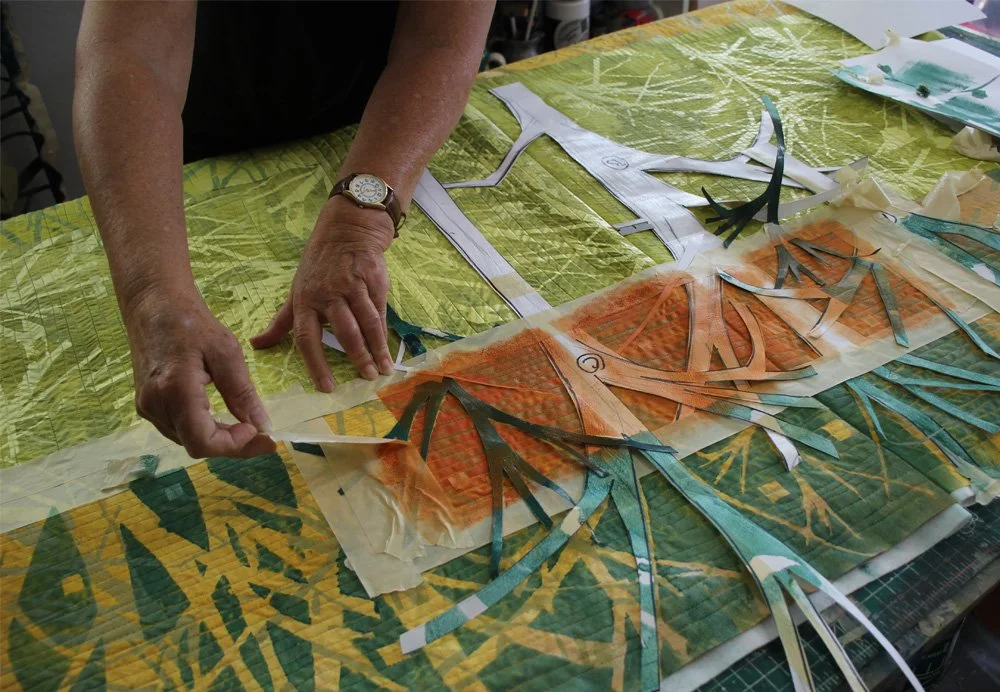
I’ve used a mix of stencils, positive and negative, plus a screen-printed background of branches to create an environment.
The pattern that’s visible at the top of the photo above, off-white branches on a yellow/green background, was created by screen printing with this screen:
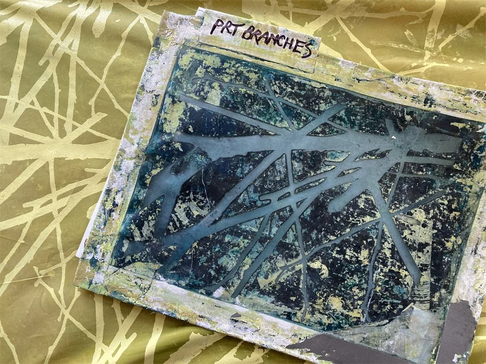
The image area is about 8” x 10”. I repeated it across the fabric to make an all-over fabric. It has a nice detail quality, in contrast to the child-like simplicity of tree forms also in this quilt, because I had it made from a photo I took of actual branches— a branch that had fallen in my driveway.
(You’ll see that I’ve labeled this one “Print Branches,” to indicate that it is a positive image. The paint goes through the mesh openings and prints the tree images. I also have a negative of this same branch; using that one, the paint goes through the mesh openings to print the background and the branches show through. I label the screens because I have learned that I can easily mix them up while working.)
Now what?
I’ve added a lot to this work since I took the in-progress photo at the beginning of this post. But I am still thinking I might like a few more layered shapes. For that, I’ve decided to use the same screen, but to use it differently.
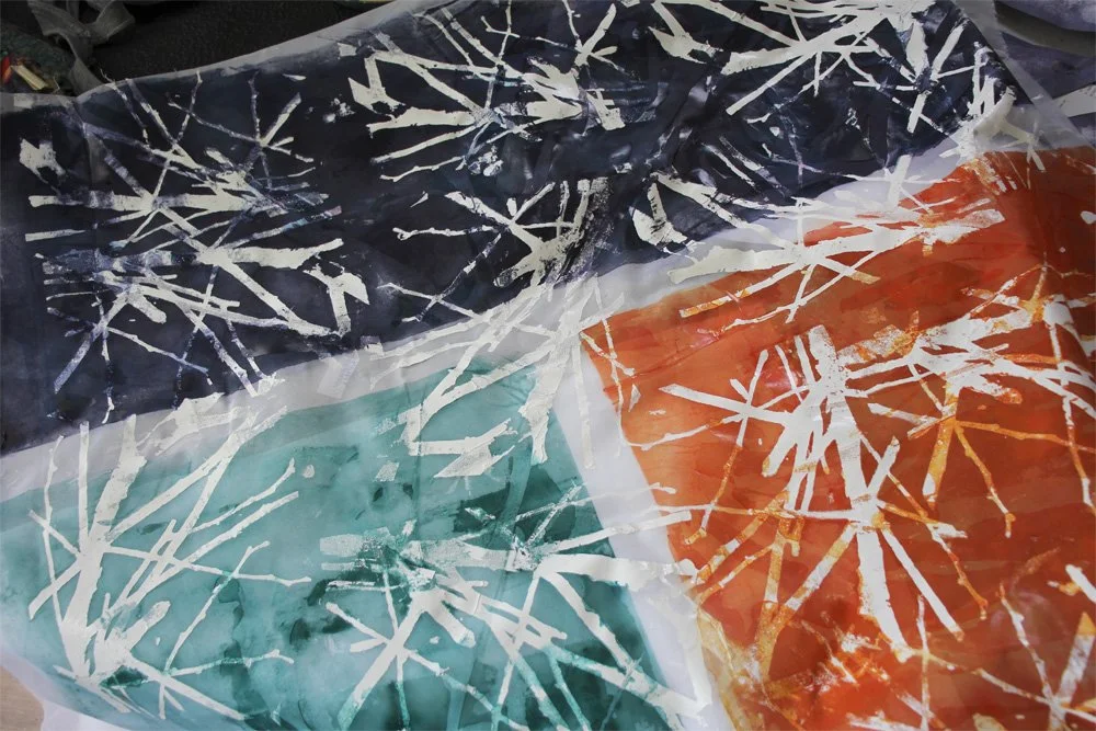
I printed white branches on sheer polyester fabric. Once dry, I overpainted the fabric with thin acrylic washes of color. The white branches still show clearly, but they are behind a subtle over-wash of color.
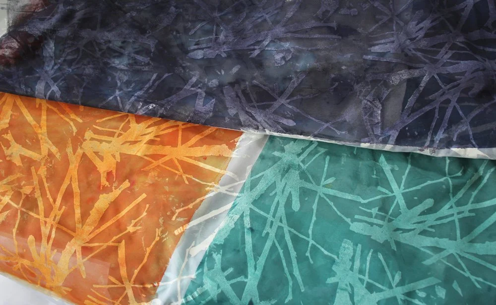
I like the way the different color fabric pieces still relate to one another harmoniously, because the pattern is a constant.
I also discovered a few other subtle results.
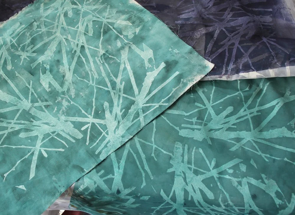
Same method. Different fabrics. Above, I have printed two different fabrics exactly the same way: with screen printed branches onto the fabric with a transparent wash of teal on top.
When these two pieces are incorporated into a finished work, collaged and stitched, the difference between the fabrics will add a bit of variety to the surface.
Don’t forget the back! Above, I have shown the back side of the screen printed sheer polyester pieces.
The images on the back are not as clean. There’s a bit of messy grunge where the paint went through the fabric and imprinted the back side against its vinyl dropcloth. Again, placing these pieces next to images of the screen printed fronts can add interest to the composition.

Different fabrics – Different backs In this picture, I’ve shown the back side of two different fabrics printed and painted with the same colors. Another way to mix and match.
There’s no substitute for time spent experimenting with your materials and methods. It’s how you figure out what works. And what does not work.
And— how wonderful— this is also the process of joyful discovery, the pleasure of hands-on artmaking.
For all of us: focus each day
on the good that needs to be done in the world.
Be part of doing it.
Thank you for reading. I always enjoy questions and comments.
--Bobbi
How I keep in touch:
BLOG POSTS - once a week: Mostly about what I am creating in the studio. If you would enjoy receiving blog posts by e-mail, please subscribe here: I post and send by e-mail each Sunday evening. BLOGS-BY-EMAIL
NEWSLETTER – about once a month: Mostly news of exhibits and my way of introducing new work. You’ll get FIRST LOOKS at new artwork and members-only discounts. You’ll hear from me about once a month. NEWSLETTER