What should go where?
Why does it matter?
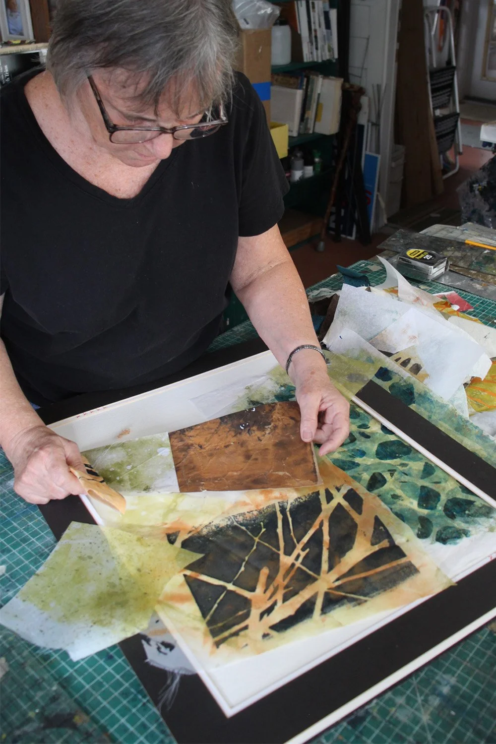
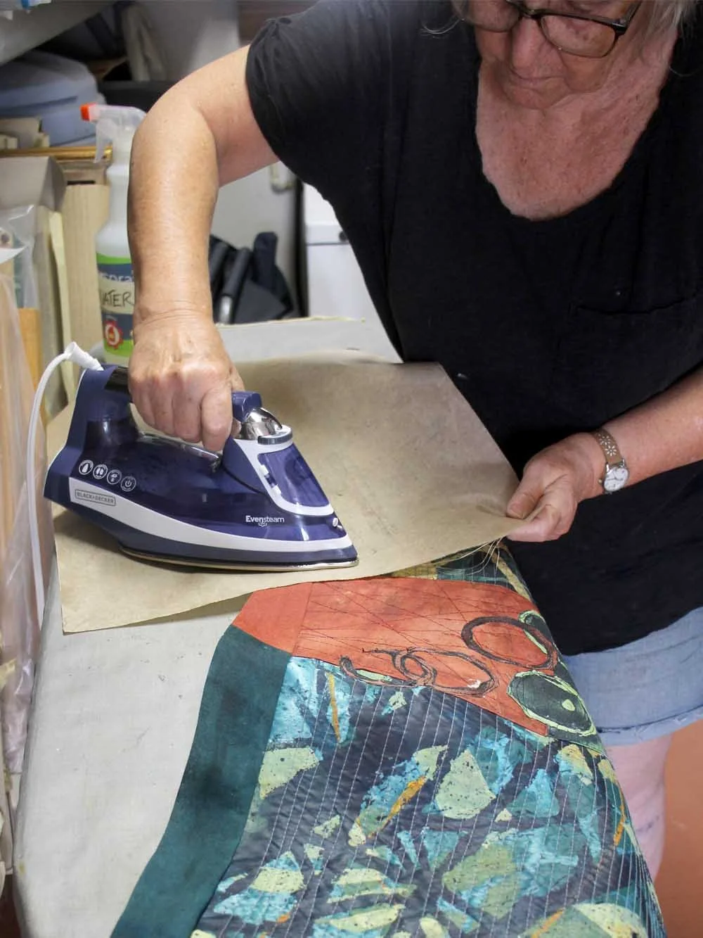
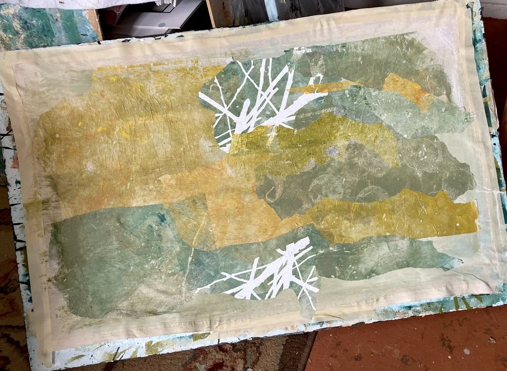
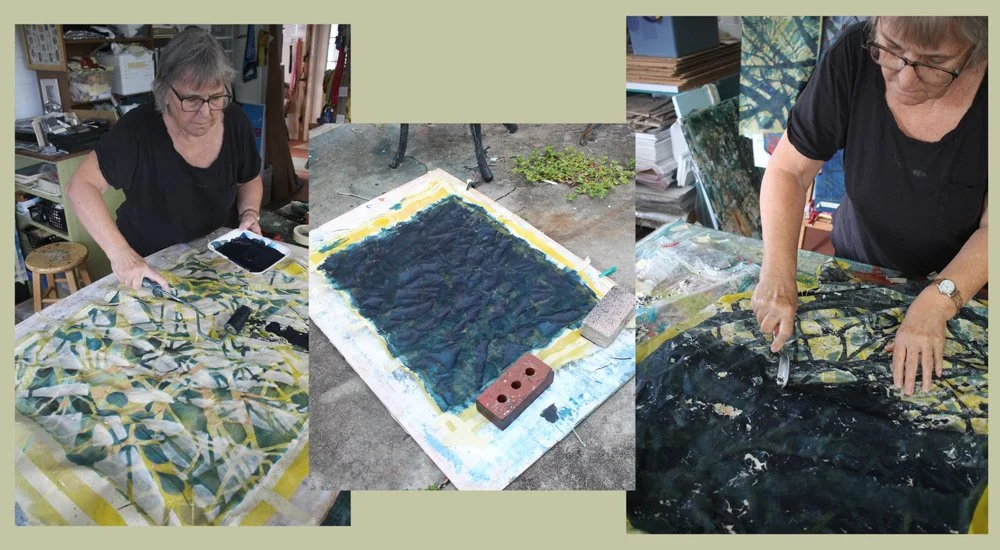
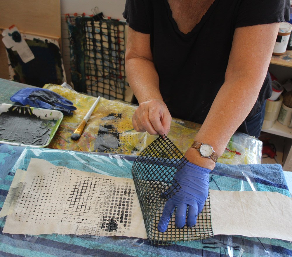
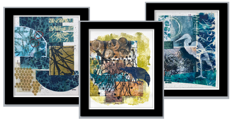
I spend a lot of time in my studio working out answers to these questions. Moving things around. Considering options. And I spent time this week – in a more analytical way – thinking and talking about concepts of composition.
In a workshop I taught via zoom (THANK YOU for the invitation, Art Quilt Association of Grand Junction, CO) and in leading some exercises with my local arts group (THANK YOU for the great day we had together, Arts Etc.) Drawing on the methods I experienced in hours as a student in Art History classes, we learned by looking at the works of other artists. Some local. Some famous masters.
Some works are successful. Some are not.
A strong composition is a make-or-break component of artwork. It’s not the end in itself. It’s the major tool artists use to communicate whatever it was that inspired them to create artwork in the first place. Composition counts.
This is one of the most recognizable works in modern art:
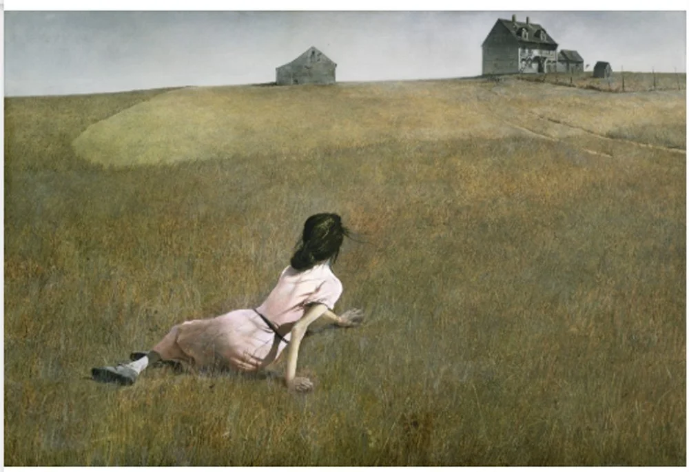
Christina’s World Andrew Wyeth
Andrew Wyeth’s Christina’s World is a masterpiece for many reasons. It is beautifully rendered. It is intriguing. It has a compelling story.
Part of the emotional punch is created by the artist’s composition choices: Wyeth’s masterful use of a high horizon line to draw the viewer into the picture. There is only one place where one could be to see what we see in Christina’s World. We are down the hill, standing slightly higher than the figure, where we can look down and see the top of her head and the top of her shoulders. But we are well below the buildings, having to look up to see them at the angle they are depicted.
So, Wyeth has placed us in the scene too. That’s why it’s so compelling. We feel like we are right there.
Any time a composition depicts depth, the horizon line plays a part. It’s an element that tells the viewer where he is.
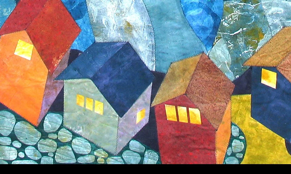
I thought this week of one of the first quilts I created that used perspective to place the viewer.
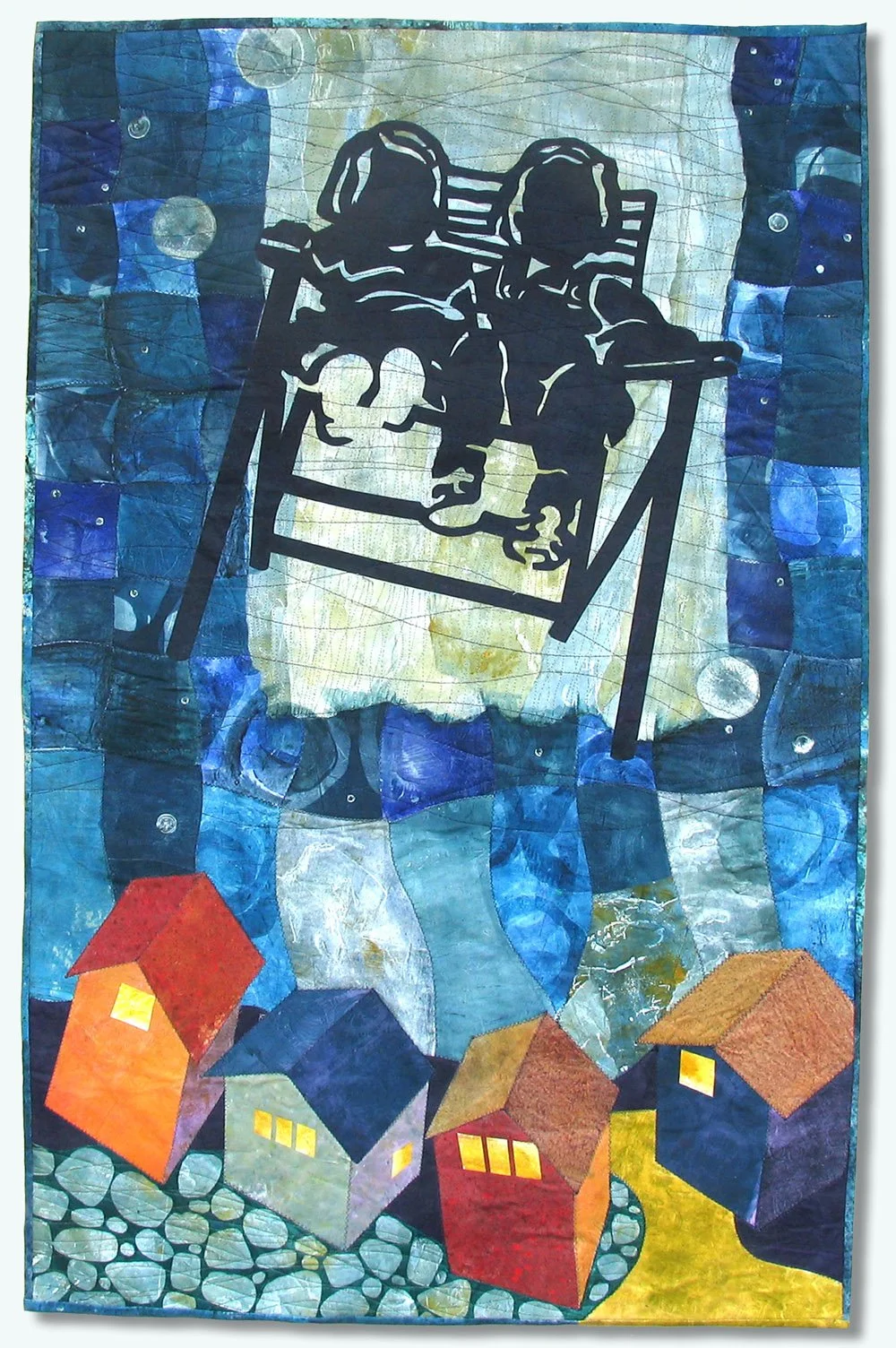
Flight of the Magical Lawnchair: I used two different perspectives in the same space in this quilt.
First is the angle used to take the photo I used as the basis for the silhouette of the two girls. (It is an old photo from my family scrapbook. The girls are myself and my sister. I am on the left.) The photographer had to be right in front of the chair, looking straight on, and crouched down slightly.
But, in the quilt composition, I have placed these girls up in the night sky, looking down at houses below as they take their imaginary, flying journey.
So . . . Where is the viewer? The viewer has to be up in the sky looking straight ahead at the girls, flying through the night with them while looking down at the houses.
The effect, I hope, is that the viewer feels drawn into this dream experience.
As you create your own works, or as you learn to deepen your appreciation of art as a viewer, pay attention to composition, especially the manipulations of depth and perspective that draw you in as part of the story.
For all the artmakers: Happy creating
For all the art lovers: Happy appreciating
Thank you for reading. I always enjoy questions and comments.
--Bobbi
How I keep in touch:
BLOG POSTS - once a week: Mostly about what I am creating in the studio. If you would enjoy receiving blog posts by e-mail, please subscribe here: I post and send by e-mail each Sunday evening. BLOGS-BY-EMAIL
NEWSLETTER – about once a month: Mostly news of exhibits and my way of introducing new work. You’ll get FIRST LOOKS at new artwork and members-only discounts. You’ll hear from me about once a month. NEWSLETTER