This week I’m in a neutral zone.
I’m in the early stages of a work that will be a figure study. I’ve started with the background and I am working my way to the foreground.
From the beginning, I was not positive how I wanted this to work. But I had a vision of a surface that had the visual interest of hand printed fabric with lots of patterns and texture that would – at the same time – function like a simple photographer’s background in a portrait.
I began with painting fabric. I worked on three sections of yardage (about one and a half yards each) that were similar, but different. One was a yellow-base neutral, one was more cream, and one was built from white and burnt umber.
My next step was to figure where on the finished piece each section would land, with special attention to what will go behind the figure. (I don’t want her to disappear in the patterns!) All of that is still in the works.
In the meantime, I’ve rediscovered that there are some wonderful characteristics of neutrals to incorporate into a finished piece.
First – they give you some place to go
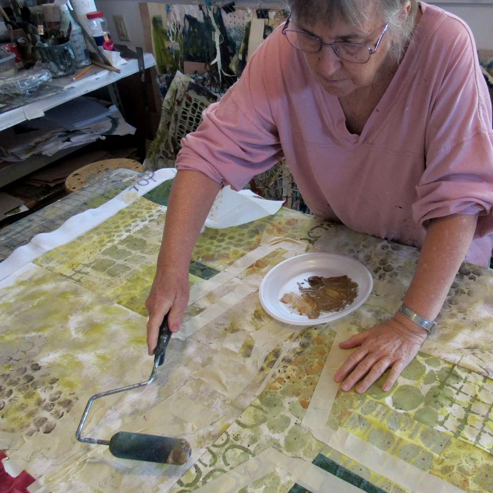
In the picture above I’ve masked off some sections and I am rolling on a very transparent wash of burnt sienna. Now, the fabric as-is will be next to the fabric-as-is-plus-sienna. That neutral base created a good surface for overprinting.
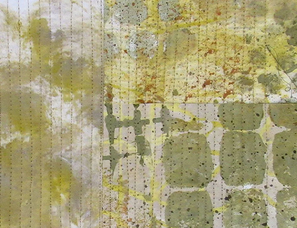
Second – Stitched sections of neutral patterns become a whole new surface.
I like the way this simple linear pattern of stitching connects these side-by-side sections so they function as a single unit.
This particular palette feels mostly new to me; it is not a frequent color decision for me. I looked back through some of my completed works to see if I had used it before. I found two works where I had started in a similar way. (Interestingly, both of these are also figurative storytelling works.)
This is “Neither Here Nor There.”
This is “From the Place Where we Landed”
In both of these, the neutral background was paired with sections of deep, intense color.
And that, I think, is what’s most interesting about working in a neutral palette.
The neutrals provide a place for the story or the focal point to take the spotlight. Rather than taking the spotlight themselves, the neutral portions will allow something else to step to the center of attention. Then, later, the viewer can wander through the neutrals and discover what they have to offer.
If you would like to learn more about the two works shown, they are on my website. Click to see more:
FROM THE PLACE WHERE WE LANDED
And now for a not-so-neutral thought: What’s good for composition may not be good for life. In my life as a human being and a citizen, I hope that in this new year I am not neutral. I would prefer to be fierce and passionate and intensely interested in events and involved as much as I am able.
My hope for you for 2023
is to find things NOT to be neutral about and jump in!
For all the artmakers: Happy creating
For all the art lovers: Happy appreciating
Thank you for reading. I always enjoy questions and comments.
--Bobbi
bobbi@bobbibaughstudio.com
How I keep in touch:
BLOG POSTS - once a week: Mostly about what I am creating in the studio. If you would enjoy receiving blog posts by e-mail, please subscribe here: I post and send by e-mail each Sunday evening. BLOGS-BY-EMAIL
NEWSLETTER – about once a month: Mostly news of exhibits and my way of introducing new work. You’ll get FIRST LOOKS at new artwork and members-only discounts. You’ll hear from me about once a month. NEWSLETTER


