
I’m so grateful that it is a new year, filled with possibilities. I feel a great burst of creative energy
This week I have been working to complete the blue-trees artwork that has developed into an art quilt. It is making me think about color and how it works.
I try hard to use my colors intentionally.
Colors have purpose; I find my work is most effective when I let each color do its job.
Generally, I compose works with one dominant color. I work almost monochromatically through a lot of the creation. Then, I add accents and splashes of (usually) the complement or near-complement.
The dominant color in this work is blue. A blue palette with tree images evokes dreams and memories to me. Although I have added a lot more complexity in monoprinting multiple layers and values in the individual sections, the overall palette reads as blue.
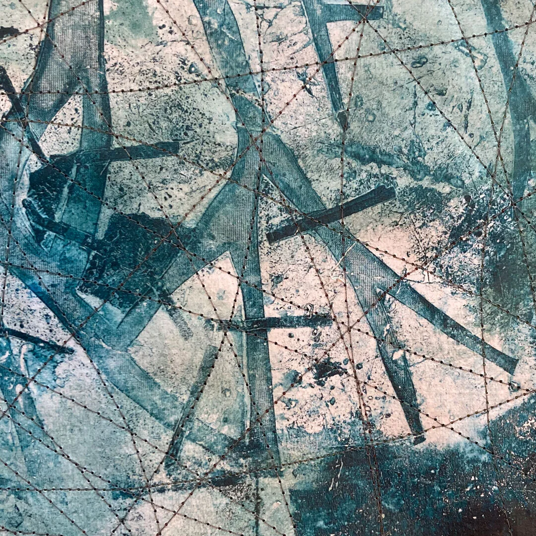
This section is monoprinted with blue acrylic on rice paper, then collaged to muslin

This section is mooprinted with multiple colors on sheer polyester, then collaged to muslin
Using MOSTLY one color throughout a work provides unity. Using ONLY one color throughout would just be boring.
In this work, I love the splashes of orange and mustard yellow. Their job is to wake up the blue and make it more lively. (Complementary colors next to each other create a visual “pop.”) Here are the two sections from above next to an orange hue.


I created the tree with the complements of orange and blue. Orange was the underneath color. The tree was formed with a hand-cut stencil on a gelatin printing plate, with some organic grass pieces providing the texture.

Even where the blue overprints the orange, that bit of orange shows through and gives it some depth.
Here is the reverse. I have overprinted orange shapes through a stencil onto a blue background. But the magic ingredient here is not the complement, it’s a little bit of white.
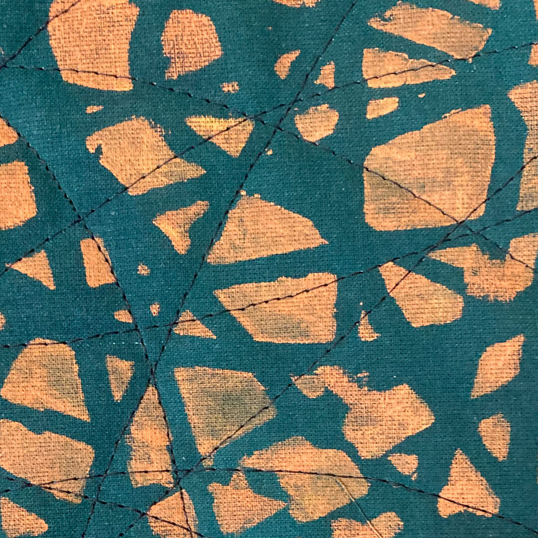
If you put blue and orange (complements) NEXT to each other they each “pop.” If you put orange on TOP of blue, you get mud. The orange is not opaque unless there’s a bit of white mixed in. The white is what has transformed this pure orange into a cantaloupe—like color. White adds opacity.
I also used the opaque quality of white to create the window shape around the tree.

I am enjoying this quilt, but I am also anxious to complete it. My new year energy has stirred up all kinds of ideas of what to work on next.
Thank you for reading. I always enjoy questions and comments.
--Bobbi
BLOG POSTS: If you would enjoy receiving blog posts by e-mail, please subscribe here: I post blogs once a week. BLOGS-BY-EMAIL
NEWSLETTER: If you enjoy more detailed behind-the-scenes stories, as well as FIRST LOOKS at new works and members-only discounts, I hope you’ll become a Studio Insider. You’ll hear from me about once a month. NEWSLETTER