This week I’ve been in the backbone-basics stage of my quilt project depicting a house of leaves.
Time for some palette decisions.
And time to print some yardage determined by those choices.
Here’s how I began:

I’ll be mixing up a neutral yellow/gold color built from yellow and black. (You might notice that my jar of yellow is a very intense cadmium yellow – like a very deep mustard. This is not my usual brand of paint. It’s a jar I acquired once and don’t really like. But, from experience I know it will work well in this particular color mix. So I’m using it up.)
Yellow + black = mustard gold. Less black = more gold-ish. More black takes the hue to olive green.
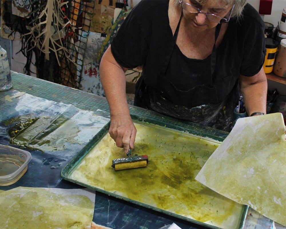
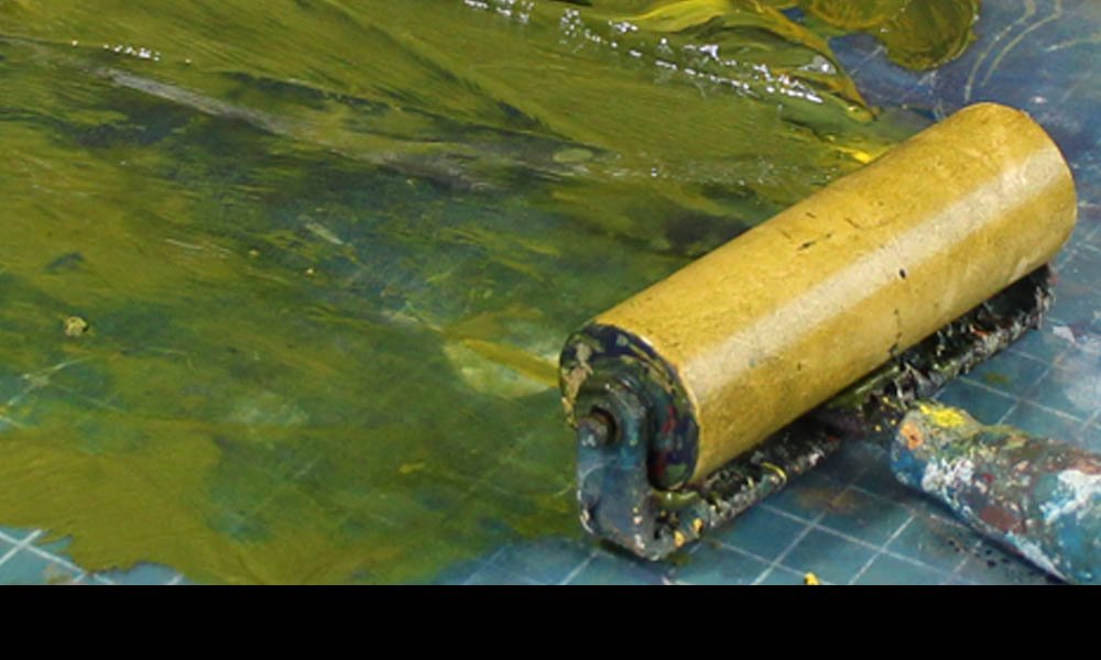
I’ve decided to monotype print on my gelatin plate. This yields a very delicate hue (because the paint is so thin on the plate) and some interesting random textures (because my plate now has some nice wear and tear in it. ) I mixed up the color right on my vinyl drop cloth and rolled the brayer through it.

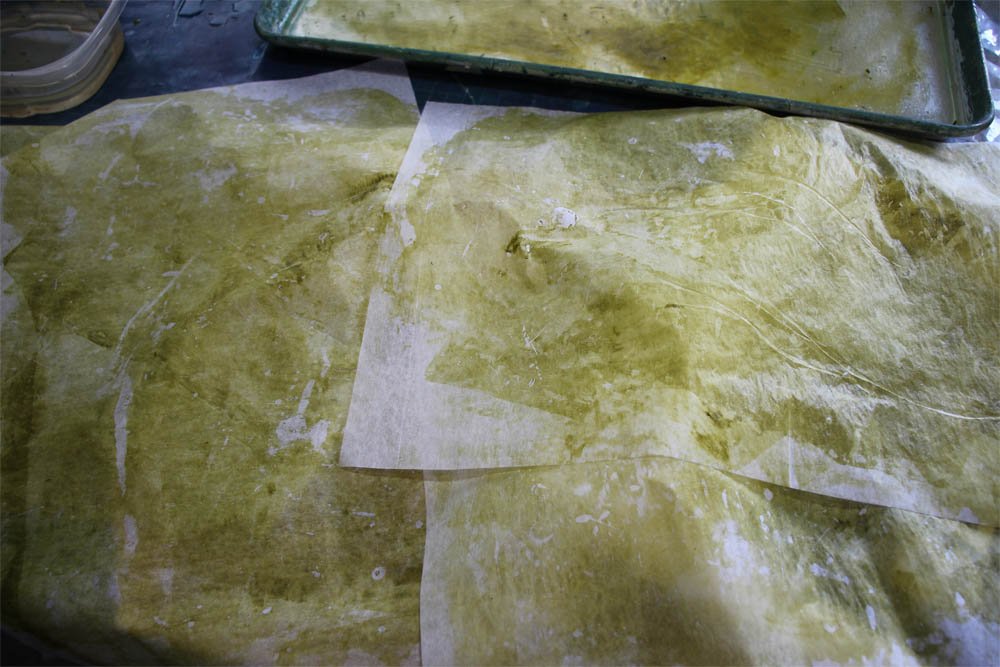
First I printed some individual paper sheets – a nice thin tissue paper. These are great for collage.

Then I printed some yardage – what I’ll actually use in my quilt-in-progress. This is a sheer polyester. First I ink up the plate with the brayer, press down a fabric section, pull it off, ink up the plate again, move the fabric down a bit and press the next section. All the sections will overlap a little to create a delicate, random texture on the yardage.
(Vocabulary lesson: I am using the word “ink” as a verb, the way a printmaker or printer would use it. To apply the color to the printing plate. But I am not using inks. I am printing with acrylic paints.)
The usefulness of a delicate, neutral color is discovered by pairing it with an intense color, especially its complement.

On the color wheel, pure yellow is the complement of pure purple. So I know that these mixed colors “yellowish” and “purplish” will work as complements too. They bring out interesting characteristics of each other.
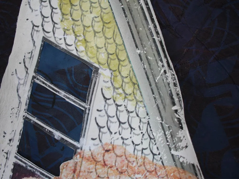
Here’s an application I found for that thin tissue paper. I ripped an uneven edge and cut it to fit under the roof angle, to provide a subtle touch of color to the house. (I also collaged the deep purplish-sky and leaves patterns inside the window so the parts will speak to each other.)
Next up in this project is some stitching. And some more collage. I expect to be living inside this project for a while. (Good thing I like the colors!)
For all the artmakers: Happy creating
For all the art lovers: Happy appreciating
Thank you for reading. I always enjoy questions and comments.
--Bobbi
How I keep in touch:
BLOG POSTS - once a week: Mostly about what I am creating in the studio. If you would enjoy receiving blog posts by e-mail, please subscribe here: I post and send by e-mail each Sunday evening. BLOGS-BY-EMAIL
NEWSLETTER – about once a month: Mostly news of exhibits and my way of introducing new work. You’ll get FIRST LOOKS at new artwork and members-only discounts. You’ll hear from me about once a month. NEWSLETTER