A little color and composition project I am working on this week is causing me to remember a friend from high school.
He was smart and funny. And a bit of a smart- apple. And I remember that when somebody would express a fondness for something (I love hamburgers! I like the Beatles!) he would reply: “As compared to what?”
The artful takeaway from this is the importance of context: a color or a design element is not usually worthy of affection all on its own. “I love blue!” As compared to what? Alongside what? Used as a layer over what? As compared to what other choice?
My project involves two small pieces, just under 12” x 12”, which are to display together, one above the other, as a diptych. (I am creating this for a call-to-entry with those specifications.)
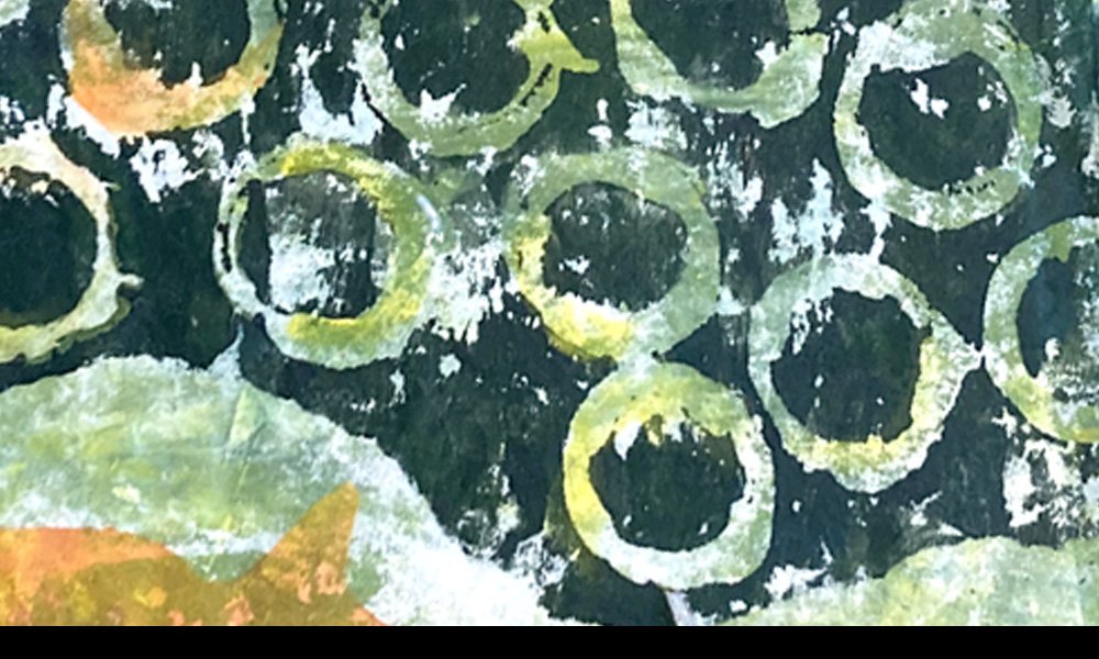
So far, I have a top section with a blue background and a bottom section with a green background, unified by a pattern of bubble-like shapes.
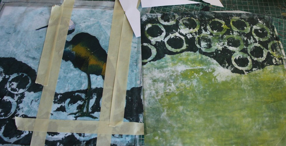
I have already printed the bubbles sections. (I created the shape edge with torn paper as a stencil then wheat paste resist for the circle shapes.) The halves are compatible, but don’t have much “pop.”
My plan is to add the complement of blue — orange — to each section to get the color to be more alive. This is an abstract depiction of above and below water. Above the water is a wading bird. Below the water are fish.

In the top section, I’ll add orange to the background and the bird will reveal as blue. On the bottom section, I’ll use orange as the foreground on the fish shapes. In each case, I’m keeping my orange transparent (pigment mixed with a good deal of matte medium) so it will be transparent.
Here’s my set-up: colors in the mixing tray, foam roller ready for application.

Now to paint. On the top half, the bird shown in the picture is a card stock stencil. It is blocking out the paint in the shape of the bird, and I have used masking tape for the edge. On the bottom half, I’ve cut card stock fish shapes to fill in.

Here is the side-by-side result at this point.

A subtle thing that occurs with transparent paints, working in complements, is the interplay of the underneath color with the over printed transparent color. Here is a close-up of the fish.

The hints of the green below with the orange on top is much more interesting than it would be as an opaque color.
I’ve experimented and played with colors and transparencies a lot in my work. I do not use fixed formulas for color partnerships or color mixing or degrees of transparency. A feel for what works with your particular working materials comes with time spent using them. (And allowing yourself to make mistakes. I’ve made a bunch!) Along the way I’ve learned what I like, and what combinations usually work out well.
This little project has some more collaged additions and stitching in its future. I’ll share it again when it’s done.
For all the artmakers: Happy creating
For all the art lovers: Happy appreciating
Thank you for reading. I always enjoy questions and comments.
--Bobbi
How I keep in touch:
BLOG POSTS - once a week: Mostly about what I am creating in the studio. If you would enjoy receiving blog posts by e-mail, please subscribe here: I post and send by e-mail each Sunday evening. BLOGS-BY-EMAIL
NEWSLETTER – about once a month: Mostly news of exhibits and my way of introducing new work. You’ll get FIRST LOOKS at new artwork and members-only discounts. You’ll hear from me about once a month. NEWSLETTER