
Compare and contrast.
Same, but different.
Light and dark.
Parts that will speak to each other.
These are some of the concepts I consider as I am creating a composition. As much as possible, I try to think through these ideas in the design and sketching phase so I know where it’s going. But, if the plan isn’t working along the way, I’ll adjust and try something new.
I had a chance (through the wonderful surprise of being on the cover of SAQA Journal) to look again at my quilt, Seeing Through to the Light. I think the composition works, and I think the contrasts are at the heart of it.

LIGHT LIGHT LIGHT The top section is dominated by a photo transfer of an image I have used in several quilts: a picture I took looking through the windows of an abandoned house. The overgrown vines were flooded with sunlight, creating intricate, delicate patterns.

Then I also created some hand-printed fabric to square off this section, which is so similar in character to the photo that it blends in as part of it.
It was here that I also introduced the yellow lines indicating light.

DARK DARK DARK The bottom section is the opposite of the top. Almost no pattern. Very dark values. Although there is actually a good deal of surface pattern in this section, it is so subtle it’s only visible right up next to the quilt. From across the room this looks solid black.

Then, in what is actually the point of the quilt, a few shafts of light dissect the dark. The light penetrates, breaking through.

DIFFERENT DIFFERENT DIFFERENT As a transition between these two sections, I created the vibrant orange circles, resist-printed. The round shapes are not found in the patterns of the other sections. The color “pops” They provide the entry point for orange as a design element, which I then pick up in two other splashes.
As I compose, I like to think of ways for the various parts of a quilt to speak to each other. To do that, each section needs o have its own defined voice. I was absolutely transfixed by the image I took of the light and vines through the window. Its voice is strong, and offered me subject matter to use as a beginning point.
Assembling the photo transfer
Seeing Through to the Light is part of the SAQA Global Exhibition “Light the World. “ (That is how it came to be featured on the cover of SAQA Journal; inside this issue is an article about that traveling exhibit.) Seeing my quilt again helped me to remember making it, and what I was thinking about during the process. This week, in other projects in the studio, I have tried to incorporate some of what I thought worked in that creation.
Compare and contrast.
Same, but different.
Light and dark.
Parts that will speak to each other.
. . . . . . . . . .
If you would enjoy looking at other quilts based on landscape and natural elements, I invite you to visit the Layered Nature Gallery on my website, HERE.
. . . . . . . . . .
You are invited:
Art in the Garden… This Weekend!
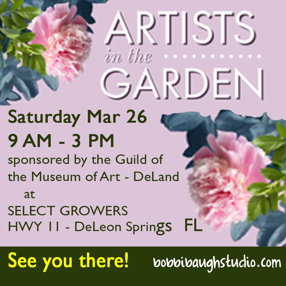
Saturday, March 26, from 9-3 PM at Select Growers Nursery on HWY 11 just North of DeLand. This one-day outdoor event is from 9 am -3 pm, and features displays by local artists plus food and beverages all in a beautiful shaded pavilion in the middle of a spectacular plant nursery. You can browse, shop for art and shop for plants all at once. I’ll be exhibiting. If you are near the DeLand area, I hope to see you there.
For all the artmakers: Happy creating
For all the art lovers: Happy appreciating
Thank you for reading. I always enjoy questions and comments.
--Bobbi
How I keep in touch:
BLOG POSTS - once a week: Mostly about what I am creating in the studio. If you would enjoy receiving blog posts by e-mail, please subscribe here: I post and send by e-mail each Sunday evening. BLOGS-BY-EMAIL
NEWSLETTER – about once a month: Mostly news of exhibits and my way of introducing new work. You’ll get FIRST LOOKS at new artwork and members-only discounts. You’ll hear from me about once a month. NEWSLETTER