
Color is wonderful.
Color on color can be even wonderfuller! (That’s a word. I’m sure of it.)
I had two different color adventures this week. One was a fix of something printed before on paper that I did not like. The second was a create-from-scratch color build on fabric.
First, the color rescue on paper

These are some paper sheets I printed a few months ago. I can’t remember what project I created them for. I only know that once they were done I didn’t like them at all. (And – wouldn’t you know – I had printed a BUNCH of them.) I just don’t like baby blue. And I had mixed up a baby blue (cerulean plus white) so that it would overprint the darker blue background. To me, the leaves are just pasty looking. I can’t think of a way I would ever want to use these sheets.
Time to overprint.

Here’s my set up ready to over print. I’ve mixed a blue color that has a lot more teal in it. (Phthalo blue plus raw sienna.) I’ll re-print my papers as monotypes on the gelatin plate. The teal color will very slightly alter the background blue color and will kill the pastiness in the leaves

Inking up the plate. (Vocabulary note: I actually print with acrylic paints, not printing inks. But, I always learned to use the word “ink” as a verb when it means putting the printing material on the plate. So I say “inking up” even though I’m “painting up.”)
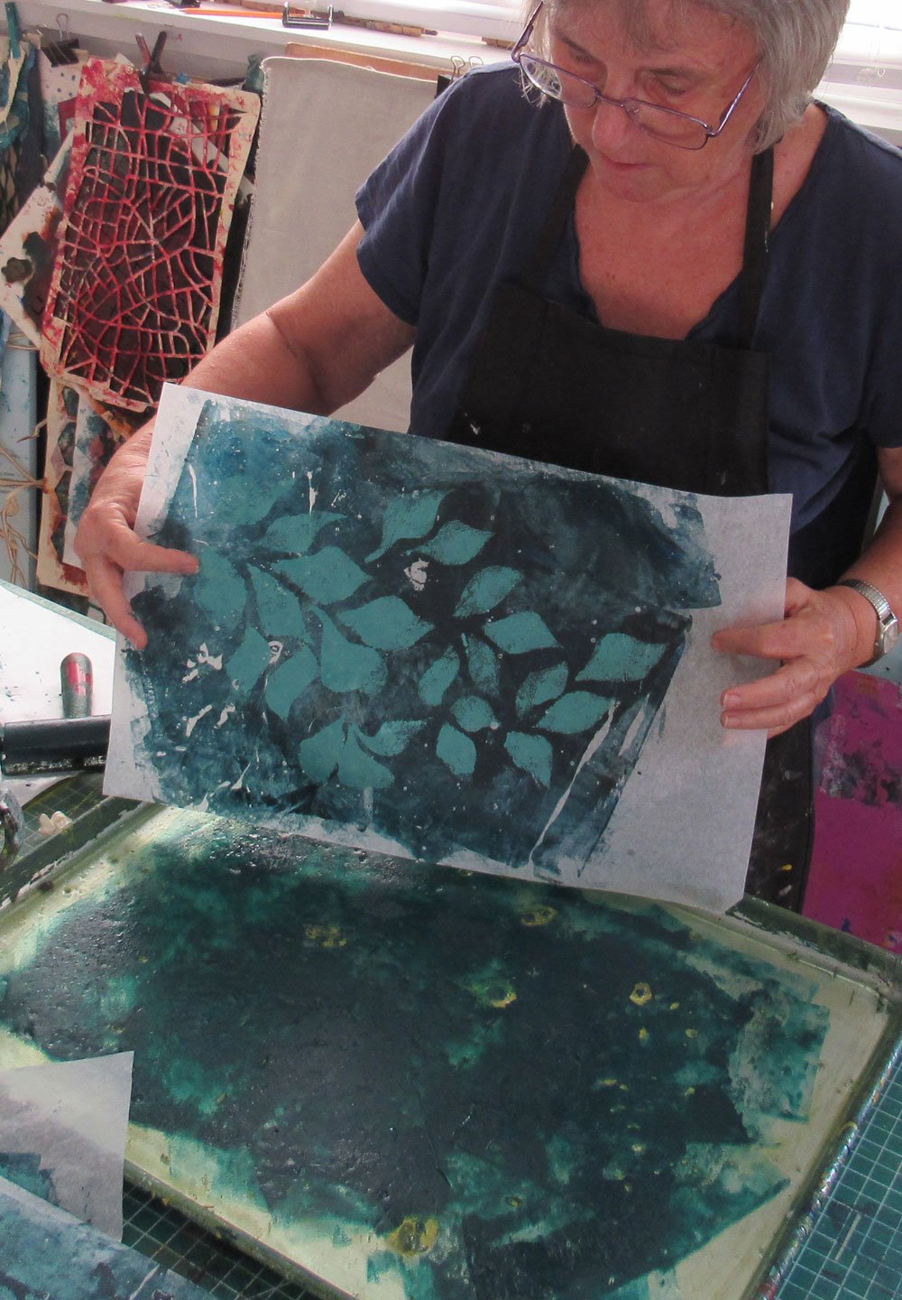
Here’s the paper with the pasty leaves ready to be pressed into the teal color.

The result. The shape of the leaves is still visible, but much more muted. And I have killed the baby blue!
Project two: building up color from scratch on cotton fabric.

This is a piece of fabric about 40” square. I do not use a lot of red, but I have a project that will need a nice red splash and so I wanted it to be interesting. What pleases me about this piece is the richness of the red hues. I combined unlike reds together on the palette: cadmium red (which has a red-orange base) and alizarin crimson (a magenta base) plus just a tad or pre-mixed pink. I thought the colors might fight each other. Instead I think they enhanced each other.

I enjoyed playing with some positive-negative shapes with stencils. All of the images on this fabric were created either with stencils or by overprinting textures that I placed beneath the fabric before painting.
So… What to do with colorful fabrics and paper? For someone who enjoys the process of the surface design as much as I do, sometimes, I need to remind myself, “Oh yeah. It’s to be incorporated into art!” Otherwise, I can just fall in love with making fabric.
Here are a few of my small collages pieces that use layers of printed fabric or layers of printed paper.

“Within the Harboring Silence.” on my website.. Learn more HERE

“Through All of its Worlds” on my website Learn more HERE
For all the artmakers: Happy creating
For all the art lovers: Happy appreciating
Thank you for reading. I always enjoy questions and comments.
--Bobbi
How I keep in touch:
BLOG POSTS - once a week: Mostly about what I am creating in the studio. If you would enjoy receiving blog posts by e-mail, please subscribe here: I post and send by e-mail each Sunday evening. BLOGS-BY-EMAIL
NEWSLETTER – about once a month: Mostly news of exhibits and my way of introducing new work. You’ll get FIRST LOOKS at new artwork and members-only discounts. You’ll hear from me about once a month. NEWSLETTER