
Whenever I think about blue, I remember a long-running joke between myself and a customer when I was in the commercial printing business. We sold political campaign printing, mostly to local candidates. I worked closely with a very nice man who was running for City Commission as a first-time candidate. He wanted an attention-getting color for his signs. Red? Green? Yellow with black? What did I think?
And I told him, “Nobody doesn’t like blue.” He thought that was too funny. And he used blue for his campaign. And for years after, whenever we would see each other in town, he would repeat to me “nobody doesn’t like blue, you know.”
Except that, for some time as I began to work with paints on textiles, I thought that I didn’t like blue. I perceived myself as an orange-sepia-umber earthtone kinda gal. Then I stepped back and looked at my body of work. Apparently, I’m quite at home with blue.

On my worktable… a recent batch of fabrics with mixed blues
I just ran out of Cerulean Blue and have placed an order for more. (People frequently ask about what brand paints I like. I use Nova Color Paint – Artex Mfg. – in California. They do not know I am writing this and they don’t pay me. They just have good paint, reasonably priced, in-wide-mouth jars that I really like. They are actually the manufacturer and I like that. The only disadvantage is paying shipping from California to Florida. But, I group my orders so it’s not so bad.)
I only order a limited palette of colors – basically the primaries plus two browns (burnt sienna and burnt umber) plus black and white. I mix all my colors from these.
Cerulean blue had to grow on me. Used out-of the jar straight it’s really a pretty uninteresting blue. (Actually, most colors used straight-out-of-the-jar are uninteresting, or at least less interesting than when mixed with something else.) But what a great mixing blue! I use a lot of teal colors, and I create these mostly with Cerulean plus one of the browns. I also mix my greys, and Cerulean + orange + white makes a wonderful grey.
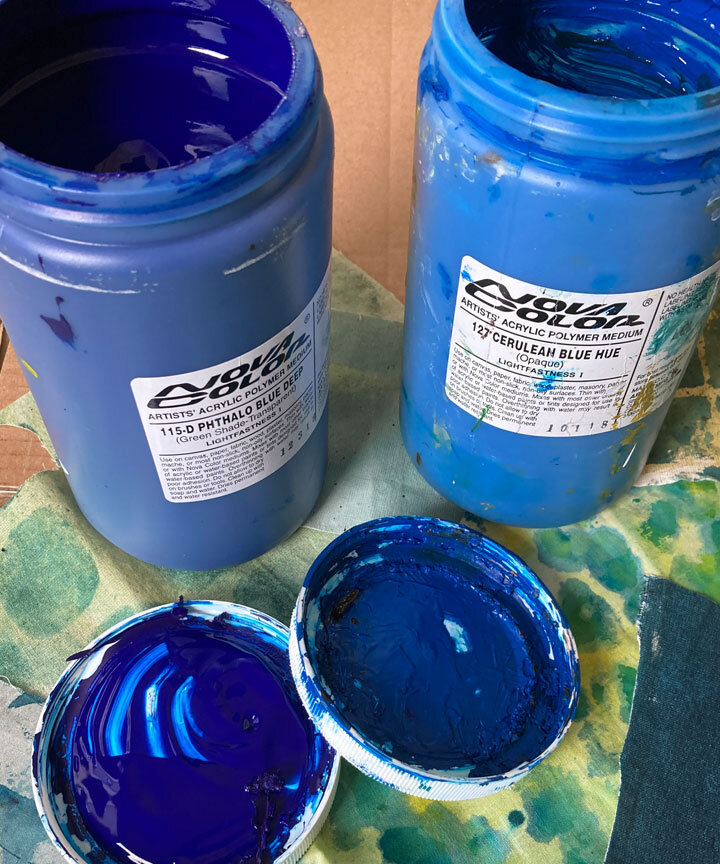
The other blue I keep on hand is phthalo blue. It’s deep and intense and wonderful. But, a little goes a really long way. It’s dangerous to mix with because it comes on so strong.
This week I had a visitor in my studio picking up some collages she’d purchased. The large quilt-in-progress is on my easel. It’s always helpful to hear feedback on unfinished works. I was grateful to hear her say, “Oh. I just love those windows and all that blue. I could get lost in this work.”
See. Nobody doesn’t like blue.

My current art quilt-in-progress at the composition stage

Detail of the same quilt-in-progress on my easel
If you’d like to see another quilt that features windows along with hand-printed fabrics,, take a look on my website at Connecting to the Invisible HERE
If you’d like to see another quilt that features a deep blue palette, take a look on my website at Tide Pools – Tide Pulls HERE
Thank you for reading.
I always enjoy questions and comments.
--Bobbi
bobbi@bobbibaughstudio.com
BLOG POSTS: If you would enjoy receiving blog posts by e-mail, please subscribe here: I post blogs once a week. BLOGS-BY-EMAIL
NEWSLETTER: If you enjoy more detailed behind-the-scenes stories, as well as FIRST LOOKS at new works and members-only discounts, I hope you’ll become a Studio Insider. You’ll hear from me about once a month. NEWSLETTER