
Today I’ve done some walking through the distance in a new work I just delivered to Arts on Douglas Gallery in New Smyrna. (artsondouglas.net)
There are some things I was pleased with in this collage, called “While Approaching the Distance.”

For readers who are artmakers, I hope you don’t mind if I talk through out loud about some composition basics. I know it helps me periodically to remember Art 101 kinds of things.
For readers who are art lovers but not artmakers, I hope a look inside some composition basics provides richer tools for looking at and appreciating artwork of all kinds.
THINGS FAR AWAY NEED TO BE LESS INTENSE: This might be a matter of being less distinct (like blurred trees in the distance of a forest), or it might mean a more subdued hue, or it might mean the medium used with less intensity. In this collage, I created the sky on sheer polyester as a monotype. That fabric almost always yields a softer look than muslin.

I also really like this piece at the base of the sky. It was a serendipitous event in a fabric-printing session. My plate was wet and the fabric was wet, I pressed it on the plate and it created a nice loose imprint.

A BIT OF WHITE CAN BE MAGIC. I discover in my own work that I like most works that have some underneath white showing through. Perhaps because that’s the aesthetic of watercolor painting, and I love watercolor. The space between the sea and the sky and the bits of white around the edge are important to this composition. (This is really written as a note to myself. I am so frequently tempted to fill up every little inch.)
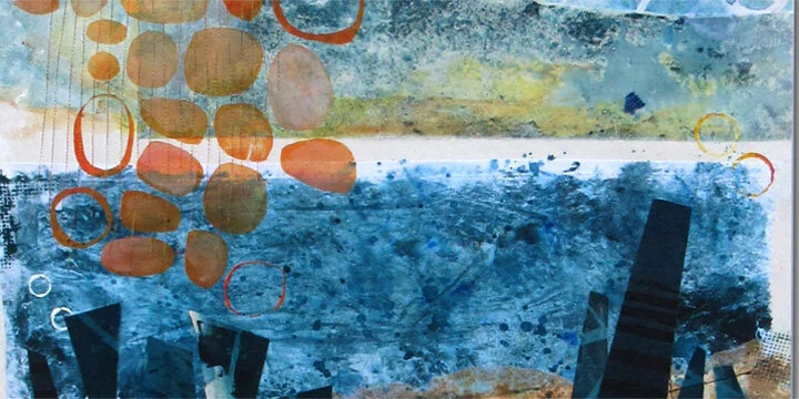
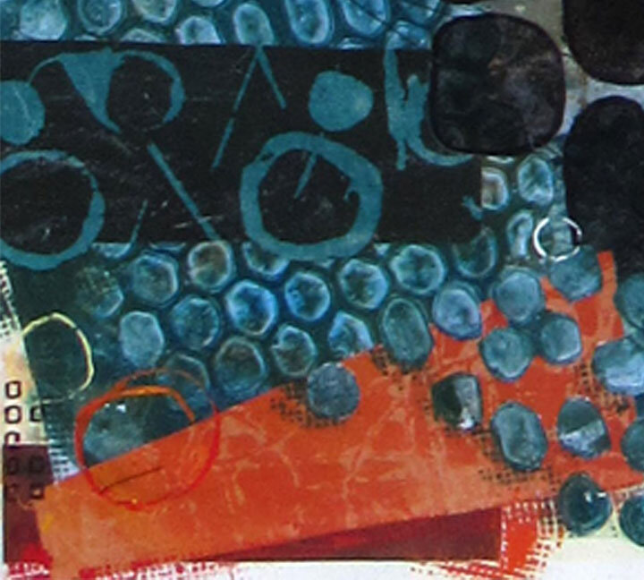
THINGS CLOSE UP SHOULD BE MORE INTENSE The rocks and the dancing trapezoid forms in the foreground are the darkest values. I have not made a lot of difference between these parts. So, to me, they all function as a group. The black circles and the trapezoids are in the same plane. They are all in front of the ocean but related ambiguously to each other. I had fun with that. If I had wanted more depth within this area, some things would have to be even bigger and possibly overlapped shapes behind them.

COMPLEMENTS “POP” This work has a very limited palette – mostly blue and orange plus black and white. (The “brown” sand is actually and orange base that been subdued by mixing with blue.) Where the two main colors interact, there will be contrast and maybe a little energy. In the sky, the orange shapes – even though quite pale – are not hard to distinguish from the sky. In the foreground, the orange triangular shape interacts with the teal blue honeycomb pattern.

When I ask myself what’s important to me when I create a piece of art, I like the analogy of a favorite book. It’s my hope that one can return to it over and over again and still find something new. When I create storytelling works, the content and the memory will be a big part of that. With an abstract composition, it’s got to be all about the interaction of the varying elements.
Thank you for reading. I always enjoy questions and comments.
--Bobbi
bobbi@bobbibaughstudio.com
BLOG POSTS: If you would enjoy receiving blog posts by e-mail, please subscribe here: I post blogs once a week. BLOGS-BY-EMAIL
NEWSLETTER: If you enjoy more detailed behind-the-scenes stories, as well as FIRST LOOKS at new works and members-only discounts, I hope you’ll become a Studio Insider. You’ll hear from me about once a month. NEWSLETTER